- 5 - Implicit vs Explicit Tracks
- 6 - Grid Auto Flow
- 7 - Sizing Tracks
- 8 - Repeat Function
- EMMETT TRICK
- 9- Sizing Grid Items
- 10 - Placing Grid Items
- 11- Spanning and Placing Cardio
- 12 - Grid Auto-Fit and Auto-Fill
- 13 - MinMax
- 14 - Grid Template Areas
- Grid Line Names
- 15- Naming Lines
- 16 - Grid Auto Flow Dense
- 18 - Re-ordering Grid Items
- 19 - Nesting Grid Items
- 20 - CSS Image Gallery
- 22 - Recreating CodePen
- 23 - Bootstrappy Grid with CSS Variables
- 24 - Responsive Website Example
- 25 - Full Bleed Blog Layout
Definitions
Grid container - element containing a grid, defined by display: grid; (you can have as many as you want)
Grid item- any direct descendent of a grid container (only first level descendents)
Grid line - horizontal or vertical line separating the grid. Referenced by numbers starting and ending with the outer borders of the grid
Grid cell - intersection between a grid row and a grid column
grid track - the space between two or more adjacent grid lines (row tracks are horizontal, column tracks are vertical) (row or column)
Grid area - rectangular area between four specificed grid lines (grid areas can cover one or more cells)
Grid gap - empty space between grid tracks (shown in blue). Commonly called gutters.
- Define a grid
- Place items where you want in the grid
Useful Links:
https://goo.gl/SJmlms
https://gridbyexample.com
https://goo.gl/wa0Fk9
https://goo.gl/z01gjF
Https://goo.gl/URouSh
Https://goo.gl/ae838
http://mor10.com/wceu2017
5 - Implicit vs Explicit Tracks
.container {
  display: grid;
  grid-gap: 20px;
  grid-template-columns: 200px 400px;
}
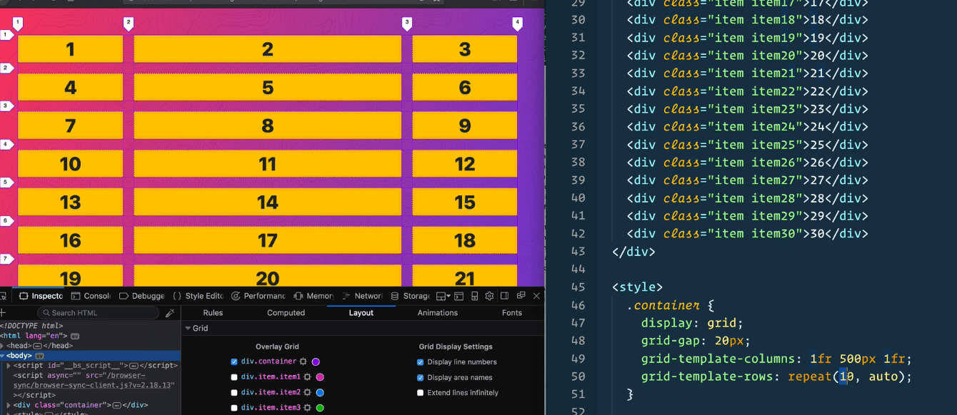
Here we have defined what the columns will be, which is explicit, but we have not defined what the rows will be, which is implicit.
If we add
grid-template-rows: 50px 100px;
And two more grid items, how can we set the size of the implicitly created row?
Using grid-auto-rows
Add grid-auto-rows: 100px 500px; for example
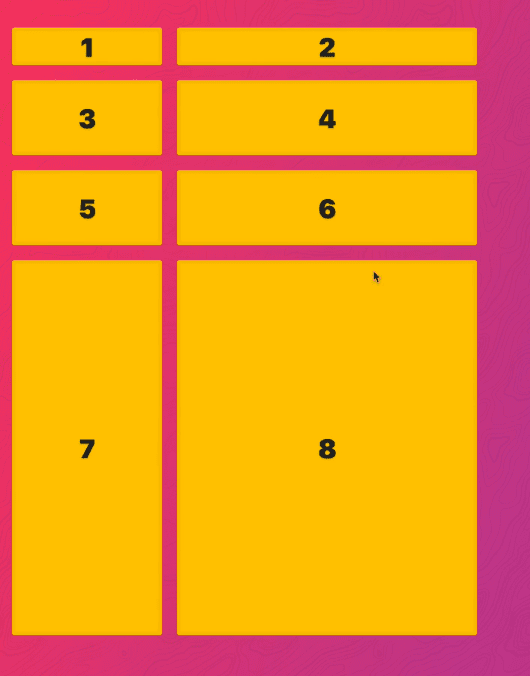
There is also grid-auto-columns.
However, if we were to add it to this example, it wouldn’t do anything.
How do you get extra columns?
By default, you define your columns and any extra elements are turned into rows. That is where grid-auto-flow, which instead of automatically giving us rows, it will give us columns.
6 - Grid Auto Flow
When you explicitly define your columns and don’t define any rows, they are automatically created (implicitly).
What grid-auto-flow will do is determine whether to add another row or column if you have another item that is implicitly defined.
grid-auto-flow:row is the default.
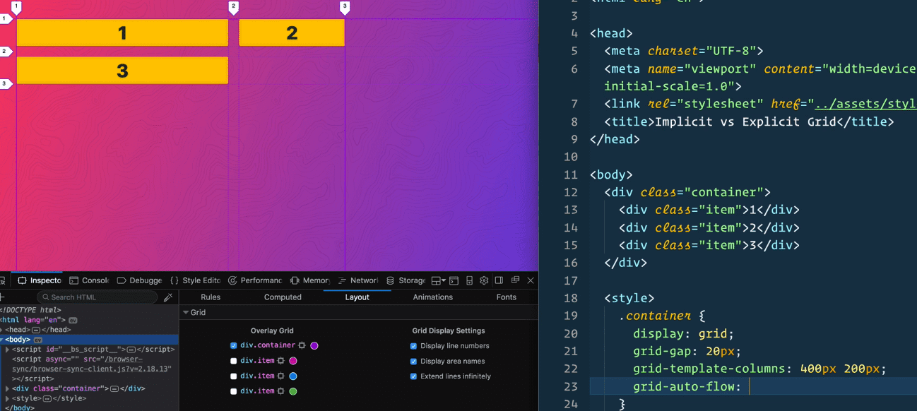
If you do
grid-auto-flow:column
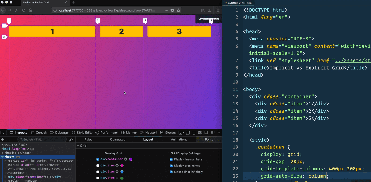
The extra item will now be created as a column, instead of a row.
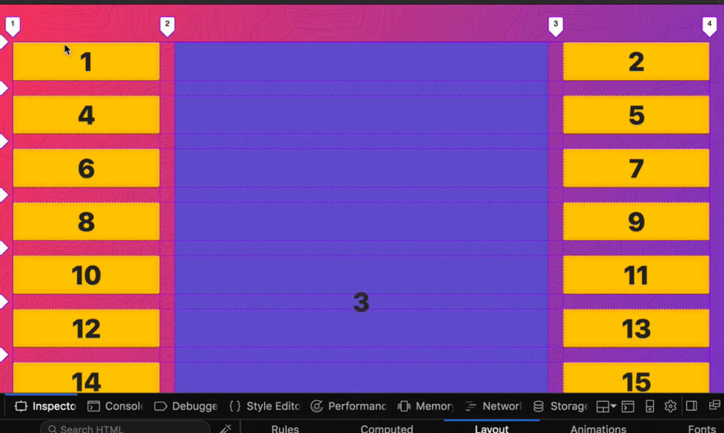
7 - Sizing Tracks
fr unit (fractional unit)
-represent the amount of space that is left after all the elements are laid out
-css grid will layout the columns that have explicit width/height and then if you said 1fr for example, it will take up the remaining available space
NOTE: using fr with grid-template-rows will only work if the grid item has a height.
For grid-template-columns: auto 1fr; the auto portion will adjust to the max size of the contents (the widest content that is defining that column.
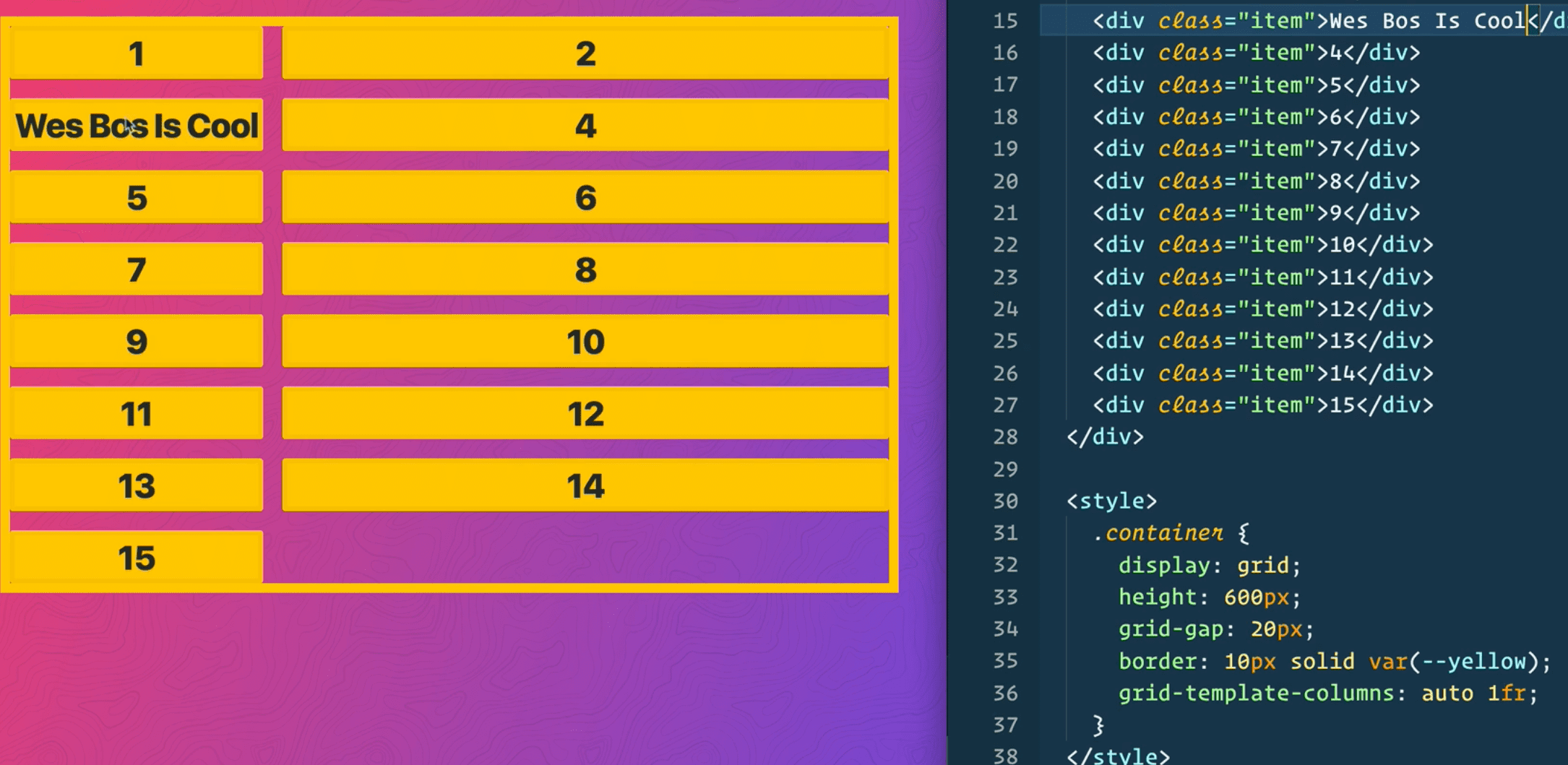
auto sizes to fit the widest content
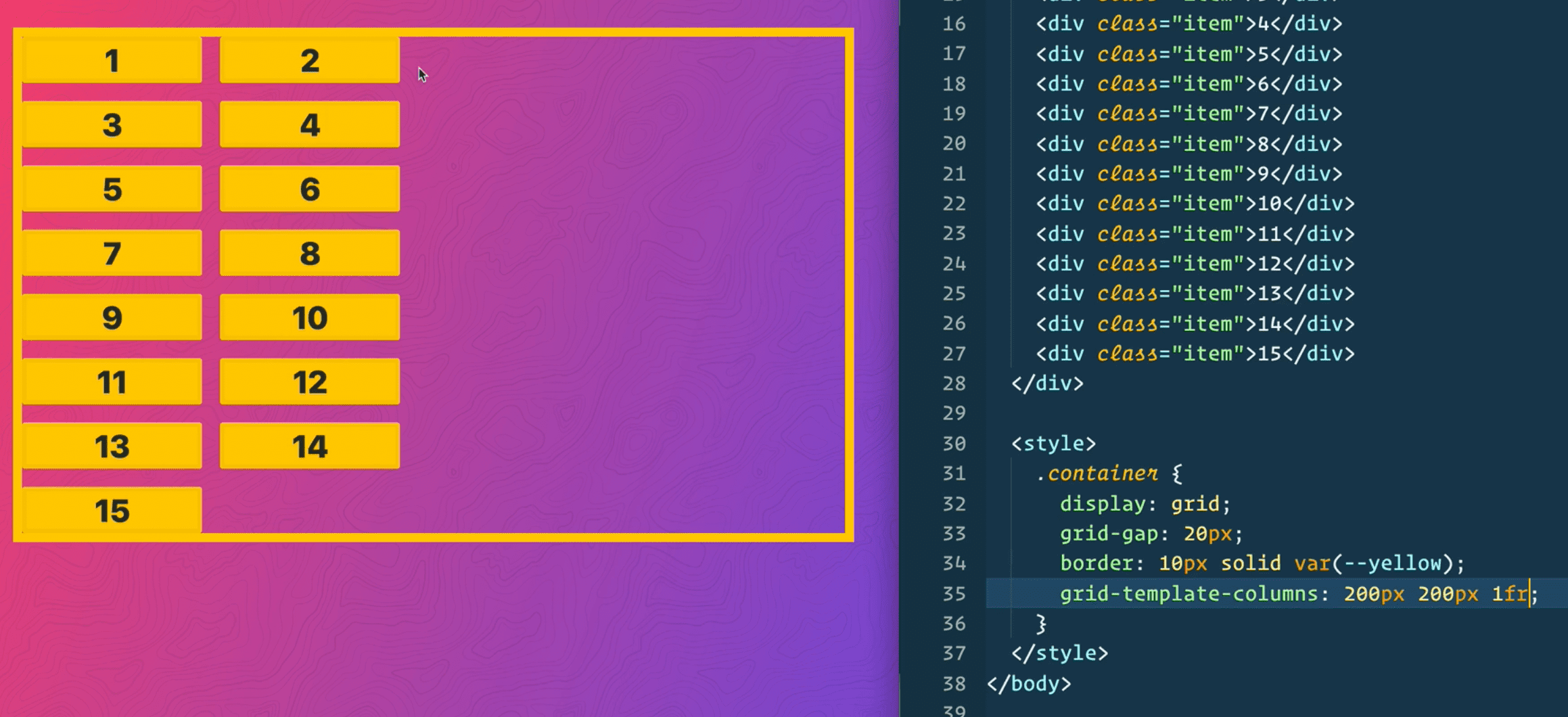
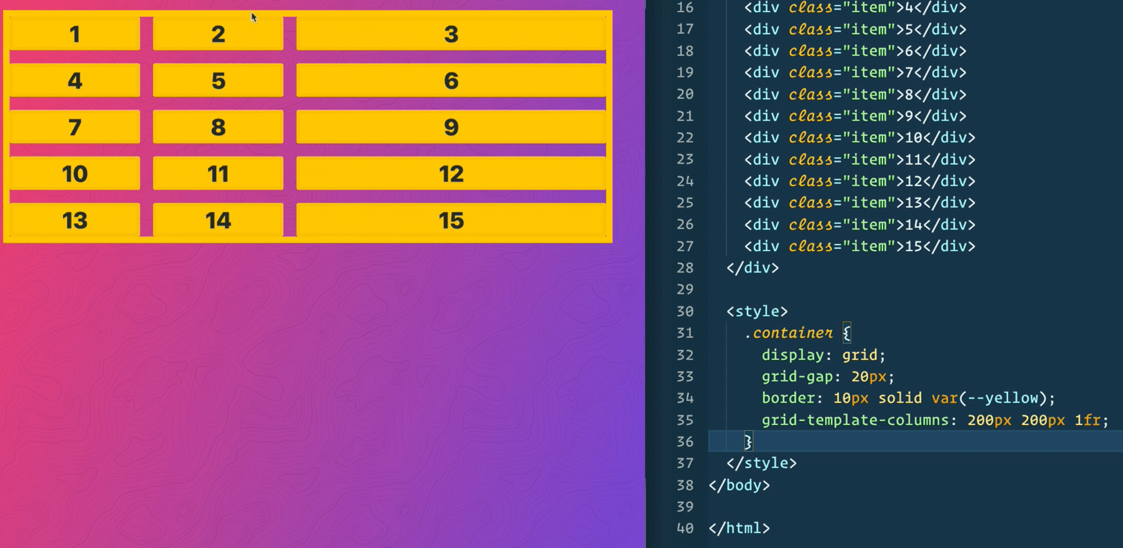
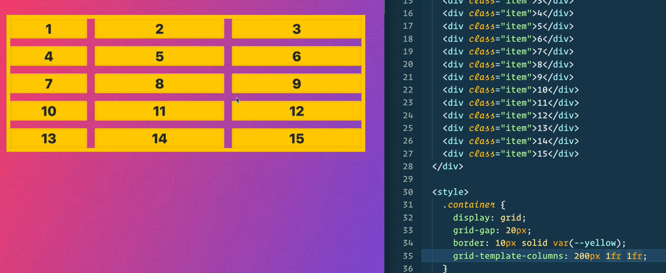
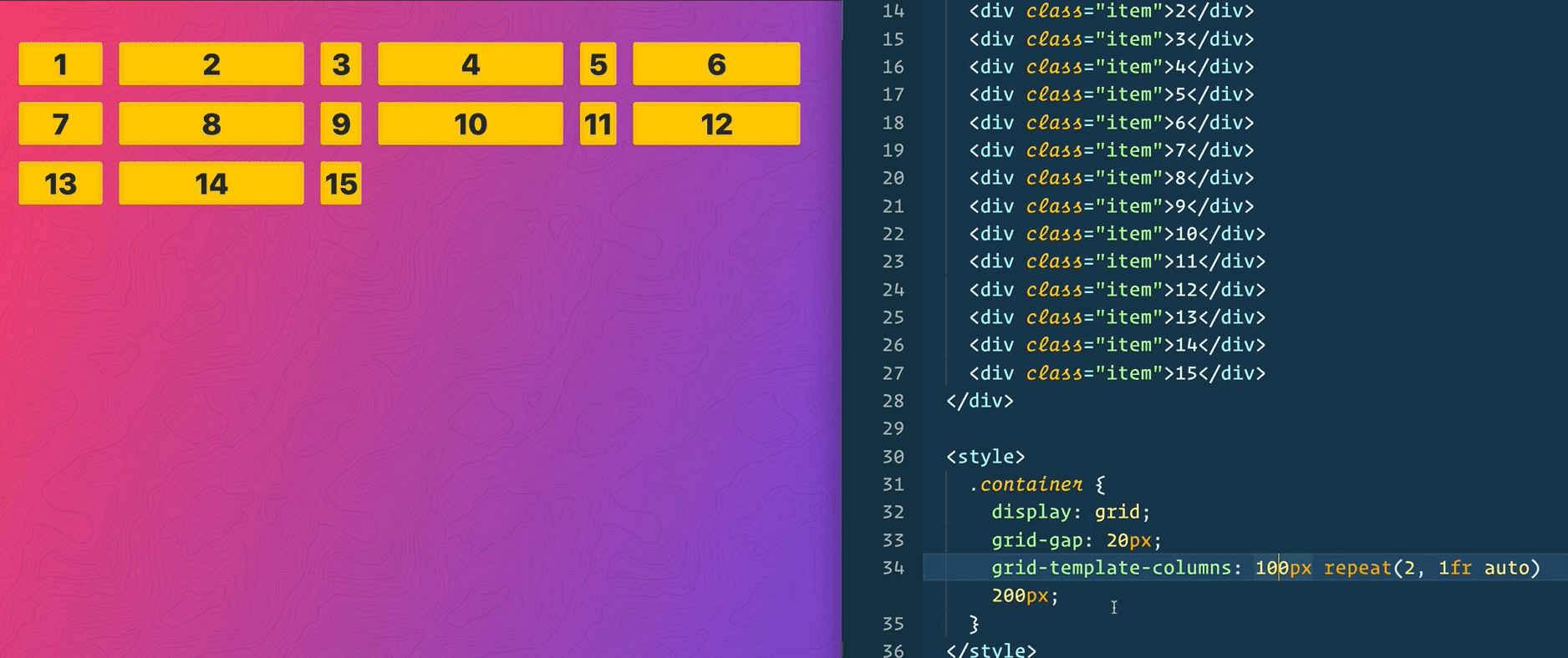
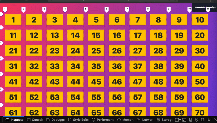
8 - Repeat Function
grid-template-column: 1fr 1fr 1fr 1 fr; is equal to grid-template-column: repeat(4,1fr)
this is also possible
grid-template-column: repeat(4, 1fr 2fr);
Also grid-template-columns: 100px repeat(2, 1fr auto) (see below)
EMMETT TRICK
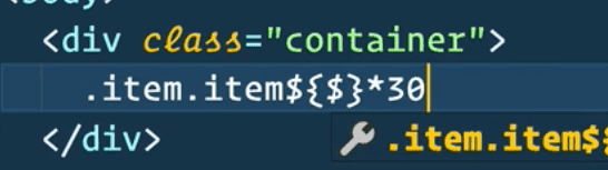
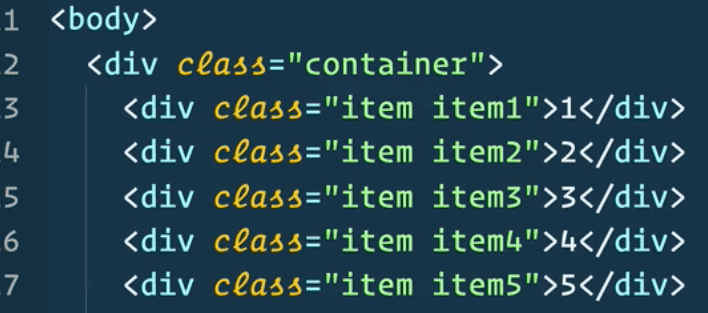
.item.item${$}*30
<div class=“item item1”>1</div><div class=“item item2 ”>2</div>etc etc
Will expand to:
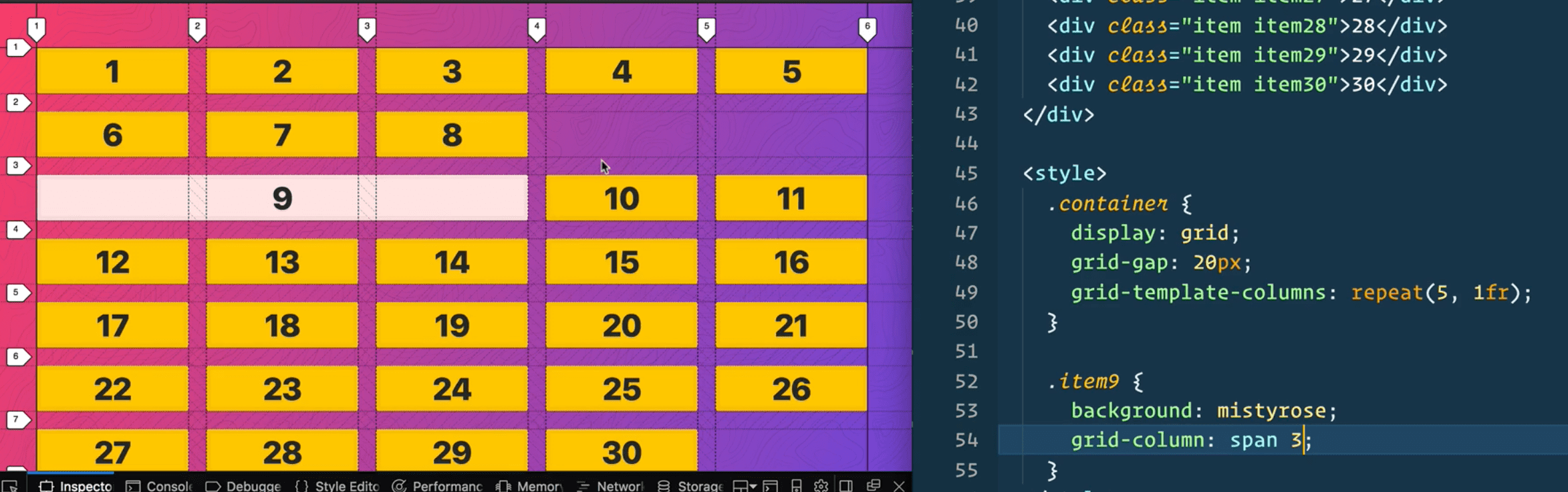
9- Sizing Grid Items
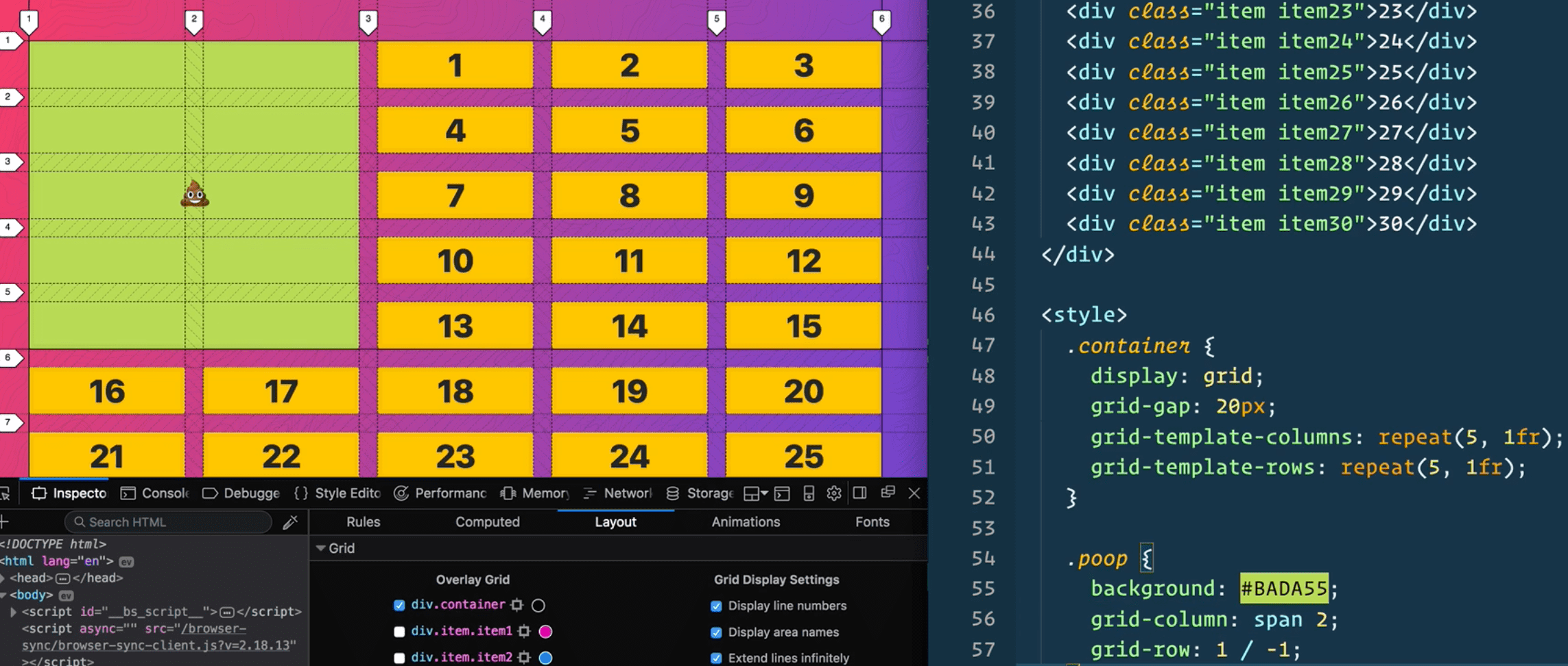
spanning allows you to tell some items to be a specific width.
grid-column: span 2; will allow the item to take up two spots in the grid
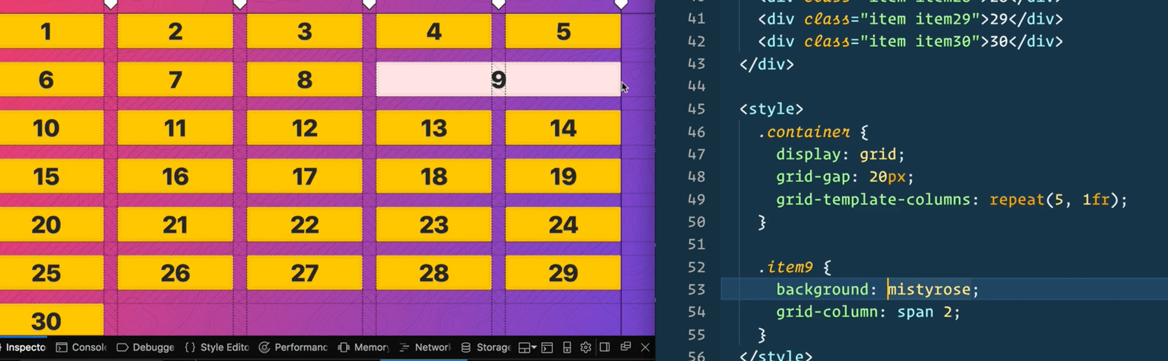
span will layout one after the other, so if there is not enough space it will go to the next row like so :
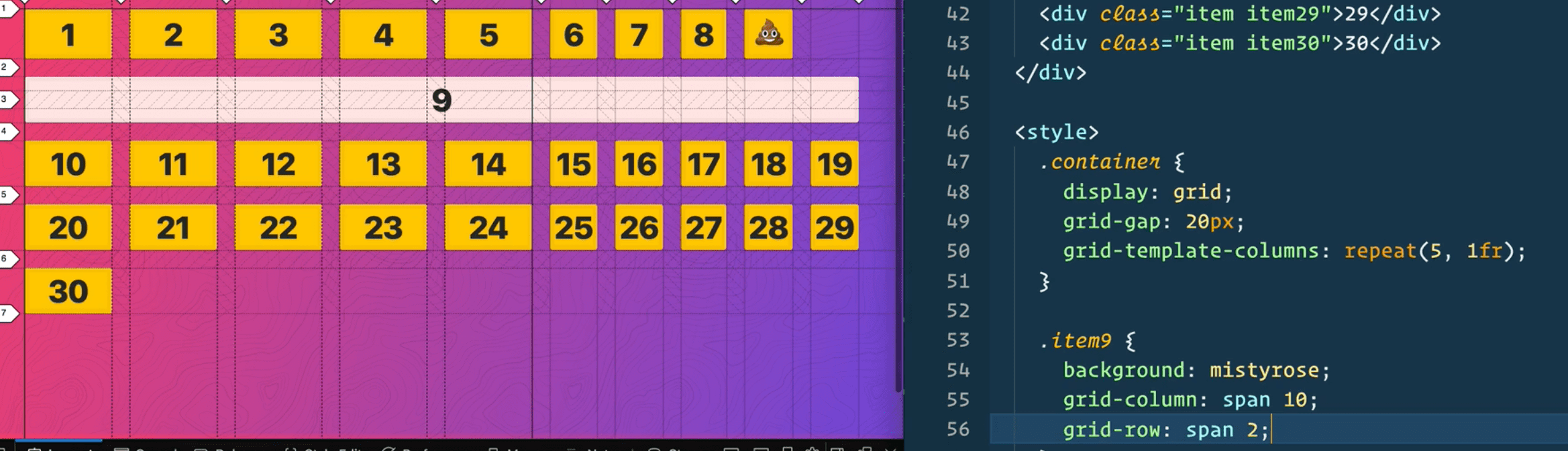
If we want to span multiple rows, we can you do, grid-row:span 2;
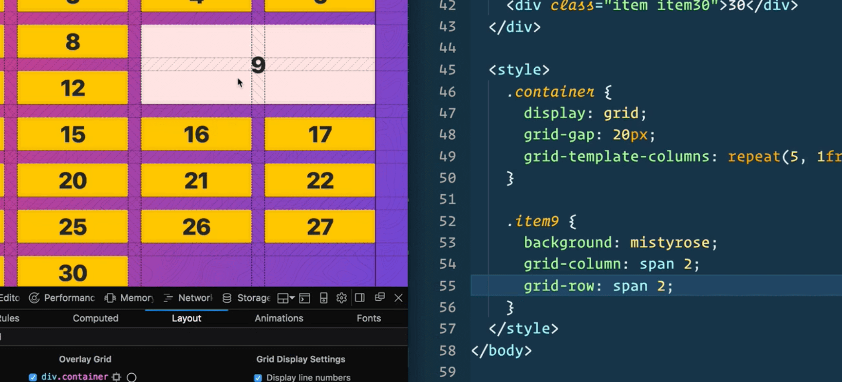
If you span wider than the number of columns, for example if we have 6 spots in the grid but you make it grid-column: span 10; it will force the grid to be larger than it wants (see below)
10 - Placing Grid Items
grid-column is actually a short hand.
if you did grid-colum: span 2; it is actually
grid-column-start:span 2; grid-column-end:auto
If you were to take an item in the grid and say:
grid-column-start: 2 then it would start on the number 2 track like so..
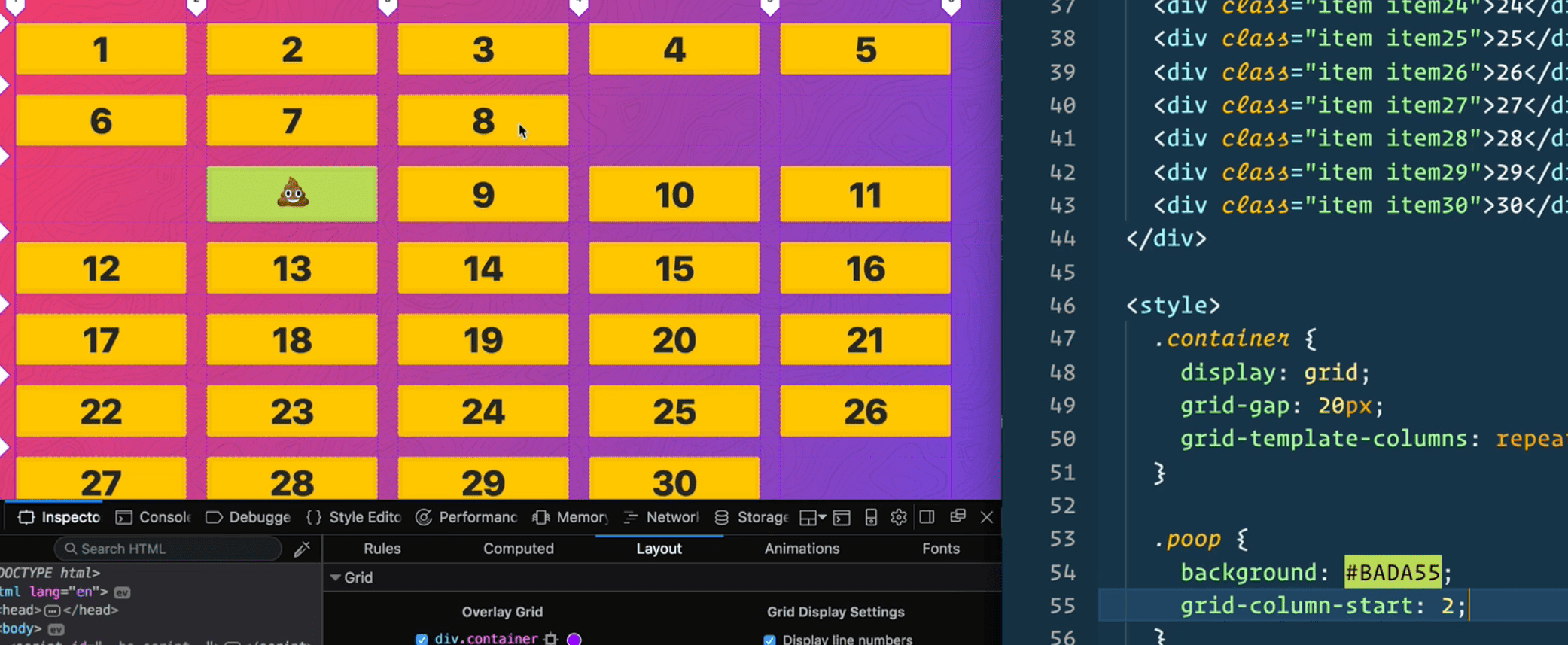
If you also added grid-column-end:5; it would span it to track 5;
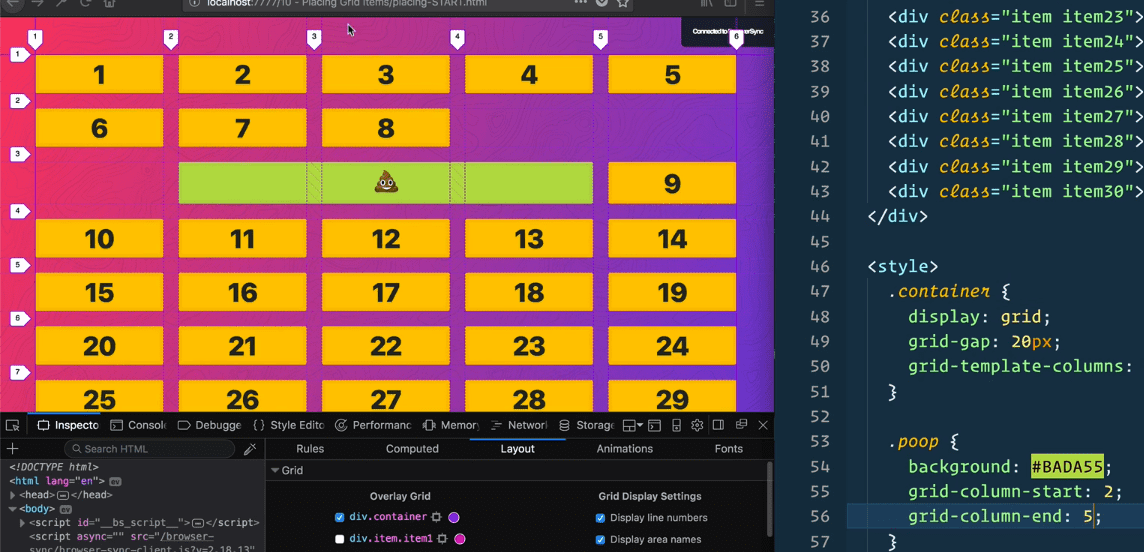
Short hand for colum-end and column-start is grid-column: 2/5
You can also combine them with spans
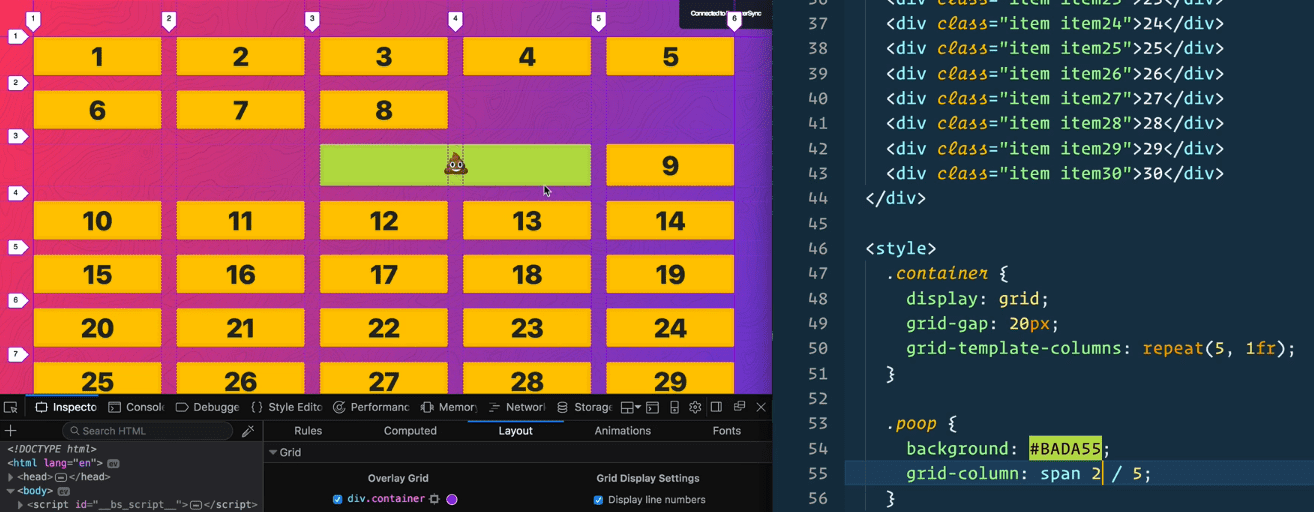
You could say start at 1 and span 2 with this syntax: grid-column: 1 / span 2;
You can also tell it to end at the last track. If you do not know how many tracks there are you can put -1
grid-column: 1 / -1; this can be used as width 100%

(If you do -2, it would put it at the second track from the end)
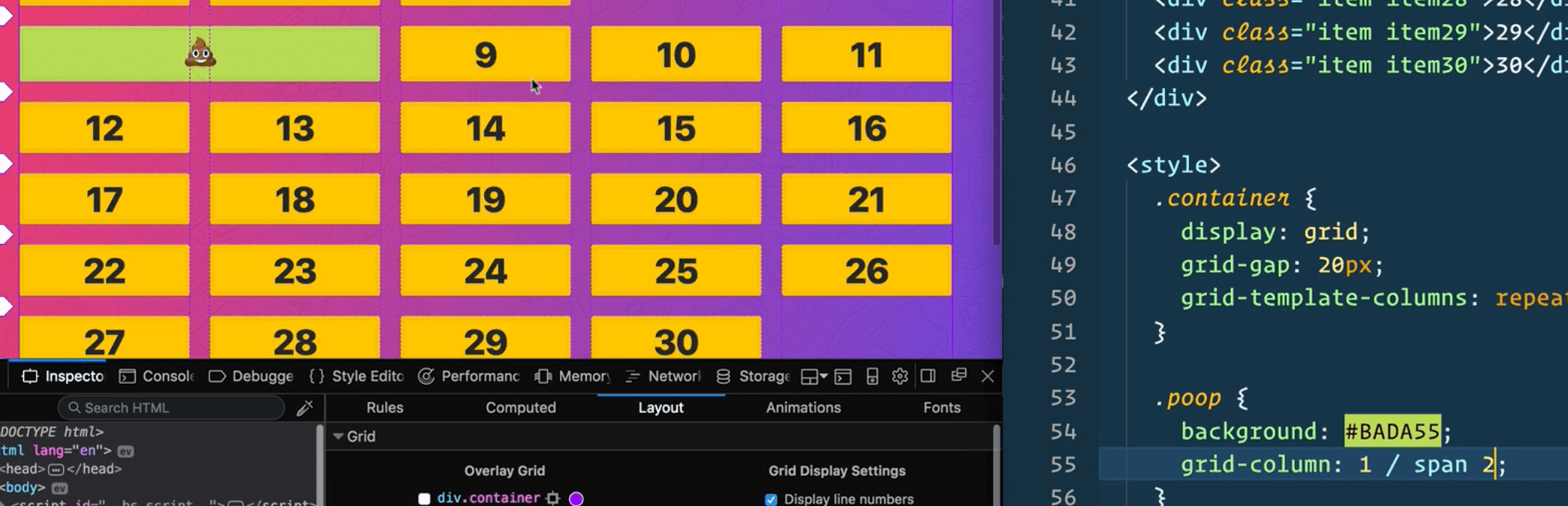
For rows, you cannot do -1 to do the row end, unless you have explicitly stated the rows, and if you have explicitly stated the rows it will only go to the end of the explicit track.
The example below will only do the first one because we have not explicitly defined any rows.

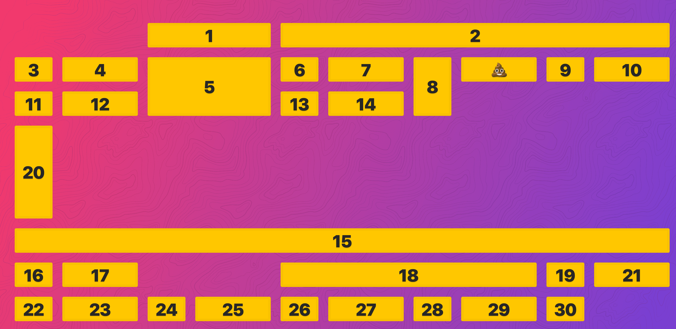
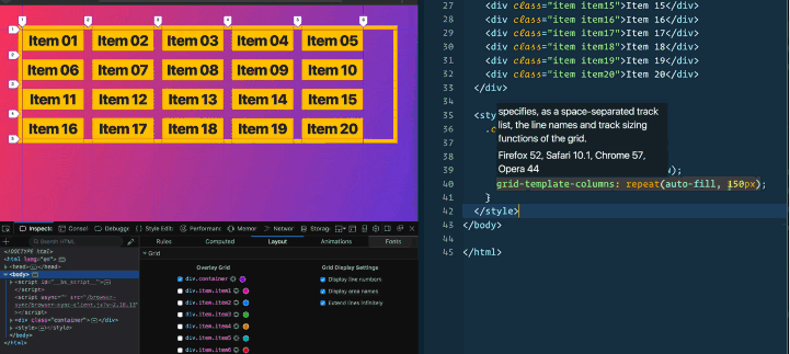
11- Spanning and Placing Cardio
<div class="container">
<div class="item item1">1</div>
<div class="item item2">2</div>
<div class="item item3">3</div>
<div class="item item4">4</div>
<div class="item item5">5</div>
<div class="item item6">6</div>
<div class="item item7">7</div>
<div class="item item8">8</div>
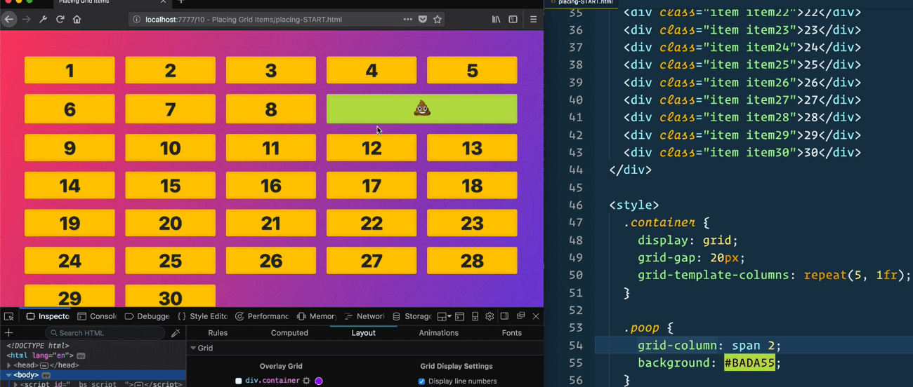
<div class="item poop">💩</div>
<div class="item item9">9</div>
<div class="item item10">10</div>
<div class="item item11">11</div>
<div class="item item12">12</div>
<div class="item item13">13</div>
<div class="item item14">14</div>
<div class="item item15">15</div>
<div class="item item16">16</div>
<div class="item item17">17</div>
<div class="item item18">18</div>
<div class="item item19">19</div>
<div class="item item20">20</div>
<div class="item item21">21</div>
<div class="item item22">22</div>
<div class="item item23">23</div>
<div class="item item24">24</div>
<div class="item item25">25</div>
<div class="item item26">26</div>
<div class="item item27">27</div>
<div class="item item28">28</div>
<div class="item item29">29</div>
<div class="item item30">30</div>
</div>
<style>
.container {
display: grid;
grid-gap: 20px;
grid-template-columns: repeat(5, 1fr 2fr);
grid-template-rows: repeat(10, 50px);
/* Make the grid 10 columns wide, every other taking up twice the free space */
/* Make the grid have 10 explicit rows, 50px high each */
}
/* With Item 1, start at col 3 and go until 5 */
.item1 {
grid-column: 3/ 5;
}
/* With Item 2, start at col 5 and go until the end */
.item2 {
grid-column : 5/-1;
}
/* Make Item 5 double span 2 cols and rows */
.item5 {
grid-column: span 2;
grid-row: span 2;
}
/* Make Item 8 two rows high */
.item8 {
grid-row: span 2;
}
/* Make Item 15 span the entire grid width */
.item15 {
grid-column: 1/-1;
}
/* Make item 18 span 4 widths, but end 9 */
.item18 {
grid-column: span 4/ 9;
}
/* Make item 20 start at row 4 and go for 3 */
.item20 {
grid-row: 4 / span 3;
}
</style>
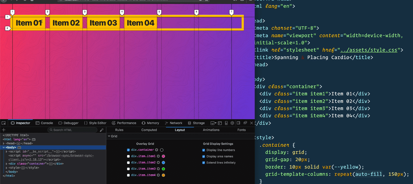
12 - Grid Auto-Fit and Auto-Fill
Starting point
 <style>
    .container {
      display: grid;
      grid-gap: 20px;
      border: 10px solid var(—yellow);
    }
  </style>
Instead of doing:
grid-template-columns: repeat(5, 100px);
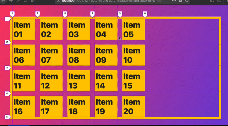
Which you won’t know how many columns will fit and the content of the items might be bigger or smaller. We have keywords like auto-fill and auto-fit.
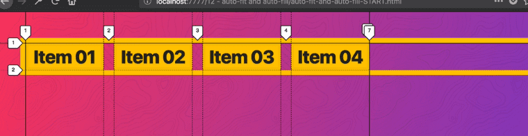
grid-template-columns: repeat(auto-fill, 150px) ->
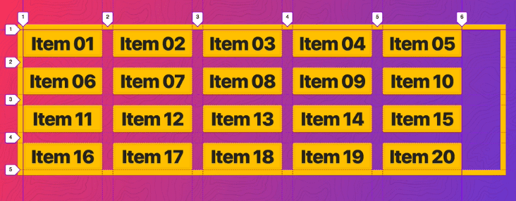
For AutoFill, you don’t tell it how many columns you want, you just say you figure out how many could possibly fit.
As you resize the screen, it will flow differently.
What is the difference with grid-auto-fit. Vs fill.
The difference is when you don’t have enough items to fill up the entire width or height of a grid.
When you have fill on, it will chop it up into as many spaces as it can.
At the right edge, there is space for two more items.
However with auto-fit, it would actually end the grid at the last item.
Why is that helpful?
Let’s say you have a bunch of buttons and you want them left aligned except you want one on the right.
You can take the item you want to put the right, and do ->
.item4 {
  grid-column: auto/ -1;
}

You could also do
.item4{ grid-column-end:-1}
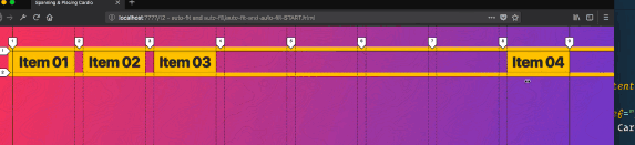
If we change it from fill to fit, there is no way to tack it onto the end because the grid ends.
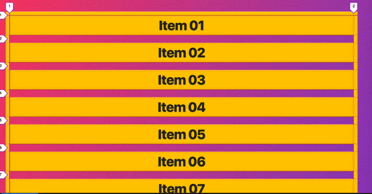
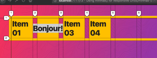
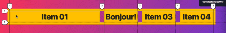
13 - MinMax
<div class="“container”">
  <div class="“item" item1”>Item 01</div>
  <div class="“item" item2”>Bonjour!</div>
  <div class="“item" item3”>Item 03</div>
  <div class="“item" item4”>Item 04</div>
</div>

<style>
  .container {
    display: grid;
    grid-gap: 20px;
    border: 10px solid var(—yellow);
    grid-template-columns: repeat(auto-fill, 150px);
  }
</style>
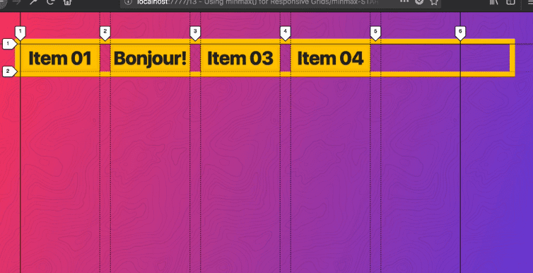
If we were to change css to -> grid-template-columns: repeat(auto-fill, 100px); we run into the issue where the content spills out like so ->
We don’t want to have to figure out how wide our columns should be, they should just flow as wide as they need to be.
We can replace that with a minmax(), which we pass the minimum and maximum that the track can be.
min(150px, 1fr) meaning that at a max they will be the entire width of the grid.
If you change it from auto-fill to auto-fit it will function like this
->
It will not give us that extra space, it will stretch the items inside of the track to fit.
We will be using that often in real world examples.
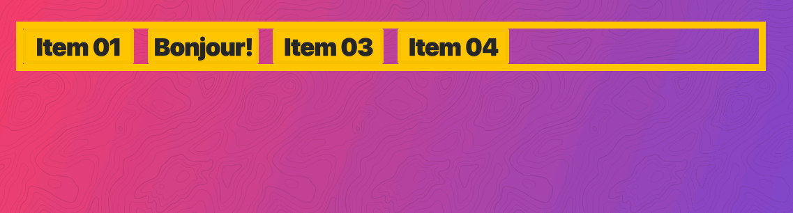
.container {
  display: grid;
  grid-gap: 20px;
  border: 10px solid var(--yellow);
  /* grid-template-columns: repeat(auto-fit, minmax(150px, 1fr)); */
  grid-template-columns: 150px 150px 150px 150px;
}
Will give you ->

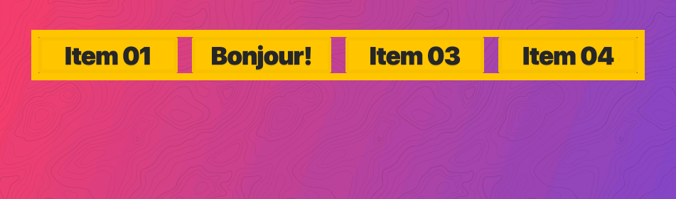
If you change it to -> grid-template-columns: auto 150px 150px 150px; ->
 If you resize it , it will get smaller

NTS: tried swapping auto with 1fr and it worked similarly
You can also use the fit-content function instead of auto because you might think auto is a bit big. You pass fit-content a clamp value, a max width or height that it cannot surpass.
grid-template-column: fit-content(100px) 150px 150px 150px;

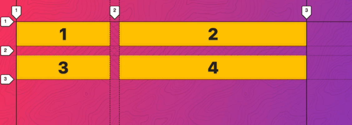
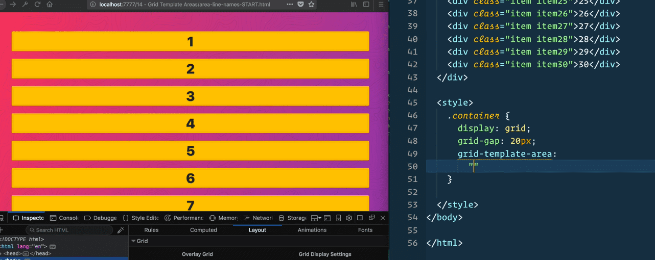
14 - Grid Template Areas
<div class="container">
  <div class="item item1">
    <p>I'm Sidebar #1</p>
  </div>
  <div class="item item2">
    <p>
      Lorem ipsum dolor sit amet consectetur adipisicing elit. Inventore, sed.
    </p>
    <p>Lorem ipsum d</p>
  </div>
  <div class="item item3">
    <p>I'm Sidebar #2</p>
  </div>
  <div class="item footer">
    <p>I'm the footer</p>
  </div>
</div>

<style>
  .container {
    display: grid;
    grid-gap: 20px;
  }
</style>
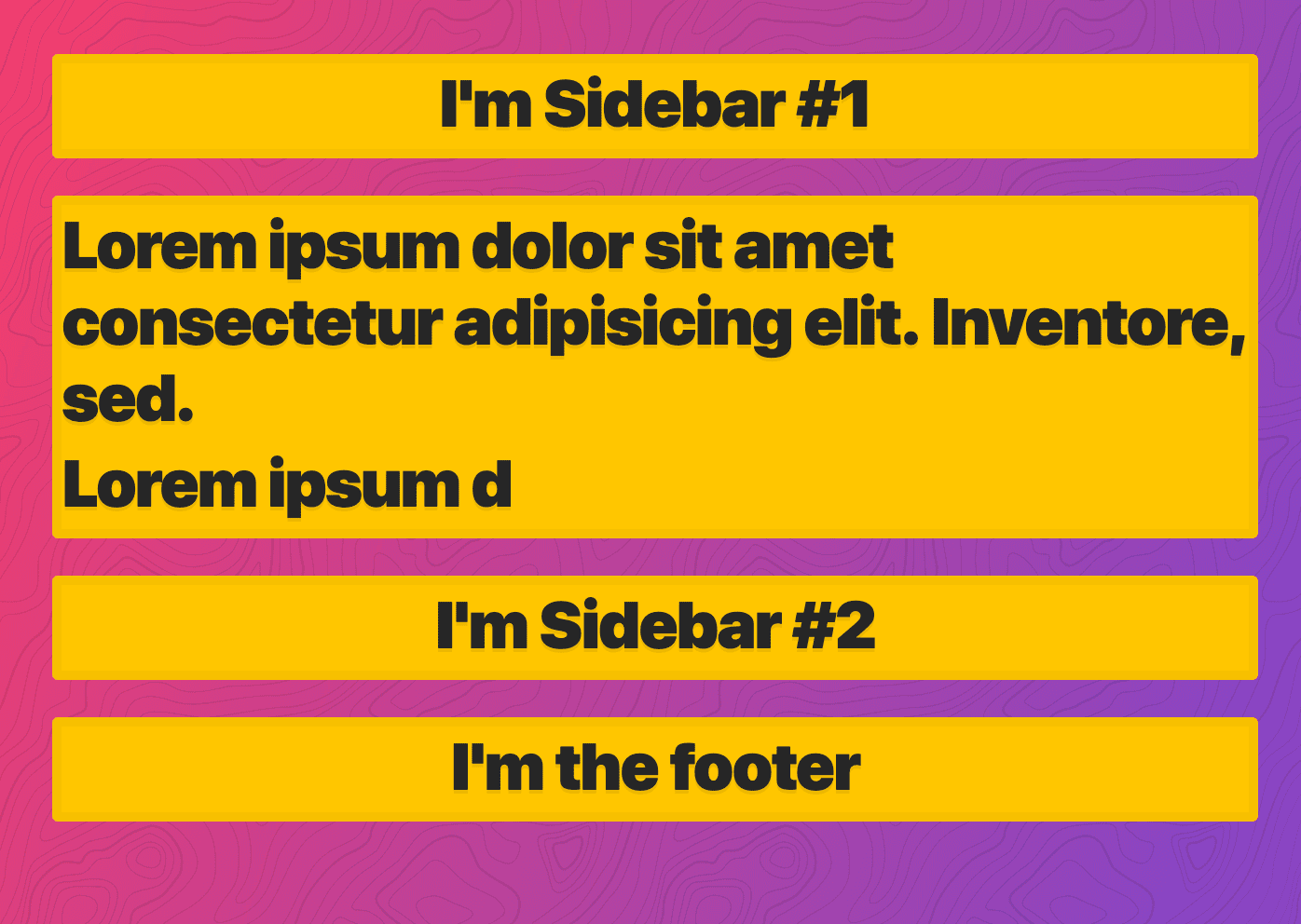
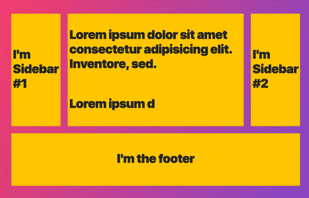
We want to lay it out with one sidebar on the left, content in the middle, another sidebar on the right and then the footer along the bottom.
We are going to do grid-template-columns:1fr 500px 1fr which will put the content at a fixed width and the sidebars fill the rest of the size ->
Add grid-template-rows: 150px 150px 150px;
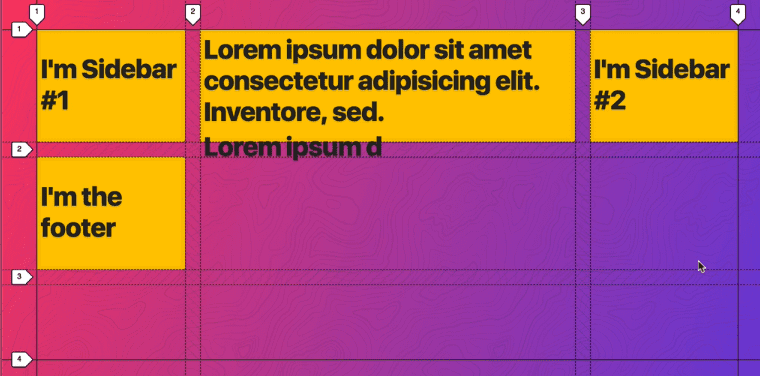
We want the footer to span the last row, and the sidebar 1 and sidebar 2 and content area span two rows.
We are going to create template areas. You write and for each row you give yourself a set of quotes and type the name of the area that you wish it to be.
grid-template-areas: "sidebar-1 content sidebar-2"Gives you ->
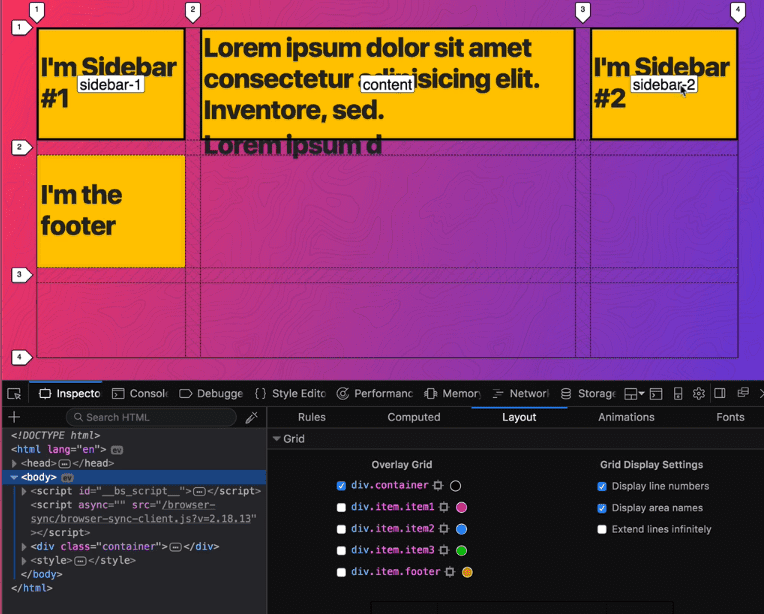
grid-template-areas:
  “sidebar-1 content sidebar-2”
  “sidebar-1 content sidebar-2”
  “footer footer footer”;
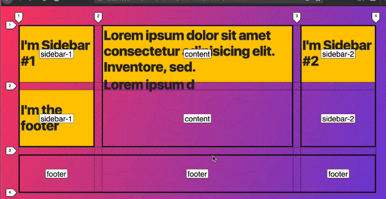
Now when we want to place our items in the areas, we can use the names.
.footer {
  grid-area: footer;
}

.item1 {
  grid-area: sidebar-1;
}

.item2 {
  grid-area: content;
}
.item3 {
  grid-area: sidebar-2;
}
We can use media queries to refine the template areas as we need them.
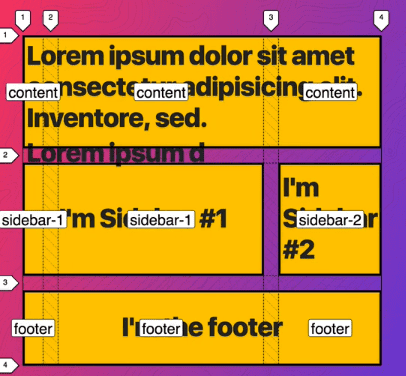
@media (max-width: 700px) {
  .container {
    grid-template-areas:
      “content content content”
      “sidebar-1 sidebar-1 sidebar-2”
      “footer footer footer”;
  }
}
This way, even if you add more columns,
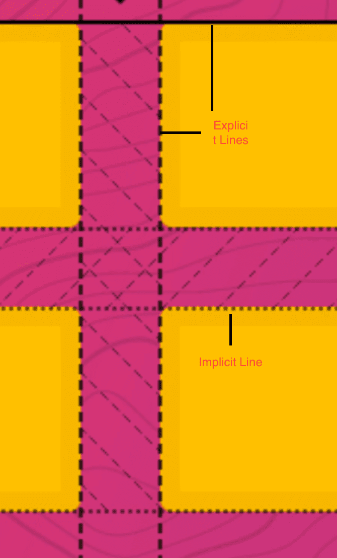
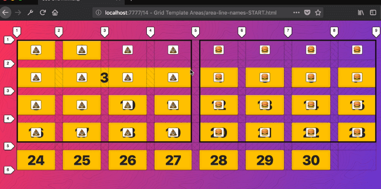
Grid Line Names
When you create grid areas, you also get access to grid line names.
We aren’t going to define columns and rows.
If you add
.container {
  display: grid;
  grid-gap: 20px;
  grid-template-areas:
    "💩 💩 💩 💩 🍔 🍔 🍔 🍔"
    "💩 💩 💩 💩 🍔 🍔 🍔 🍔"
    "💩 💩 💩 💩 🍔 🍔 🍔 🍔"
    "💩 💩 💩 💩 🍔 🍔 🍔 🍔";
}
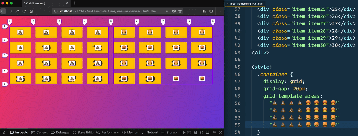
If you add
.item3 {
  grid-area: 💩;
}
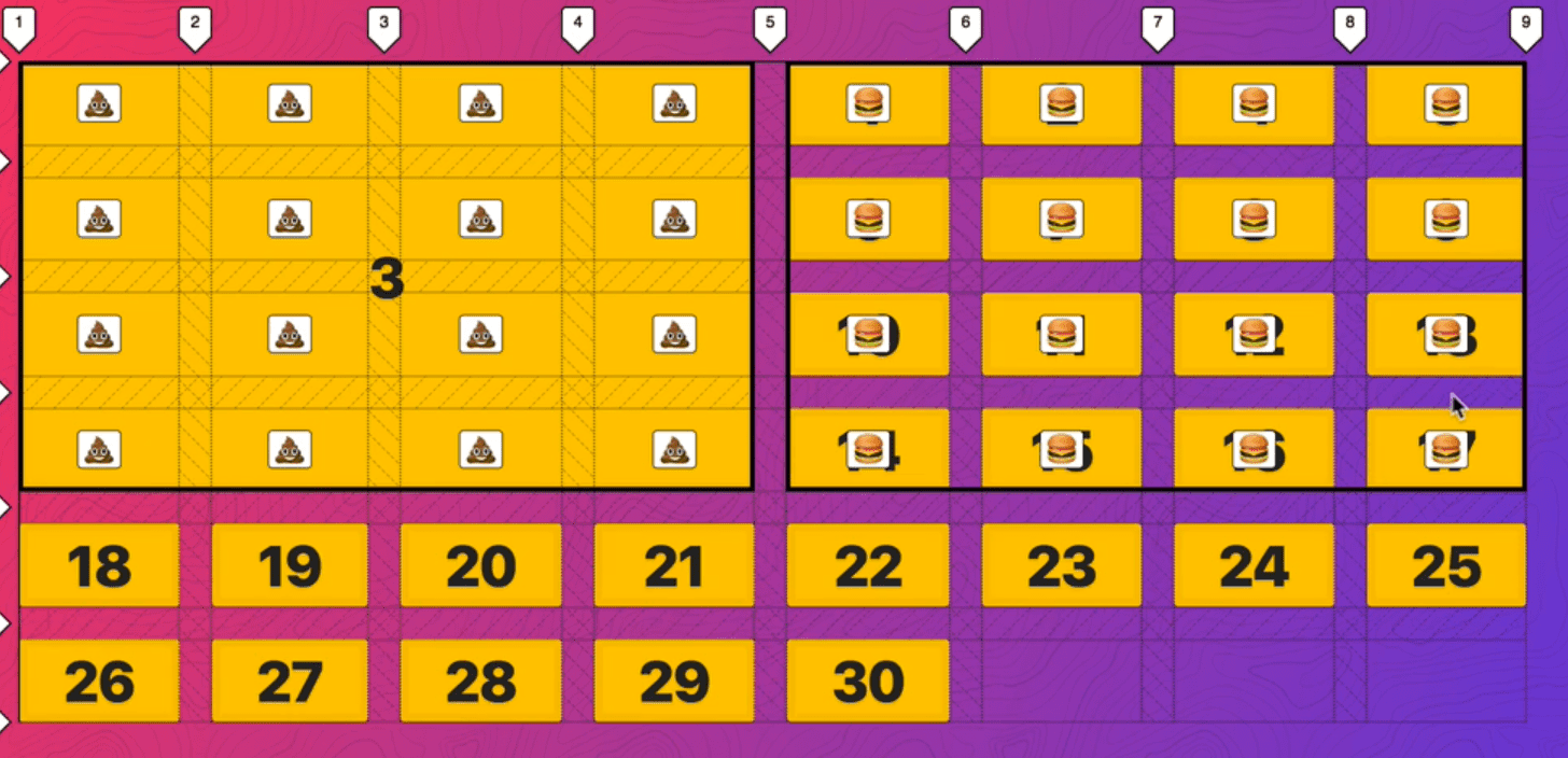
You can see that new implicit rows are created.
Before we were doing
.item3 {
  grid-column: 2 /5;
}
Which would tell it to start at 2.and span till 5. With template areas we can use line names like 💩-start / 💩-end.
Or
.item3 {
grid-column: 💩-start/🍔-end;
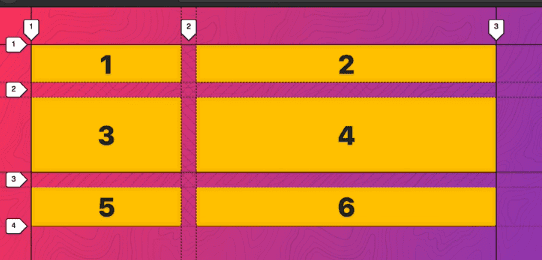
}15- Naming Lines
When you set grid-template-areas, you get line names for free but if you would like to name your lines specific names, you can do that.
Starting point -> We have 10 rows that autosize and then after that they turn into implicit.
The way you name your lines is by defining them in square brackets when you define your columns and rows. Then you can call them like so ->
.container {
  display: grid;
  grid-gap: 20px;
  grid-template-columns: [site-left] 1fr [content-start] 500px [content-end] 1fr [site-right];
  grid-template-rows: [content-top] repeat(10, auto) [content-bottom];
}

.item3 {
  background: slateblue;
  grid-column: content-start;
  grid-row: content-top/ content-bottom;
}
Which still gives you the same effect ->
You can also name lines two things like so ->
grid-template-columns: [sidebar-start site-left] 1fr [sidebar-end content-start] 500px [content-end] 1fr [site-right];
16 - Grid Auto Flow Dense
When you have more items than can fit in a grid, by default it will wrap onto the new lines and create an implicit row .We can switch that to column meeting it creates implicit columns.
In this example, we start with 70 items, and we will make a grid of 10 equal items.
.container {
  display: grid;
  grid-gap: 20px;
  grid-template-columns: repeat(10, 1fr);
}
For every 6th item, we are going to make it span 6 items and make it blue.
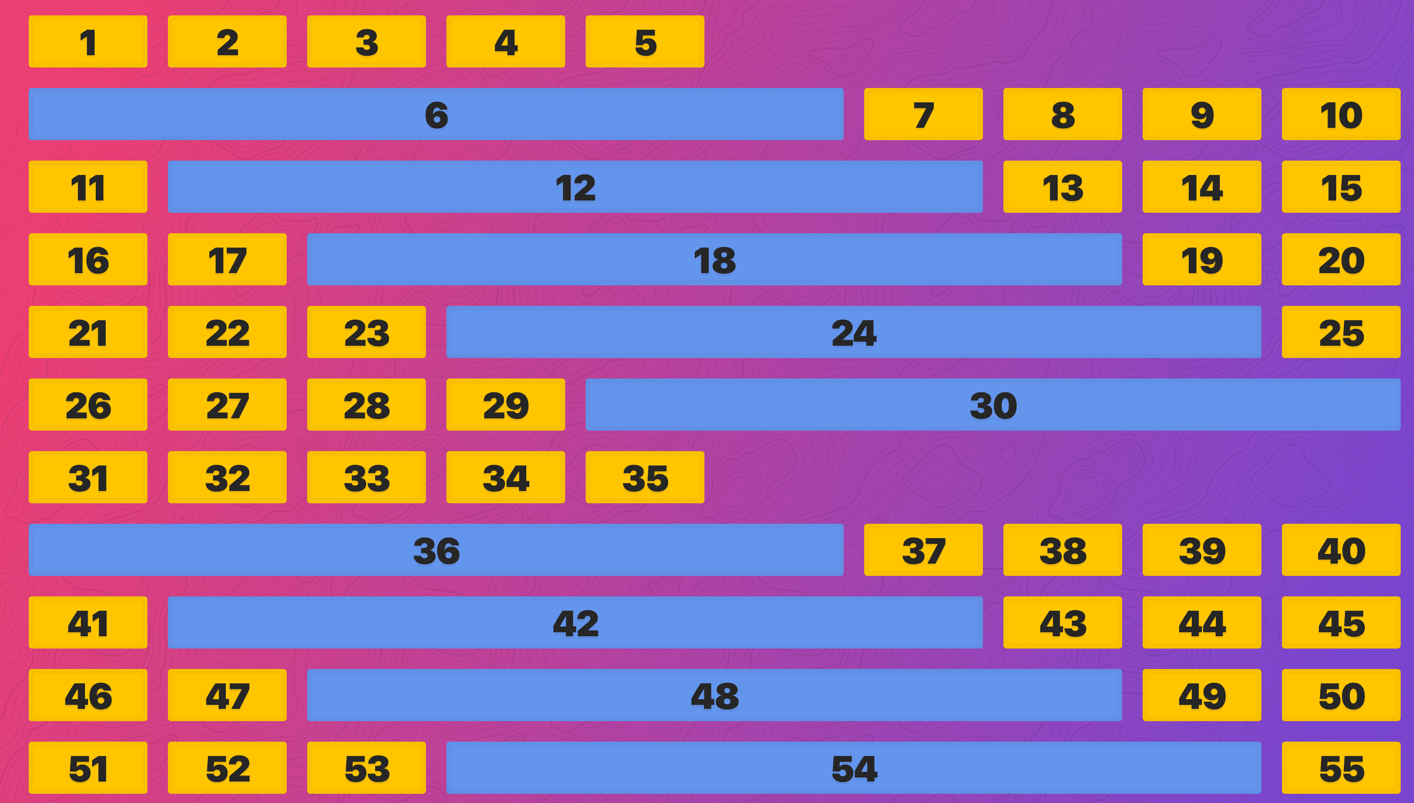
.item:nth-child(6n) {
  background: cornflowerblue;
  grid-column: span 6;
}
The way the browser lays out the grid, it takes all the spots we have (10 across) and takes each item and checks if it can fit it and if it can, it places it. When it gets to the 6th item, we know it needs to take up 6 spots, but we only have 5, so it breaks onto the next row and we continue adding that item. The downside is it doesn’t fill in the empty spots with items that could fit like 7,8,9,10
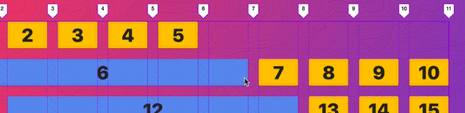
If you add grid-auto-flow:dense; ->

How that works is when the browser hits 6, it knows it cannot fit it so it puts it on the next line. Then it gets to 7 and goes back to the start and says is there anywhere I can fit this one in. It will go back to the first available grid column or row that we have and fit it in.
We will make a few more items irregularly shaped ->
.item:nth-child(8n) {
  background: tomato;
  grid-column: span 2;
}
.item:nth-child(9n) {
  grid-row: span 2;
}
If you don’t care which order they show up in, it will try and fit all the different values that you want.
.container {
  display: grid;
  grid-gap: 20px;
  grid-template-columns: repeat(10, 1fr);
  grid-auto-flow: dense;
}
.item:nth-child(6n) {
  background: cornflowerblue;
  grid-column: span 6;
}
.item:nth-child(8n) {
  background: tomato;
  grid-column: span 2;
}
.item:nth-child(9n) {
  grid-row: span 2;
}
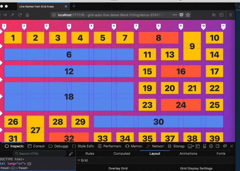
If you add
.item18 {
  background: greenyellow !important;
  grid-column-end: -1 !important;
}
Grid will first layout the ones that need to go in a specific spot first, and then fill them in. You won’t always get a perfect layout if there are no items that are the right size to fit the empty spaces.
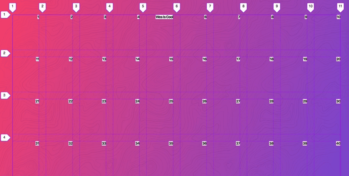
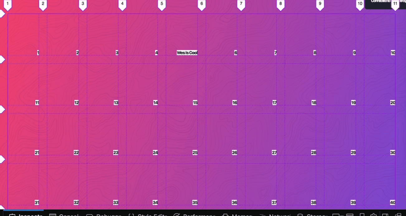
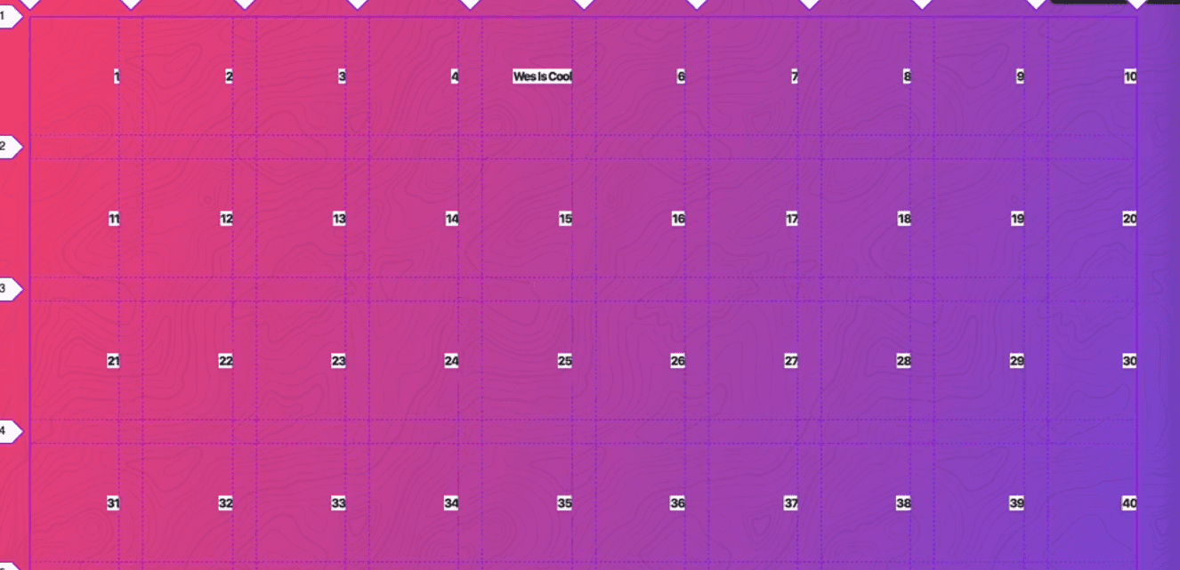
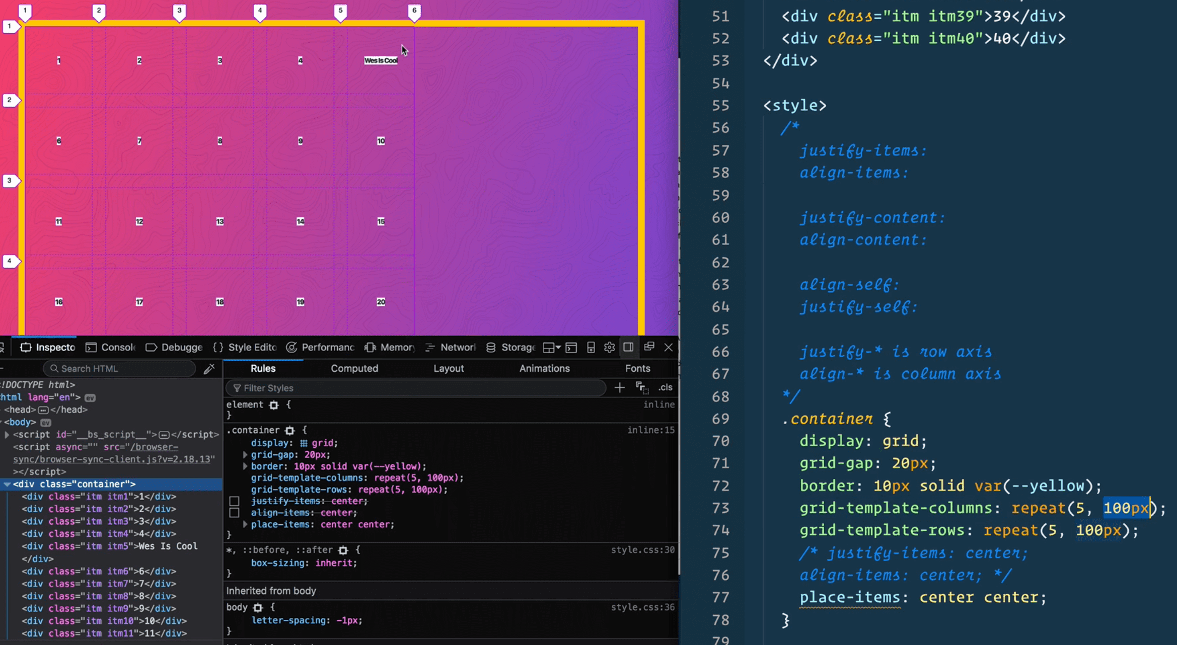
17- Grid Alignment + Centering
Even if you are not building a website that requires a strict grid, it may be that your grid is one column wide and two rows high , it is still useful to use css grid for centering things.
There are 6 properties you can use to align things in css grid.
justify-items: align-items:
justify-content: align-content:
align-self: justify-self:
The justify properties are along the x (row) axis and align items are along the y or column axis. Unlike flex box, grid doesn’t switch axis.
A Complete Guide to Grid | CSS-Tricks
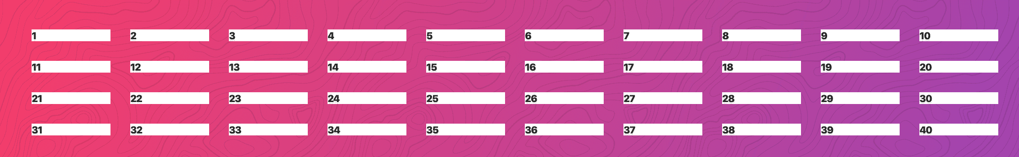
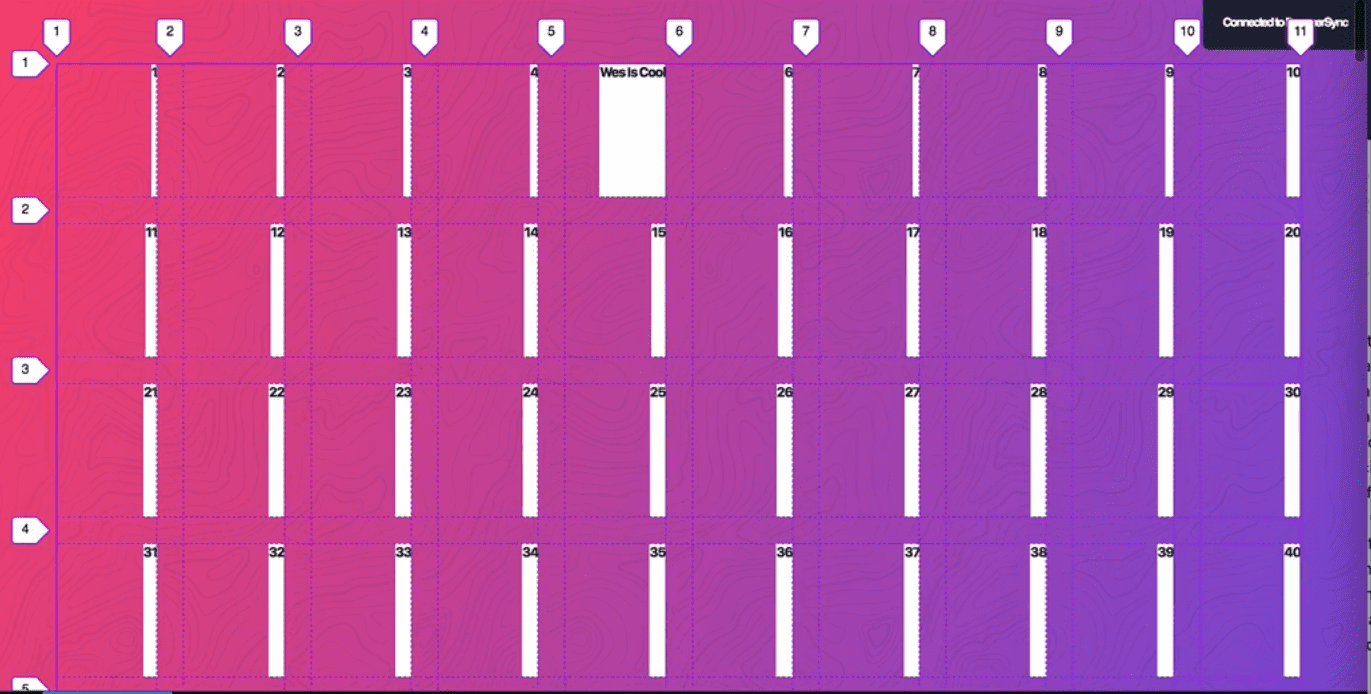
We are starting with 40 items on the page.
justify-items and align-items refers to the items themselves, which are direct children of the grid container.
Justify Items
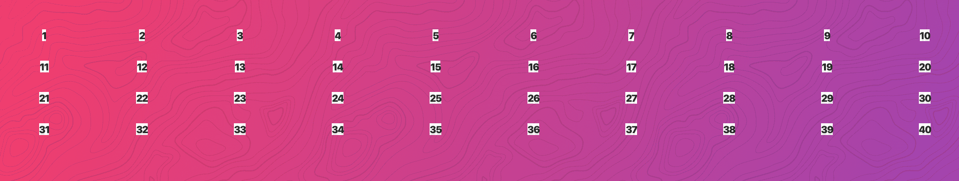
The default of justify-items is stretch, which will stretch them across the entire grid.
If you change to justify-items:center like so
.container {
  display: grid;
  grid-gap: 20px;
  grid-template-columns: repeat(10, 1fr);
  justify-items: center;
}
You get ->
For center, it will only go as wide as the content inside of it.
There is also justify-items: start and justify-items:end
Start ->

End ->
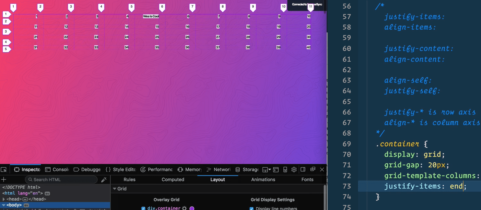
You can use start or flex-start and end or flex-end, they do the same thing.
Align Items
If we add align-items:start it doesn’t do anything because our rows don’t have any height.
If we add ->
grid-template-rows: repeat(5, 100px);
justify-items: end;
align-items: start;
You get ->
align-items:end; will bring them to the end ->
align-items:center ->
align-items:stretch ->
To perfectly centre something you can just do
justify-items: center;
align-items: center;
There is also a css shorthand we can use -> but browser support is iffy
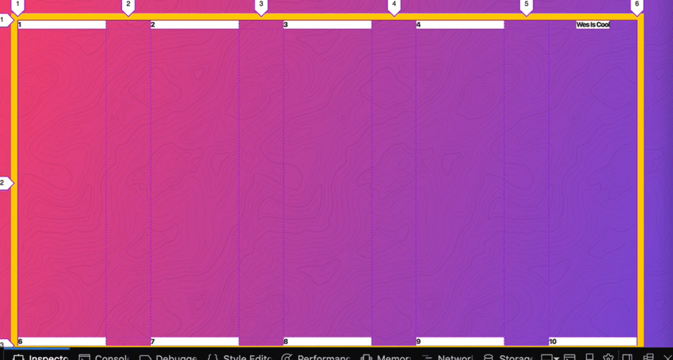
place-items: center center;Justify-Content & Align-Content
If the grid is not as wide as we could possibly want, (we are using fr units which means we will go all the way across but if we were to change that to 100px, we would have extra space.
We have all that extra space. What we do with that extra space is what justify-items and align-items are responsible for.
justify-content:end ->
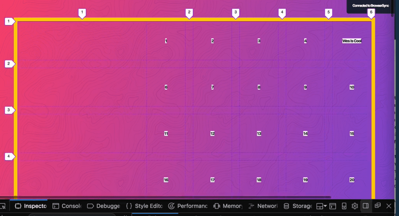
justify-content:center ->

The two most helpful ones are space-around and space-between
justify-content:space-around ->
The spaces aren’t even because space-around will take all of the extra space and evenly divide it on either side of the column. If you don’t want the sideline parts, we can do space-between
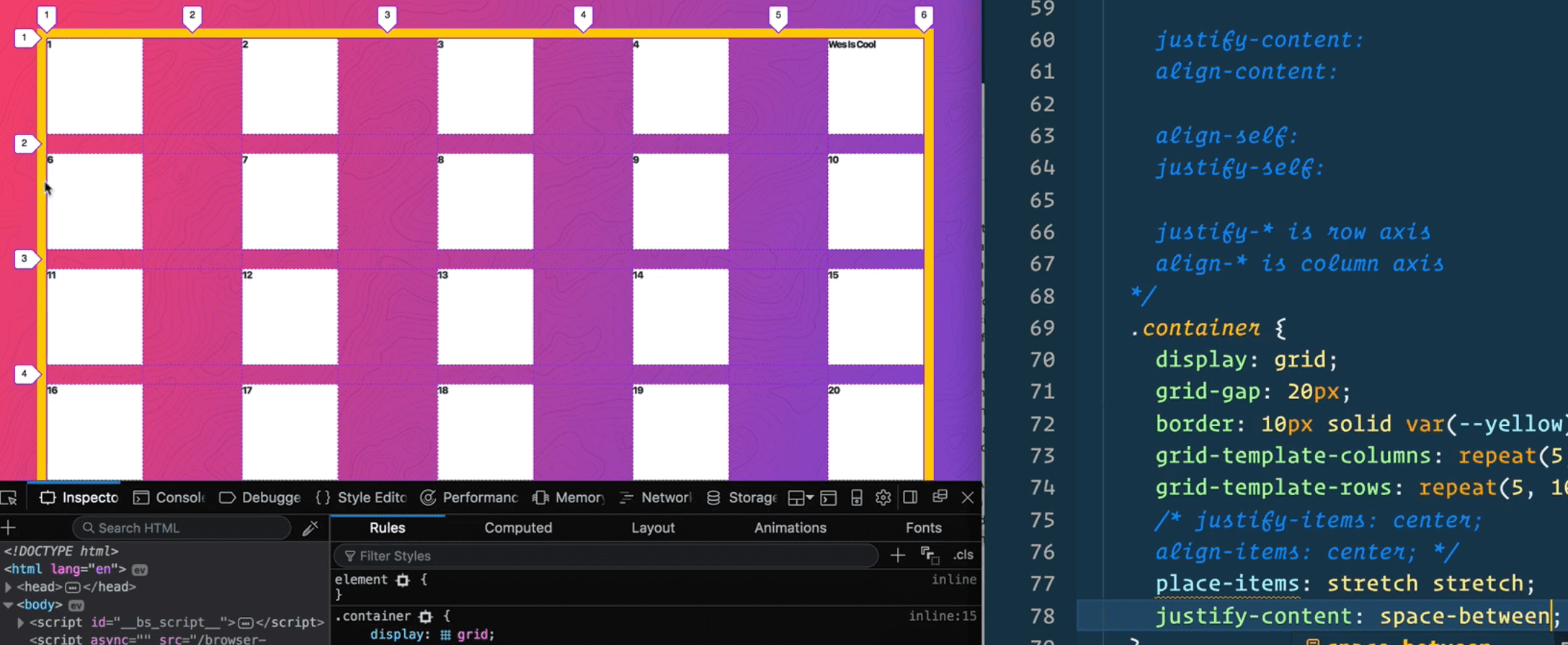
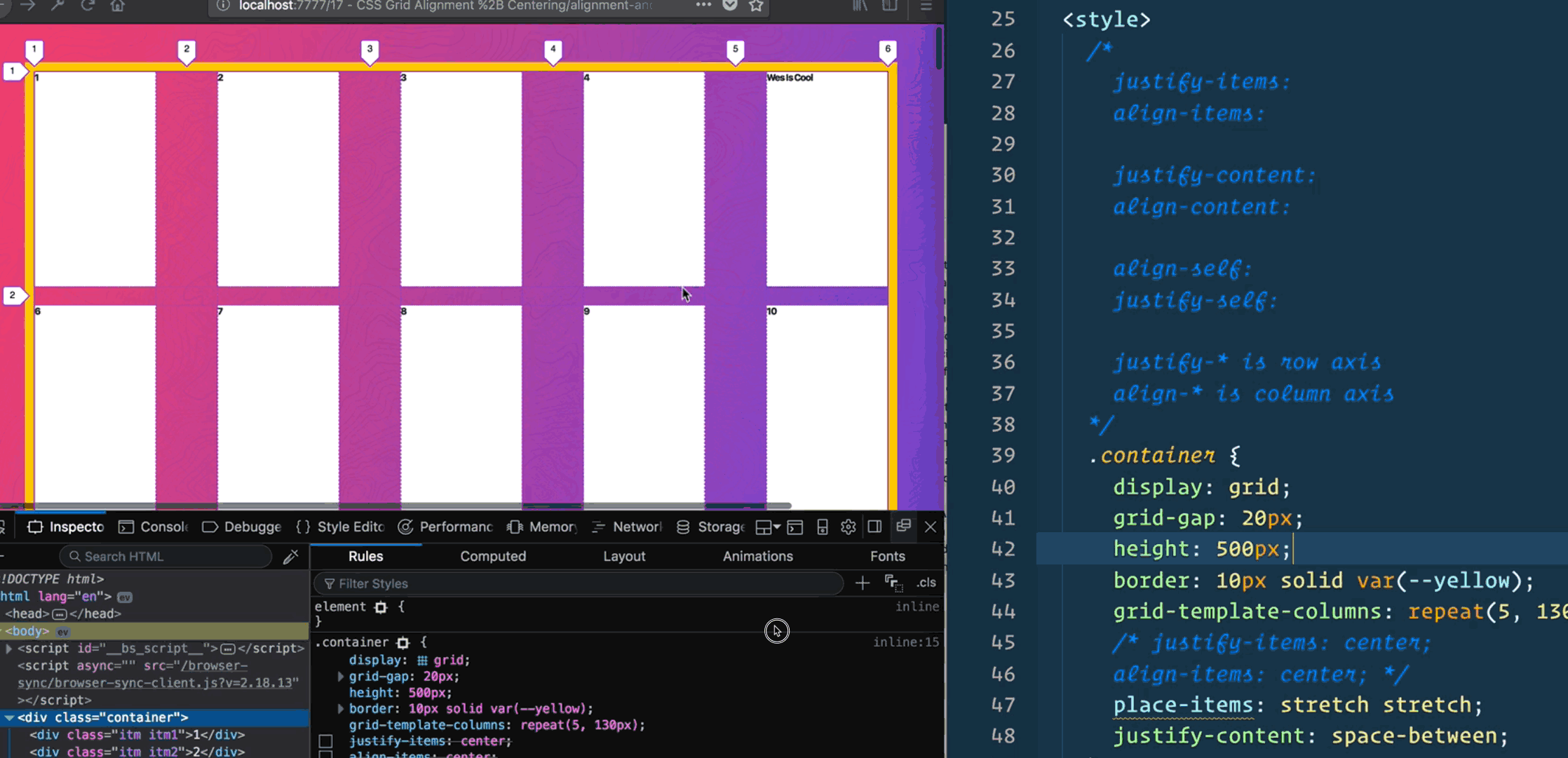
If your container is bigger than you need your grid to be (this won’t be the case if you are using % or fr units), you can use justify-content to tell it where those items should go.
If our container had a hard height on it, like 500px, what will happen is those items stretched h by default.
We can however do
align-items: start
align-items: end
align-items:stretch (default)
align-items: space-around
align-items: space-between
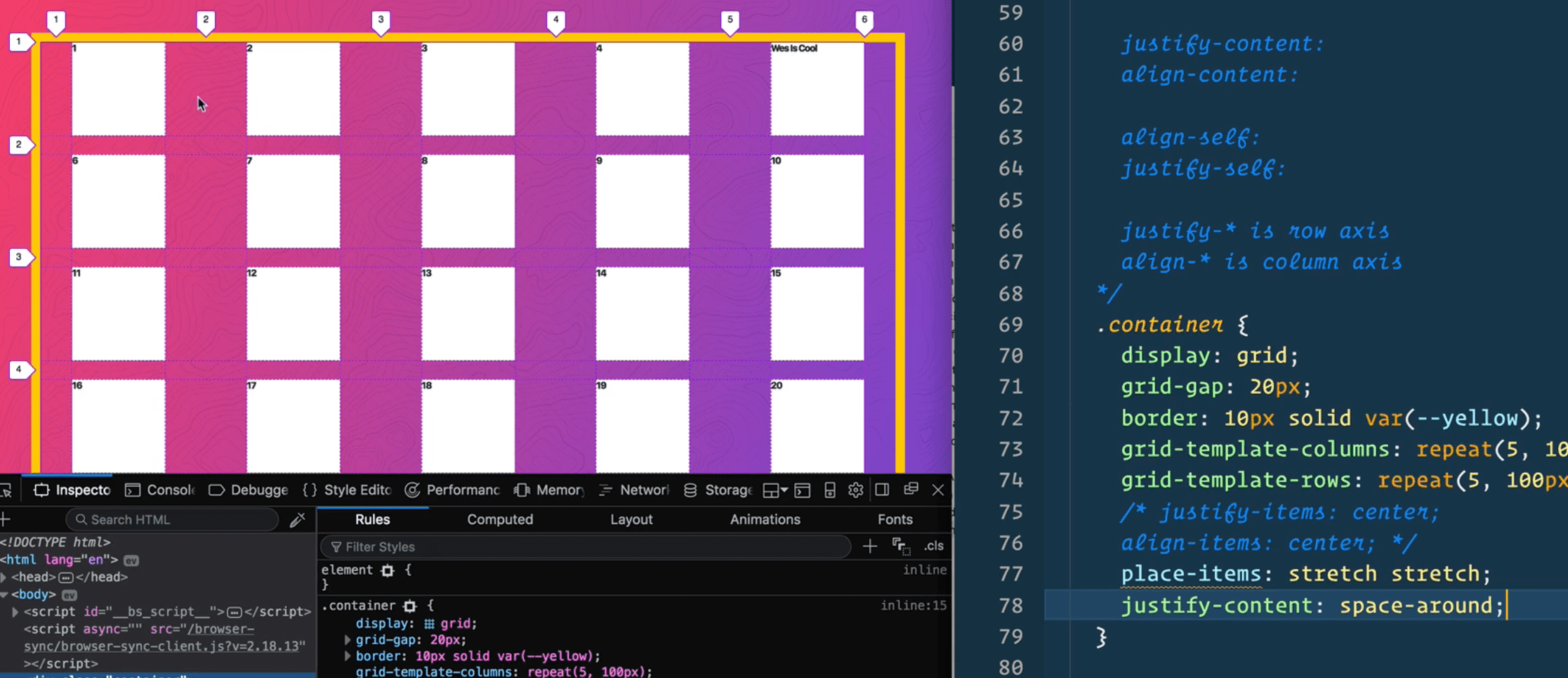
Align Self and Justify Self
Allows us to overwrite each of those on a case by case basis (on the item).
.container {
  display: grid;
  grid-gap: 20px;
  grid-template-columns: repeat(5, 130px);
  place-items: center center;
  justify-content: space-between;
  align-content: space-between;
}
.itm {
  background: white;
}

.itm5 {
  justify-self: center;
}
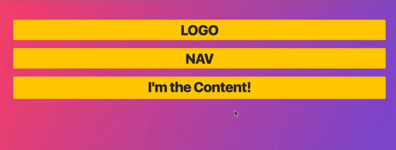
Wes uses this often to center his text.

.item {
  display: grid;
  justify-content: center;
  align-items: center;
}
^ Will perfectly center something.
18 - Re-ordering Grid Items
There is an order property that allows you to place grid items.
Starting example with ->
    <div class="container">
      <div class="item logo">LOGO</div>
      <div class="item nav">NAV</div>
      <div class="item content">
        <p>I'm the Content!</p>
      </div>
    </div>

    <style>
      .container {
        display: grid;
        grid-gap: 20px;
We are going to make a grid of 10 items, equal size, and make the content go all the way across ->
 .container {
        display: grid;
        grid-gap: 20px;
        grid-template-columns: repeat(10, 1fr);
      }

      .content {
        grid-column: 1/ -1;
      }
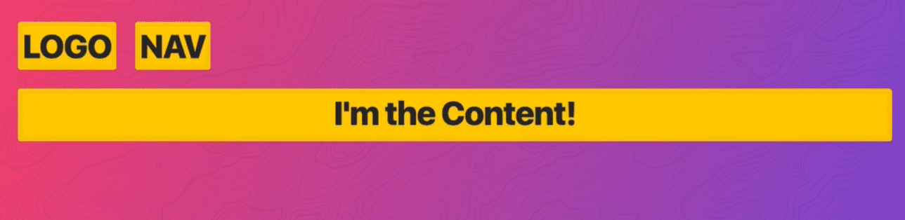
We want the logo to span 2, and the nav span 8. ->
.logo {
  grid-column: span 2;
  order: 2;
}
.nav {
  grid-column: span 8;
  order: 1;
}
->
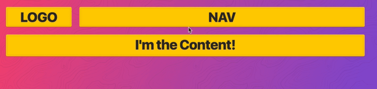
What if we wanted to put the nav before the logo at a smaller screen size.
You can give your items an order property.
If you put -> .logo{order:1;} that will put it at the end because the default value is 0.
      .logo {
        grid-column: span 2;
        order: 2;
      }
      .nav {
        grid-column: span 8;
        order: 1;
      }

      .content {
        grid-column: 1 / -1;
        order: 3;
      }
The reordering will screw up select and accessibility. Even though the source order (logo, nav, content) and then goes , logo, nav, content, it will mess up the screenreader. Don’t rearrange a paragraph tag into a different order just with css because it won’t get read back.
It screws up highlighting of text ->

19 - Nesting Grid Items
We will be creating an album layout. It will teach us how to nest grid and give us practice with auto fit and min max.
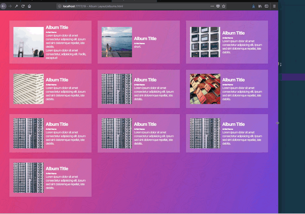
This example will be fully responsive without having to write any media queries.
Starting HTML ->
<div class="albums">
  <div class="album">
    <img
      class="album__artwork"
      src="https://source.unsplash.com/random/300x300?v=1"
    />
    <div class="album__details">
      <h2>Album Title</h2>
      <p class="album__artist">Artist Name</p>
      <p class="album__desc">
        Lorem ipsum dolor sit amet consectetur adipisicing elit. Ipsum sed sint
        doloremque repellat, iste debitis.
      </p>
      <p class="album__desc">
        Lorem ipsum dolor sit amet consectetur, adipisicing elit. Facilis,
        excepturi!
      </p>
    </div>
  </div>
  <div class="album">
    ...
  </div>
</div>
Albums will be our grid, album will be our grid item.
I thought we would do it like so ->
   .albums {
        display: grid;
        grid-template-columns: 1fr 1 fr 1fr;
      }
But we actually want to use auto-fit and pass it 100px instead of fr.
grid-template-columns: repeat(auto-fit, 100px);
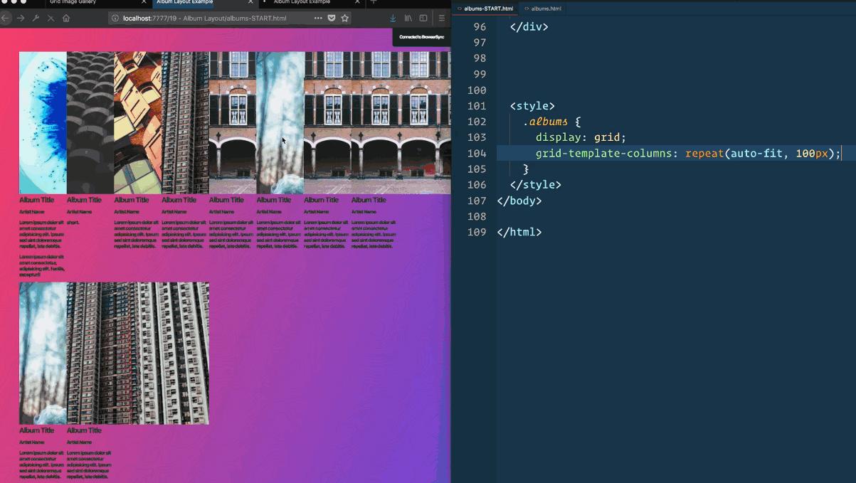
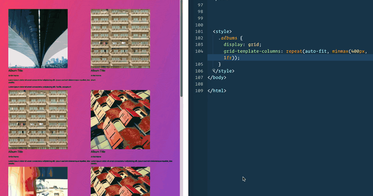
However that doesn’t work well, so we need to use minmax. At minimum we want it to be 400px, and at max 1fr.
grid-template-columns: repeat(auto-fit, minmax(400px, 1fr));
Now we will style the album a bit.
.albums {
display: grid;
grid-template-columns: repeat(auto-fit, minmax(400px, 1fr));
grid-gap: 20px;
}
.album {
background: rgba(255, 255, 255, 0.1);
box-shadow: 0 0 5px rgba(0, 0, 0, 0.1);
padding: 20px;
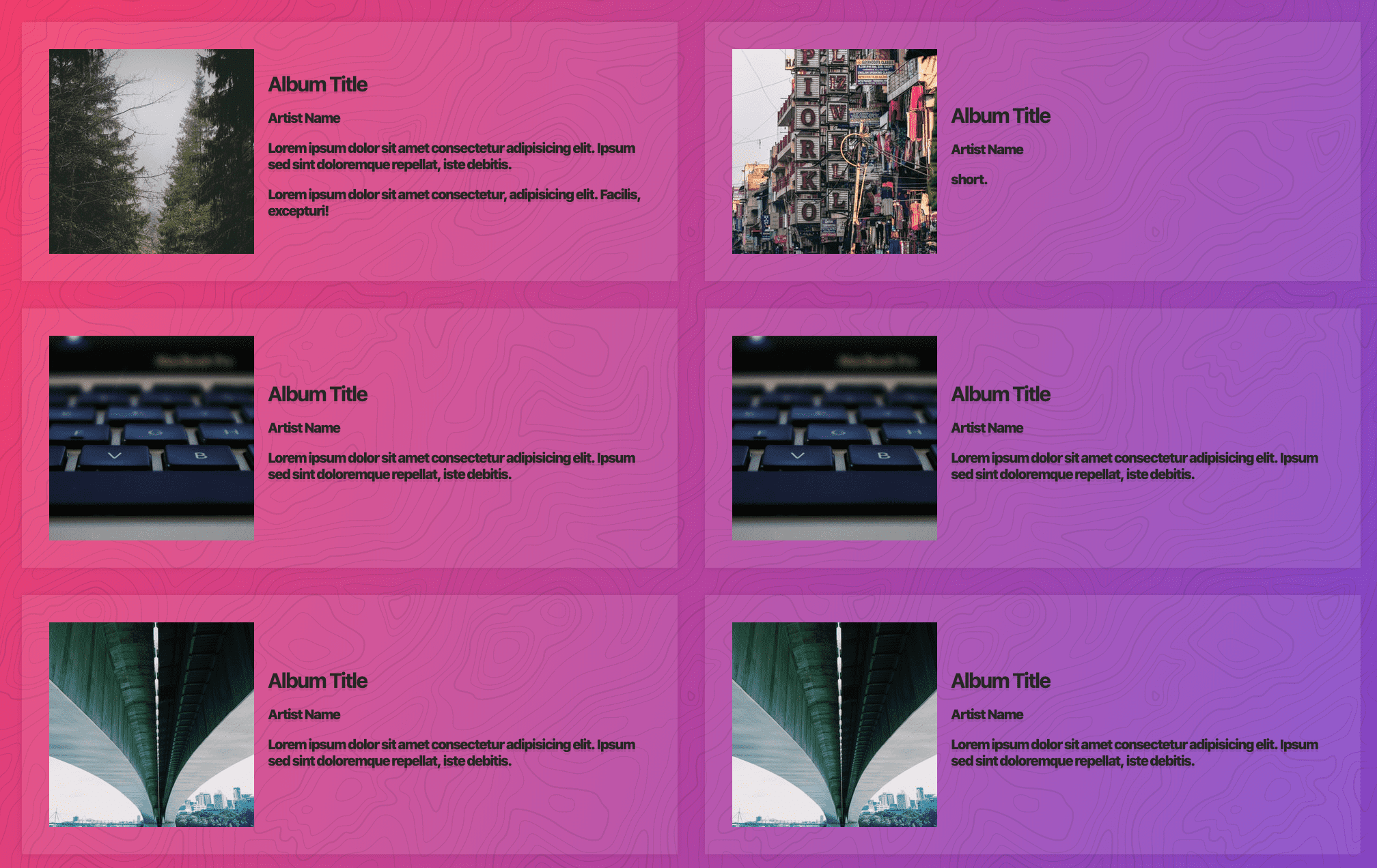
}How do we get the image and text to go side by side? If albums is the grid, and album is the grid item, how do I use grid on the actual element itself.
Grid items can also be grids (just like in flex-box flex items can also be flex containers).
Add display;grid to .album and make two columns. One that is 150px wide for the image, and then the rest for the description.
.album {
  background: rgba(255, 255, 255, 0 2);
  box-shadow: 0 0 5px rgba(0, 0, 0, 0.1);
  padding: 20px;
  display: grid;
  grid-template-columns: 150px 1fr;
  grid-gap: 10px;
}
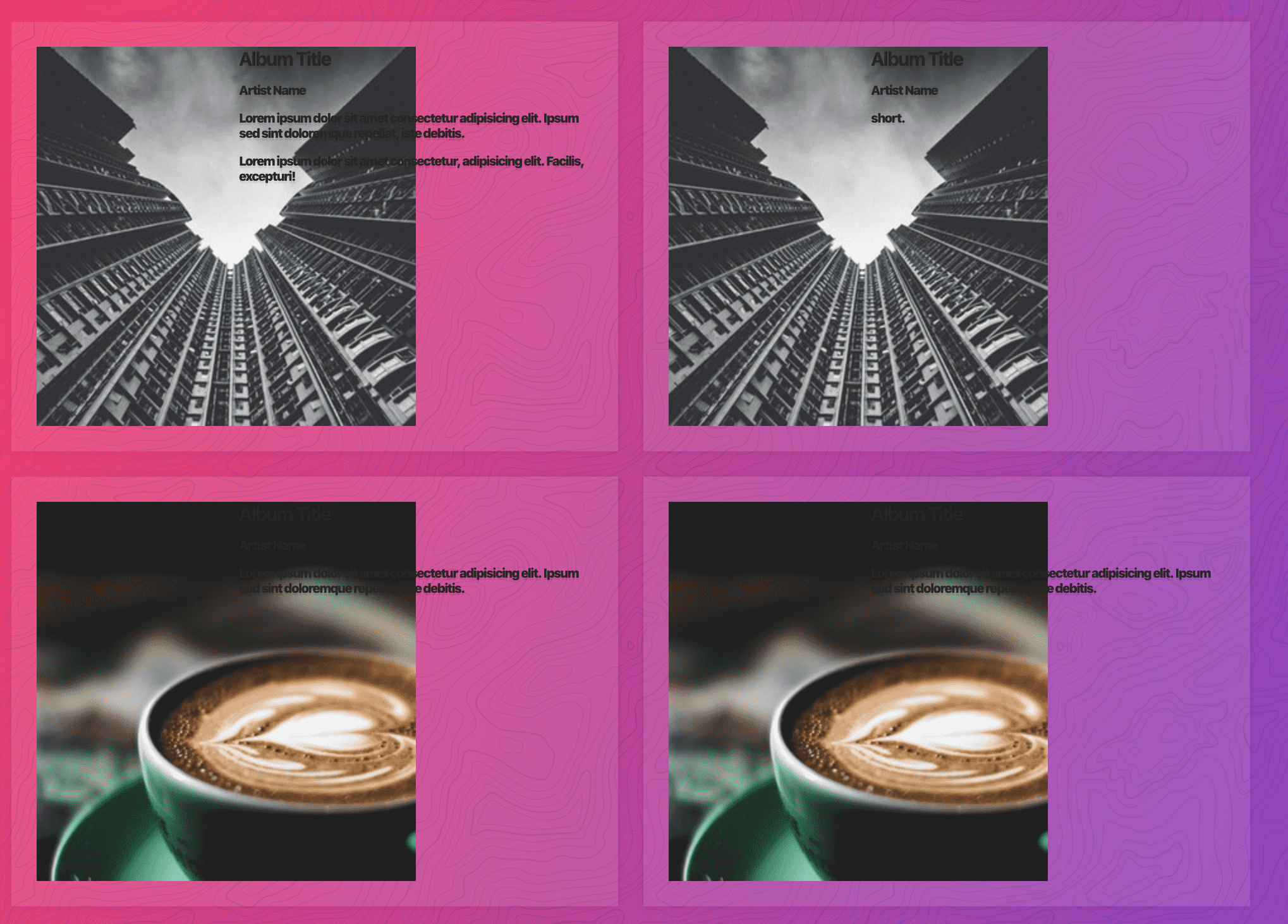
However the image wasn’t adhering to 150px..
Because the natural image height is 300px, it is causing it to be bigger than it should be. We can fix that with the code below so it spans the entire width of it’s column.
.album__artwork {
  width: 100%;
}
That forces the image to size itself based on the available space for it (150px) and that will automatically resize the height.
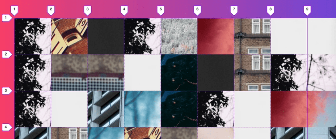
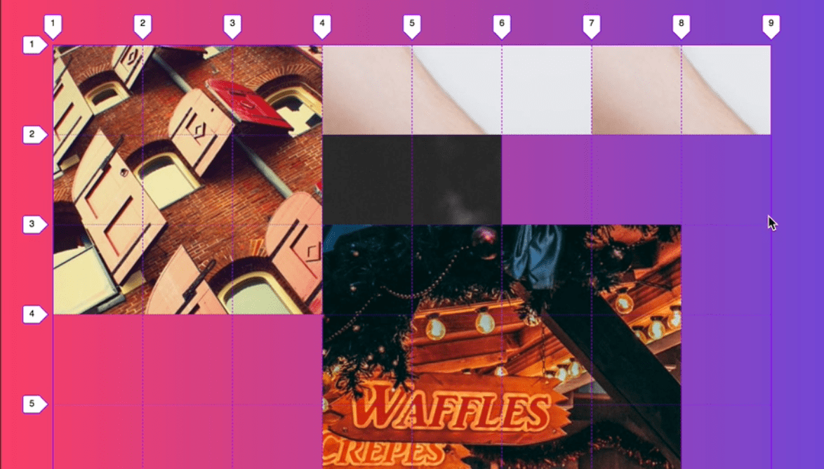
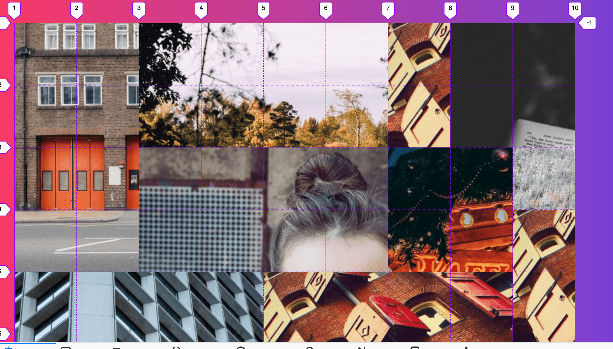
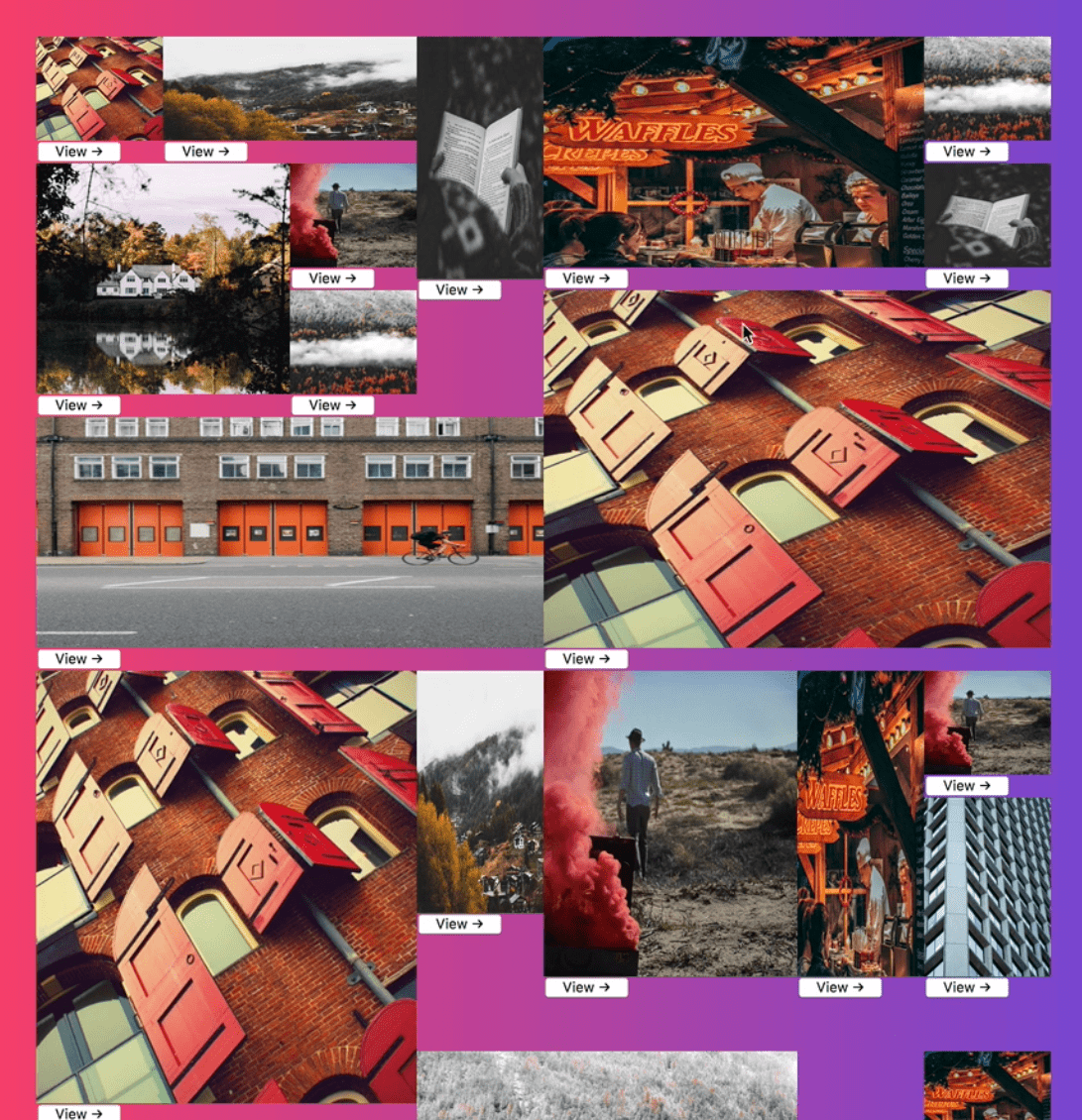
20 - CSS Image Gallery
We are going to be making an image gallery, and as wide as the screen sizes, the images fit using grid-auto-flow: dense.
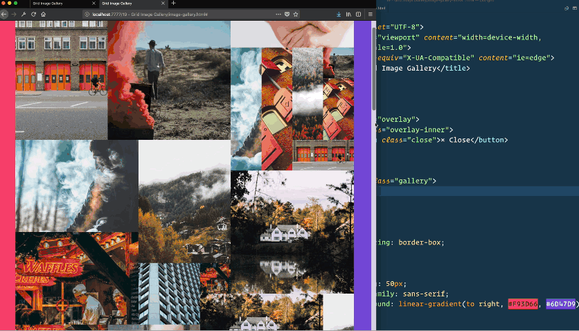
The idea about the image gallery is not everything fits into each other perfectly.
How Wes is doing it is he is making all of those possible sizes, all based on a 100px grid. The grid will always be 100px by 100px, and each of the images is going to span a random about (between 1 wide and 4 wide and 1 high and 4 high). That will be totally random.
By having a lot of extra little 1 by 1s, it will hopefully fill all the gaps.
The small images are fillers.
For this example, we have our gallery which will be our grid. It’s empty because instead of manually coding all the sizes by hand, we are going to use javascript to generate them. In the images folder there are images all 500px by 500px. We will be using css property called object fit in order to make them fit perfectly. Sort of like background-size: cover;
First, we generate gallery images.
We need a function which will generate some HTML based on passed in widths and heights between 1 and 4 width (horizontal), and 1 and 4 height (vertical). In our CSS we will assign a class of h1 and v1 and those correspond with a different span value.

We want to create a helper function which will help us generate a number between 1 and something.
  <script>
      const gallery = document.querySelector(".gallery");
      const overlay = document.querySelector(".overlay");

      const overlayImage = overlay.querySelector("img");
      const overlayClose = overlay.querySelector(".close");

      function generateHTML([h, v]) {
        return `
        <div class="item h${h} v${v}">
        <img src="images/${randomNumber(12)}.jpg">
        <div class="item__overlay">
        <button>View →</button>
        </div>
        `;
      }

      function randomNumber(limit) {
        return Math.floor(Math.random() * limit) + 1;
      }
    </script>
Now we want an array of arrays with different height / width values.
;[[1, 4][(2, 2)][(4, 1)]]First value is how many columns it spans and the second is how many rows.
We want to make an empty array with 50 spots. You do that like so. Array.from also gives us access to the map function which allows us to populate what goes into each one of those. ->
const digits = Array.from({ length: 50 }, () => [
  randomNumber(4),
  randomNumber(4),
])
When we load the page, we get an array of arrays. We want to map over each item in the array and generate array of html strings and then join those for one large HTML string which we will set to galleries innerHTML.
      const gallery = document.querySelector(“.gallery”);
      const overlay = document.querySelector(“.overlay”);

      const overlayImage = overlay.querySelector(“img”);
      const overlayClose = overlay.querySelector(“.close”);

      function generateHTML([h, v]) {
        return `
        <div class=“item h${h} v${v}”>
        <img src=“images/${randomNumber(12)}.jpg”>
        <div class=“item__overlay”>
        <button>View →</button>
        </div>
        `;
      }

      function randomNumber(limit) {
        return Math.floor(Math.random() * limit) + 1;
      }

      const digits = Array.from({ length: 50 }, () => [
        randomNumber(4),
        randomNumber(4)
      ]);
      console.log(digits);

      const html = digits.map(generateHTML).join(“”);
      gallery.innerHTML = html;
Now we make gallery a grid. We need to make it 100px wide for each one. How many do we need? We don’t know so we can use repeat and auto-fill.
Add ->
.gallery {
  display: grid;
  grid-template-columns: repeat(auto-fill, 100px);
}

For vertical, we don’t know how many there will be, so we will just size the implicit rows with grid-auto-rows: 100px
Any item with .v2 wi will add a grid row span of two like so ->
.item.v2 {
  grid-row: span 2;
}
.item {
  overflow: hidden;
}
->

.item.v2 {
  grid-row: span 2;
}

.item.v3 {
  grid-row: span 4;
}

.item.v4 {
  grid-row: span 4;
}

.item.h2 {
  grid-column: span 2;
}

.item.h3 {
  grid-column: span 4;
}

.item.h4 {
  grid-column: span 4;
}
The problem now is we have all these empty spaces.
Add grid-auto-flow:dense to .gallery grid container ->
Now we are going to go to our javascript and add a bunch of 1 by 1 fillers to take up the empty spaces. We are just going to concat a bunch of 1 by 1s.
const digits = Array.from({ length: 50 }, () => [
  randomNumber(4),
  randomNumber(4),
]).concat([
  [1, 1],
  [1, 1],
  [1, 1],
  [1, 1],
  [1, 1],
  [1, 1],
  [1, 1],
  [1, 1],
  [1, 1],
  [1, 1],
  [1, 1],
  [1, 1],
  [1, 1],
  [1, 1],
  [1, 1],
  [1, 1],
  [1, 1],
  [1, 1],
])
Next we are going to work on the overlay. We are going to make each grid item a 1 by 1 grid
.item {
        overflow: hidden;
        display: grid;
        grid-template-columns: 1;
        grid-template-rows: 1;
      }
CSS Grid is also really good for overlapping items. We can use it instead of position absolute.
   .item img {
        grid-column: 1/-1;
        grid-row: 1/-1;
        width: 100%;
        height: 100%;
      }
That gives us ->
The images are now being stretched and what we can do about that is use object-fit:cover which will trim the top or the bottom or left or right to fit perfectly while showing as much of the image. ->
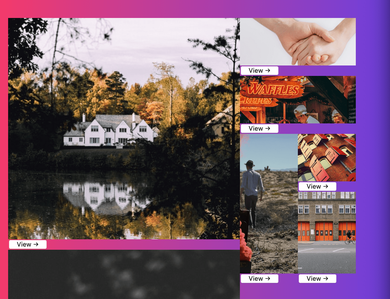
For the details, we grab the .item__overlay. The overlay is sort of below the actual item, and we want it to overlap the actual image. We have not done the ability to overlap objects. We want to take the grid-column and grid-row from .item img and apply it to the details.
If you place them on the same row and column, you can overlap items and then z-index comes into place.
      .item__overlay {
        background: #ffc60032;
        grid-column: 1/-1;
        grid-row: 1/-1;
        position: relative;
		display: grid;
}
->
We add the following to align it in the center ->
justify-items: center;
align-items: center;

We want to move the view button off the item using
transform:translateY(100%) which moves the button off.
When the item is hovered, we will put it back.
.item img {
        grid-column: 1/-1;
        grid-row: 1/-1;
        width: 100%;
        height: 100%;
        object-fit: cover;
      }

      .item__overlay {
        background: #ffc60032;
        grid-column: 1/-1;
        grid-row: 1/-1;
        position: relative;
        display: grid;
        justify-items: center;
        align-items: center;
        transform: translateY(100%);
      }

      .item__overlay button {
        background: none;
        border: 2px solid white;
        color: white;
        text-transform: uppercase;
        background: rgba(0, 0, 0, 0.7));
        padding: 5px;
      }

      .item:hover .item__overlay{
        transform: translateY(0)
      }
Now we need to add the overlay on button click. We will add the event listener after all the items have been created so we don’t have to deal with event delegation.
const items = document.querySelectorAll(".item")
items.forEach(item => item.addEventListener("click", handleClick))
function handleClick(e) {
console.log(e.currentTarget);
const src = e.currentTarget.querySelector(“img”).src;
overlayImage.src = src;
overlay.classList.add("open");
}We already have this css ->
.overlay {
  position: fixed;
  background: rgba(0, 0, 0, 0.7);
  top: 0;
  right: 0;
  bottom: 0;
  left: 0;
  display: none;
  z-index: 2;
}

.overlay.open {
  display: grid;
}
Add js for the close overlay button ->
 function close() {
        overlay.classList.remove("open");
      }
   overlayClose.addEventListener(“click”, close);`
21 - Flexbox vs Grid
Answering questions like when do you use one over the other, are they replacements, do they go together, can you use them together?
We will go through 8-9 UI patterns and discuss how to implement them in grid or flex box.
In general grid can do everything that flex box can do. Some people think flex box is for one dimensional (laying things on X or Y axis) and grid is multi-dimensional (laying things down on an X and Y grid). However, you can also use grid to just align things on an X or Y axis.
One big benefit of flexbox is they can be transitioned meaning if you want to animate a flex grow value with flex box you can but for css grid you cannot.
Pros for grid is it’s much more consistent across all web browsers and not as many bugs as flex box. If you are designing something on a single axis and then you want to wrap that into multiple rows, you can easily do that with CSS Grid.
Examples coming up will show how to achieve things we have done with flex box with grid, and then some examples that only flex box can achieve
Example 1 - Axis Flipping
With FlexBox you can flip axis from column to row and back.
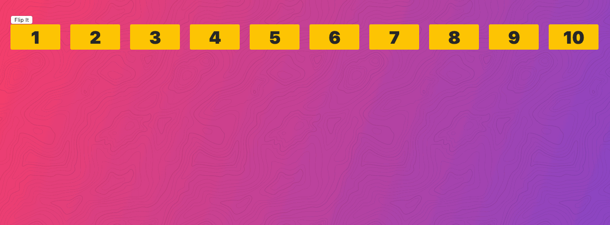
We are going to do this with css grid.
When you click the “flip” button, it will add the class .flip to the .flipper.
Along the x axis you can achieve the same with grid like so->
.flipper {
  display: grid;
  grid-gap: 20px;
  grid-template-columns: repeat(auto-fit, minmax(50px, 1fr));
}
And then to make it along the Y axis, add this code ->
 .flipper.flip {
        grid-template-columns: 1fr;
      }
Now the the functionality works the same as it would with flex box.
Flexbox has the ability to do row-reverse and column reverse but grid does not have that functionality.
Example 2 - Controls on Right
Instead of assuming there are three buttons, we don’t want to do that (with flex box you can just apply a flex 1 to that and it would fit it up.
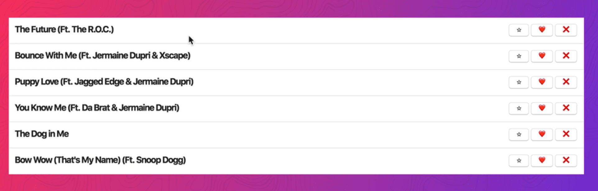
Starting point ->
<div class="tracks">
  <div class="track">
    <h2>The Future (Ft. The R.O.C.)</h2>
    <button>⭐</button>
    <button>❤️</button>
    <button>❌</button>
  </div>
  ...
</div>
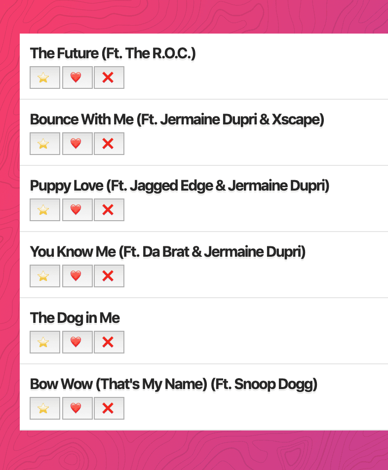
We are going to make a one column grid. If you add ->
.track {
  background: white;
  padding: 10px;
  border-bottom: 1px solid rgba(0, 0, 0, 0.1);
  display: grid;
  grid-template-columns: 1fr;
}
Gives you ->
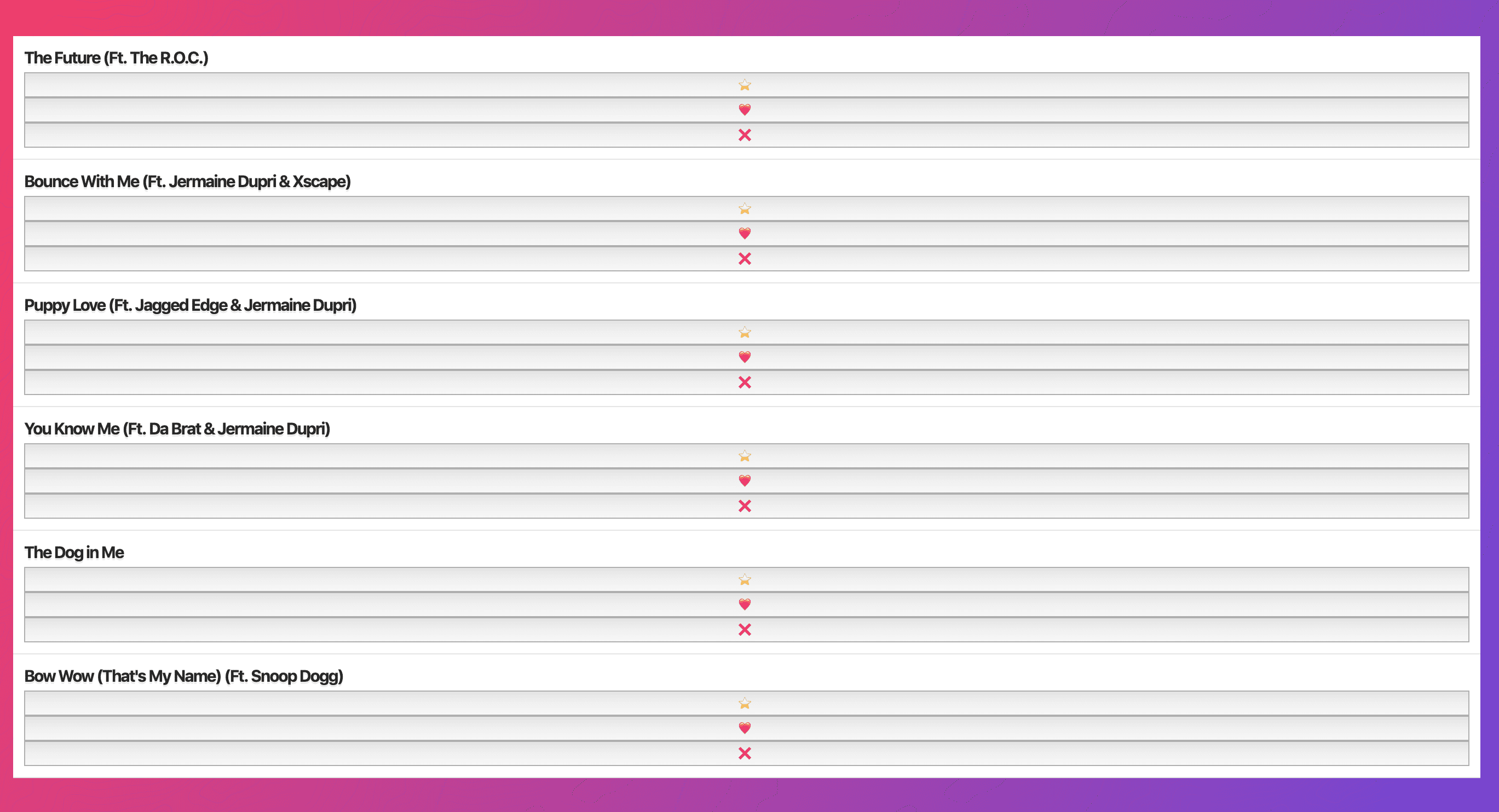
The problem now is our additional items are being added as rows instead of to the right. We can change that with grid-auto-flow:column;
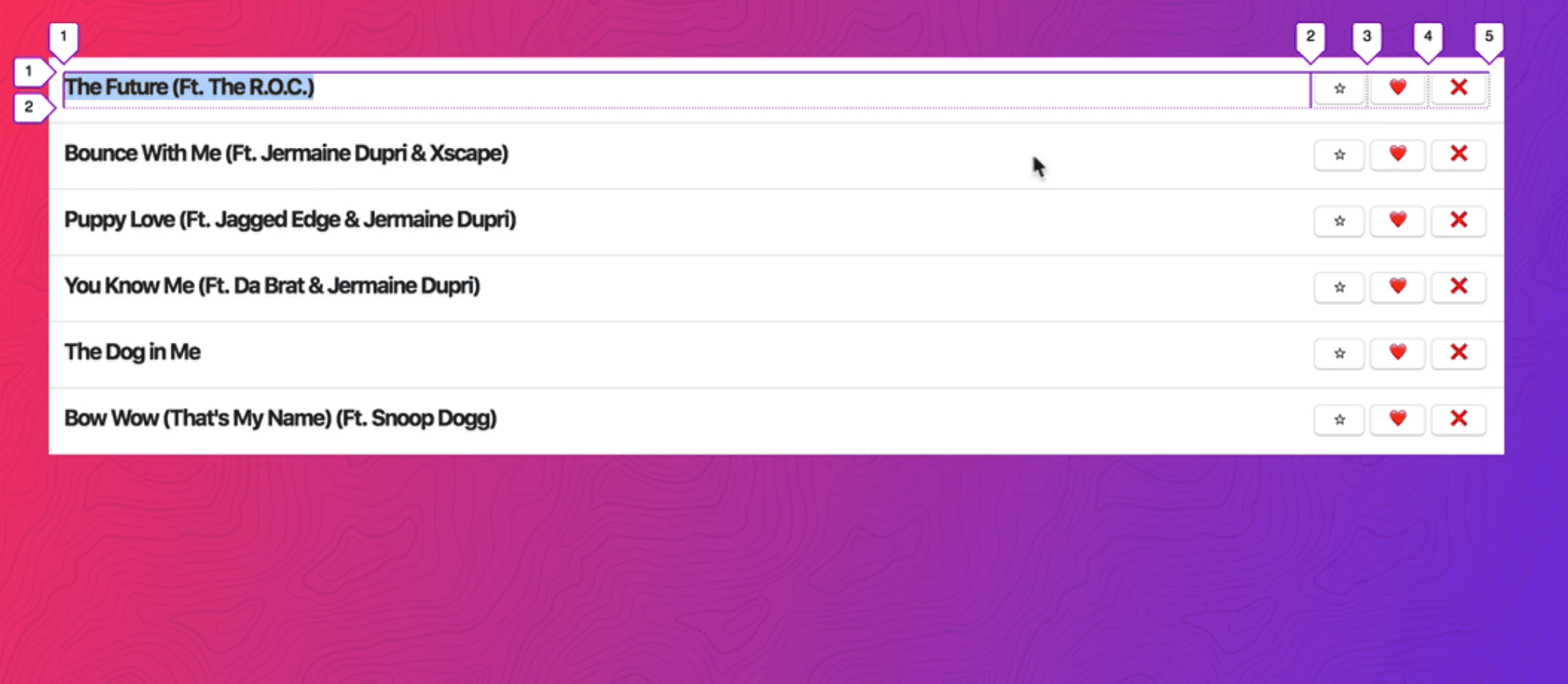
If you increase the amount of buttons, they will nicely stack up to the right.
Example 3 - Flex on Item
We want to achieve ->

Starting point ->
<div class="controls">
    <button>⏯️</button>
    <button>🐢</button>
    <button>🐰</button>
    <div class="scrubber"></div>
    <button>💬</button>
    <button>🔽</button>
  </div>

  <style>
    .controls {
      margin: 200px 0;
    }

    .scrubber {
      background: #BADA55;
      height: 10px;
      min-width: 100px;
      border-radius: 10px;
    }
  </style>

Wes likes to do this by letting the buttons take up as much space as they need. Whatever we have left (the scrubber) will take up the rest of the value so when you resize the scrubber changes size.
Wes prefers flex box for this.
Add display:flex to .controls

Scrubber has min-width of 100px, but we want it to take up the rest of the space.
We go to the scrubber and add flex:1 that will flex-grow it to take up the rest of the space.

If you add align-items:center; to .controls it will center it.

To do this with grid, we would (comment out all flexbox stuff) ->
    .controls {
        margin: 200px 0;
        /* display: flex; */
        /* align-items: center; */
        display: grid;
        grid-template-columns: auto auto auto 1fr auto auto;
      }
We do auto auto auto 1fr auto auto; because we want the buttons to be equal sizes and the scrubber to take up the rest of the space.
The makes it brittle because if we change the number of buttons, that would cause on of the buttons to get bigger rather than the scrubber.
Being able to apply the flex directly to the element is better because if the number of your flex container changes, you aren’t screwed.
Example 4 - Perfectly centred
Goal ->

Starting point ->
<div class="hero">
  <h2>Something Big Is Coming</h2>
  <p>Get Ready...</p>
</div>

<style>
  .hero {
    height: 200px;
    background: rgba(255, 255, 255, 0.2);
  }
</style>

Flex
Add display:flex to .hero which turns it into rows ->

We need to change the flex directlion to columns like so ->
 .hero {
        height: 200px;
        background: rgba(255, 255, 255, 0.2);
        display: flex;
        flex-direction: column;
      }

If you add justify-content: center ->

Add align-items:center ->

Grid
For grid, we will add display:grid ->

Add justify-items:center ->

Add align-items:center ->
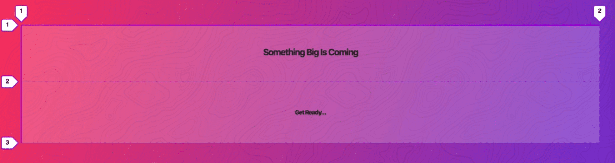
We don’t wan them to be far apart, we want them perfectly centered so we need to do align-content:center; ->
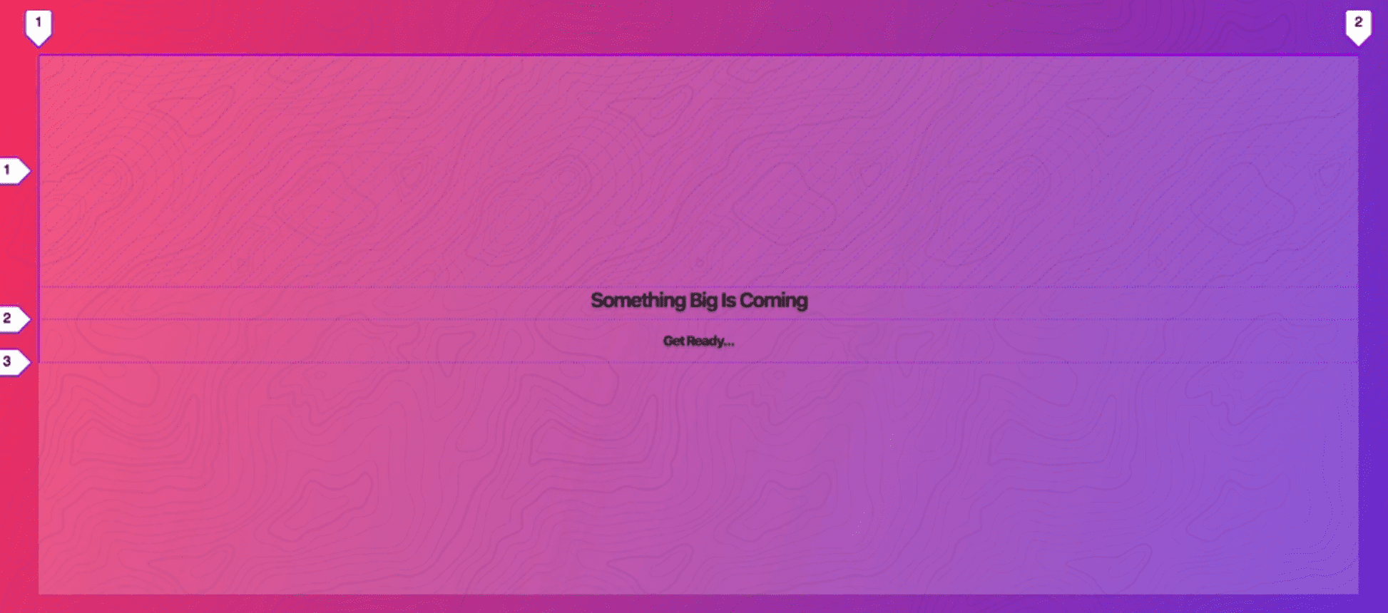 ->
Now the rows themselves are not stretching, they will be just as big as the content needs to be.
->
Now the rows themselves are not stretching, they will be just as big as the content needs to be.
Example 5 - Self Control
Goal ->
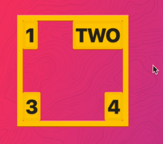
Starting ->
<div class="corners">
  <div class="corner item">1</div>
  <div class="corner item">TWO</div>
  <div class="corner item">3</div>
  <div class="corner item">4</div>
</div>

<style>
  .corners {
    display: grid;
    height: 200px;
    width: 200px;
    border: 10px solid var(--yellow);
  }

  .corner:nth-child(1),
  .corner:nth-child(2) {
  }

  .corner:nth-child(1),
  .corner:nth-child(3) {
  }
</style>

This one is only possible in grid. Probably not a real world scenario but shows the benefit of having the justify-self and align-self values.
We will make a 2x2 grid.
Add to .corners ->
grid-template-columns: 1fr 1fr;
grid-template-rows: 1fr 1fr;
Or use shortcut
grid-template: 1fr 1fr/ 1fr 1fr; which is the exact same thing.
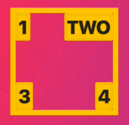
Now we want to put them in the top right hand corner. By default they are stretching .
Add align-items:end ->
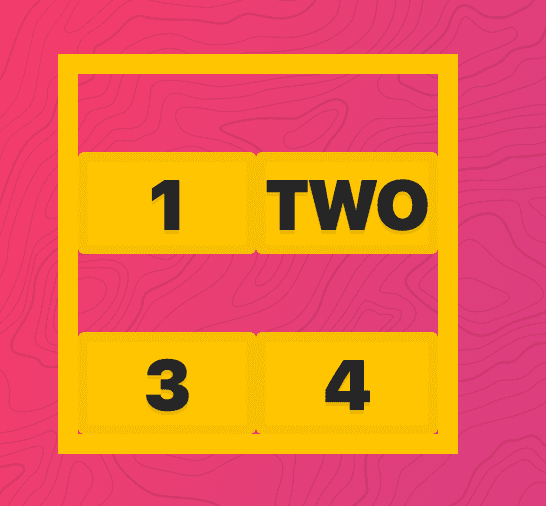
Add justify-items: end ->
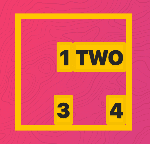
That puts each of them in their bottom righthand corner.
Now we want to override it for the 1st one and the second one (we want to stick them to the top) and for the 1st and 3rd we want to stick them to the left.
Add ->
.corner:nth-child(1),
.corner:nth-child(2) {
  align-self: start;
}

.corner:nth-child(1),
.corner:nth-child(3) {
  justify-self: start;
}
Example 6 - Stacked Layout
This one is only do-able in flex box.
Goal ->
Starting ->
<div class="stacked">
  <div class="item">1</div>
  <div class="item">2</div>
  <div class="item">3</div>
  <div class="item">4</div>
  <div class="item">5</div>
</div>

<style>
  .stacked {
  }

  .stacked > * {
    width: 30%;
    margin-bottom: 20px;
  }
</style>
With grid, your columns are rigid, you can’t have rows that are different sizes. If you wanted to achieve something like this, you would have to do manual spanning across all of the items.
Add display:flex; to .stacked

We have made them width:30%; so they should be able to wrap.
Add flex-wrap:wrap ->
If you add justify-content: space-around ->

One downside is there is no concept of gap in flex box.
Example 7 - Unknown Content Size
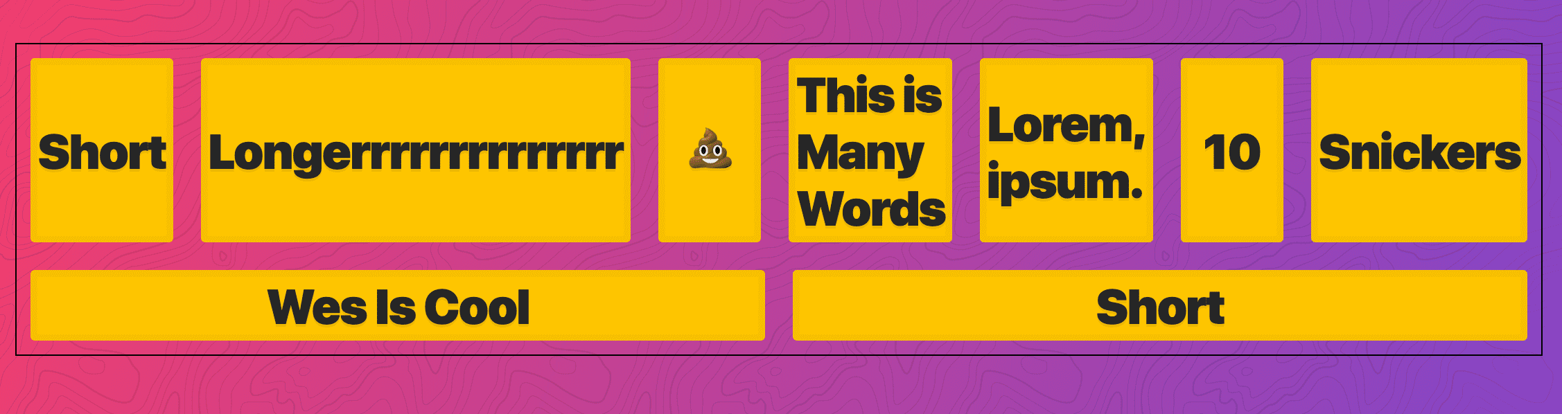
When you don’t know how wide something is but you want to put it in the middle.
Goal ->

Starting point ->
!— Known Columns, Unknown Content Width —>

  <div class=“container known”>
    <div class=“item”>Short</div>
    <div class=“item”>Longerrrrrr</div>
    <div class=“item”>
      <img src=“https://source.unsplash.com/300x200” alt=“”>
    </div>
    <div class=“item”>💩</div>
  </div>

  <style>
    .known {
      margin: 100px 0;
    }
  </style>

Grid
Add display:grid to .known
We do know how many columns we have in this case.
Add grid-template-columns: repeat(5, auto);
We make them auto because it will autosize the based on the content ->
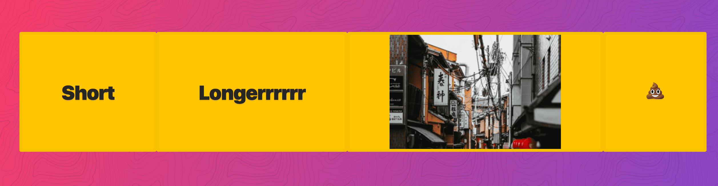
To center it, we add justify-content:center;

Add grid-gap:20px; ->
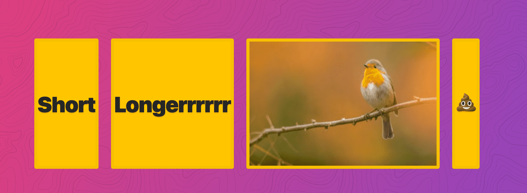
If you know the amount of columns you will have but you do not know the size of the content within them, this is a good use case.
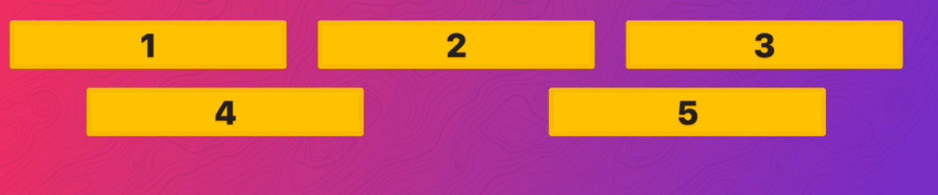
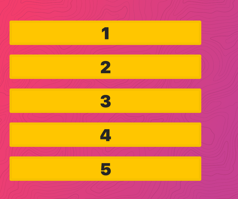
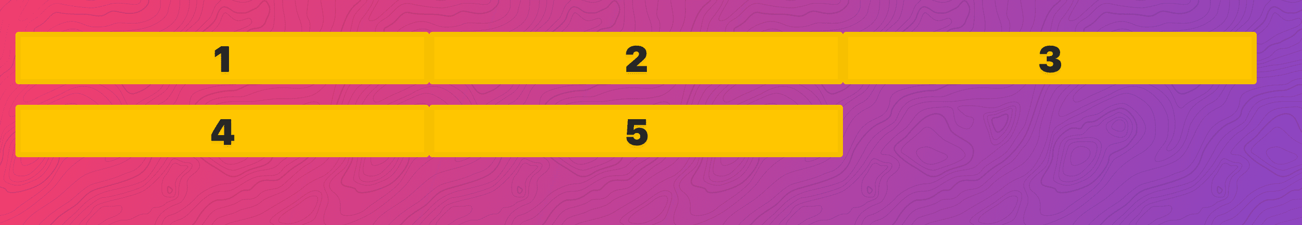
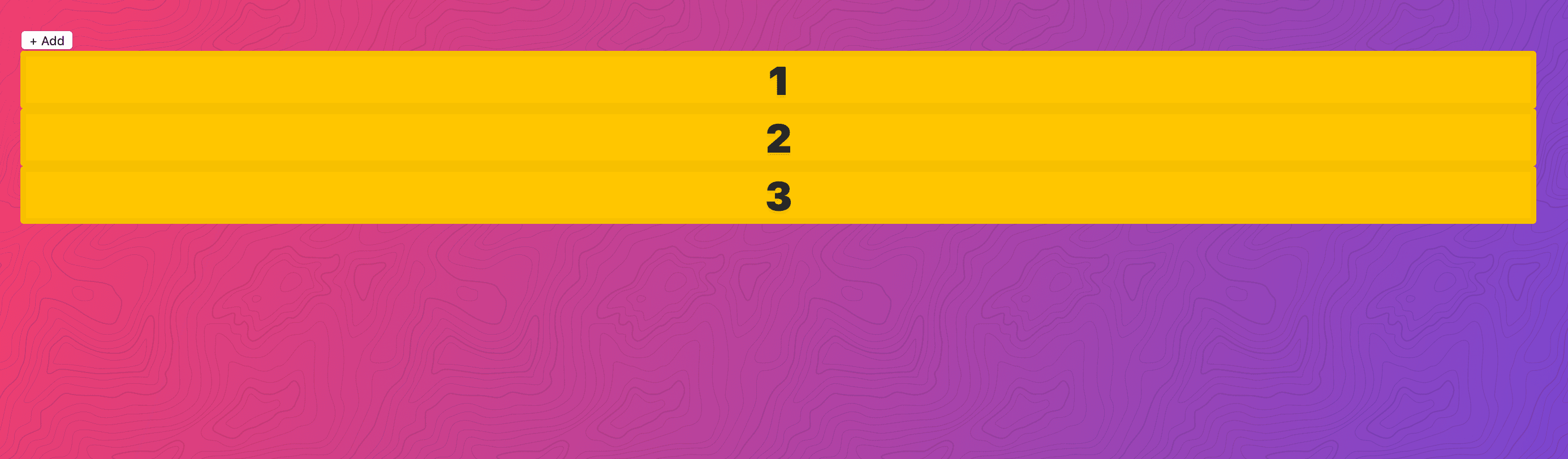
Example 8 - Unknown Number of Items
In this example you want the items to take up as much room as you want but you don’t know how many columns there will be. Once you hit the min max value, they will start to wrap.
Goal ->
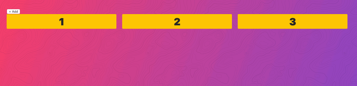
Starting ->
 <!— Unknown Amount of Elements —>
    <script>
      function addItem() {
        const unknown = document.querySelector(“.unknown”);
        unknown.innerHTML += `<div class=“item”>${
          unknown.childElementCount
        }</div>`;
      }
    </script>
    <button onClick=“addItem()”>+ Add</button>
    <div class=“unknown”>
      <div class=“item”>1</div>
      <div class=“item”>2</div>
      <div class=“item”>3</div>
    </div>

    <style>
      .unknown {
      }
    </style>
add ->
      .unknown {
        display: grid;
        grid-template-columns: repeat(auto-fit, minmax(50px, 1fr));
        grid-gap: 20px;
      }
Gives you ->

And now they will wrap after hitting the minmax.
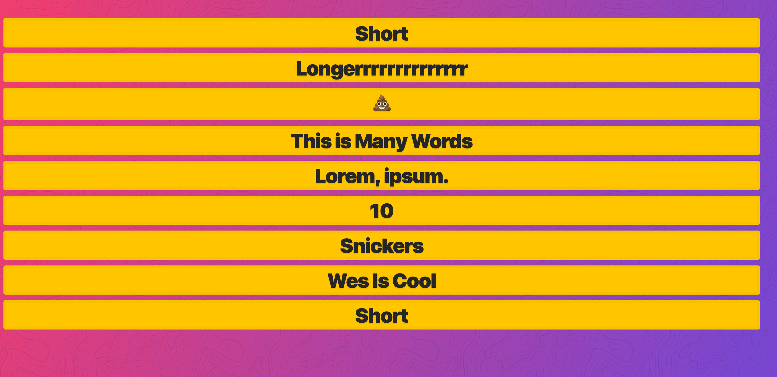
Example 9 - Variable Widths Each Row
Goal ->
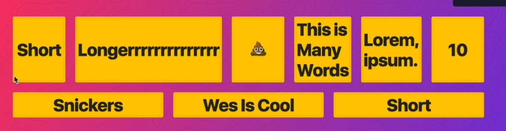
Starting ->
  <div class=“flex-container”>
    <div class=“item”>Short</div>
    <div class=“item”>Longerrrrrrrrrrrrrr</div>
    <div class=“item”>💩</div>
    <div class=“item”>This is Many Words</div>
    <div class=“item”>Lorem, ipsum.</div>
    <div class=“item”>10</div>
    <div class=“item”>Snickers</div>
    <div class=“item”>Wes Is Cool</div>
    <div class=“item”>Short</div>
  </div>
  <style>
    .flex-container {}

    .flex-container>* {
      margin: 10px;
    }
  </style>
You wouldn’t use grid for this one.
Add display:flex to the .flex-container. ->

Add flex-wrap:wrap ->
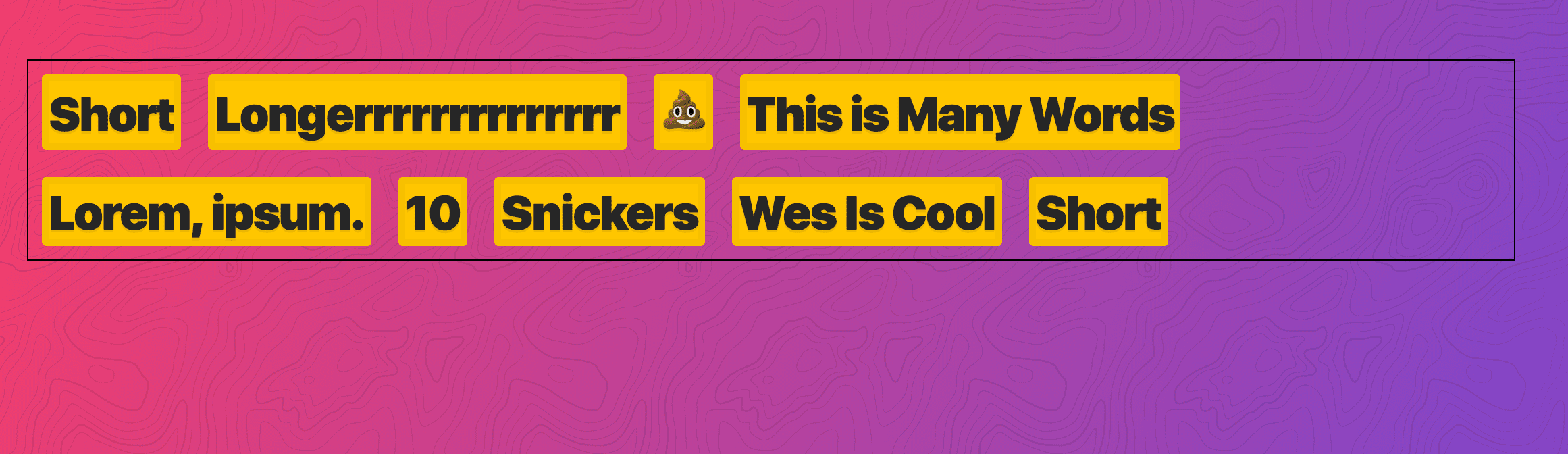
We can go to each flex-item and put value of 1 and it will fit it in as perfectly as we want.
.flex-container > * {
  margin: 10px;
  flex: 1;
}
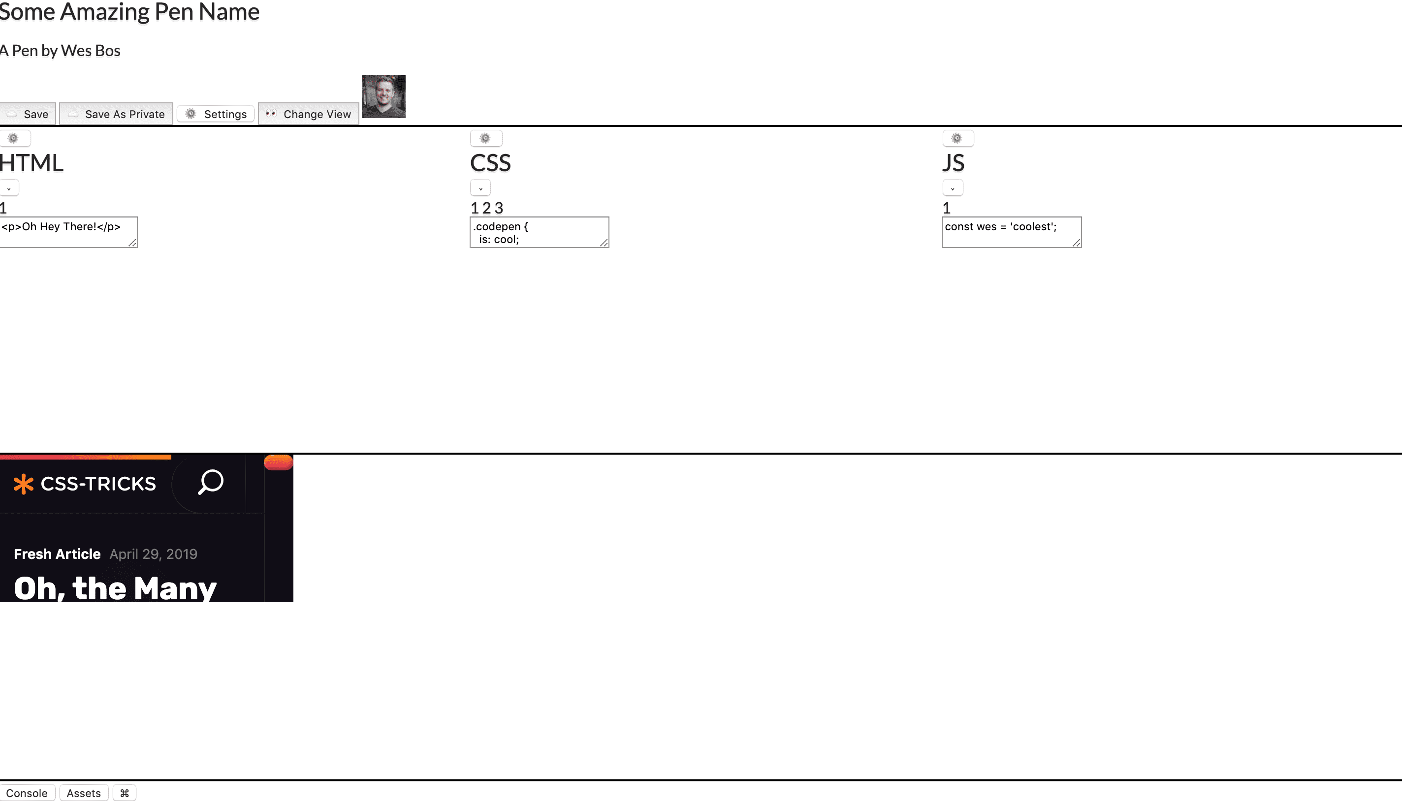
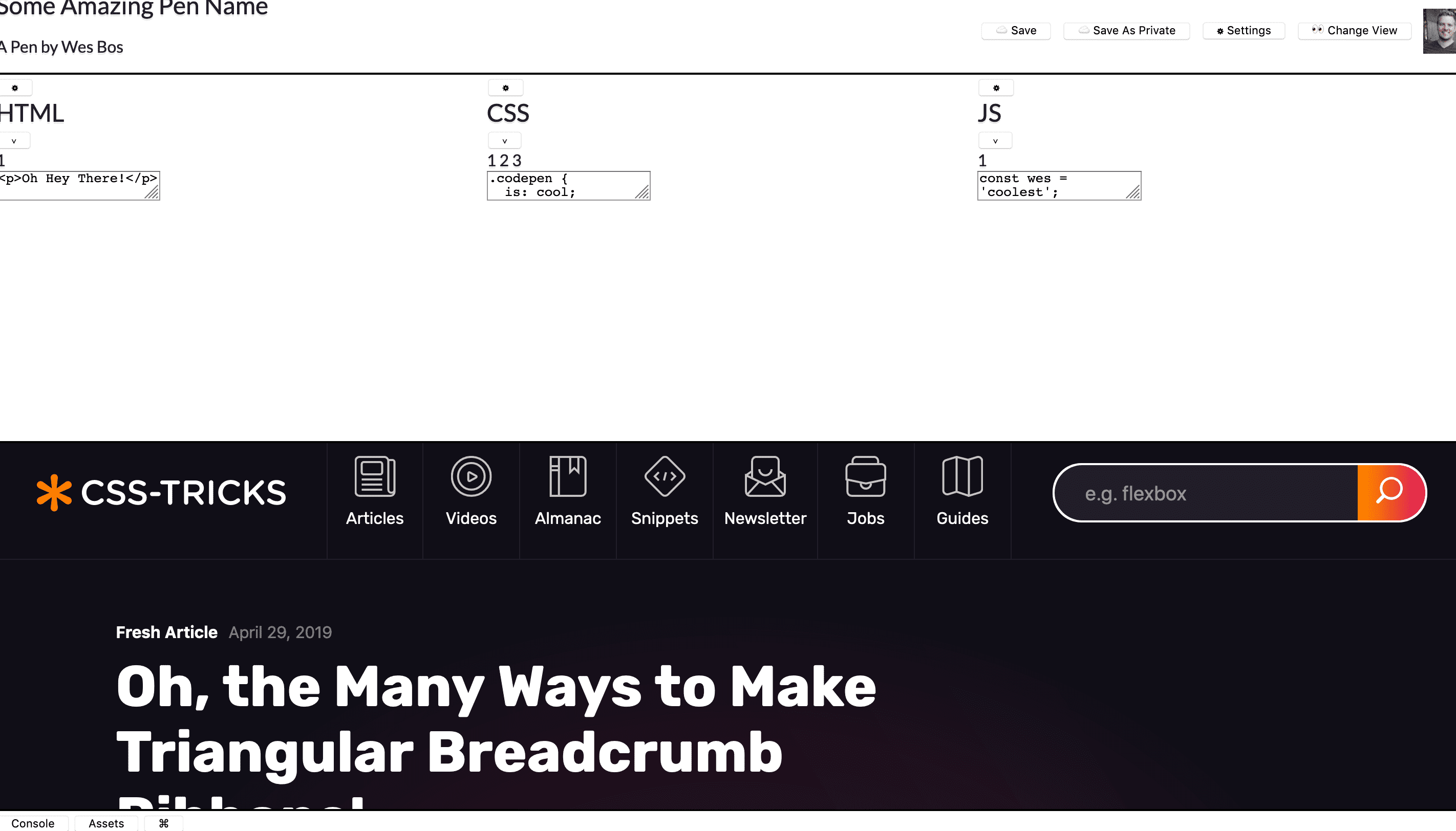
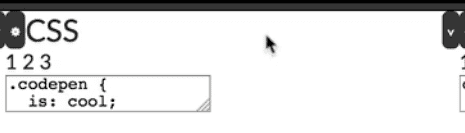
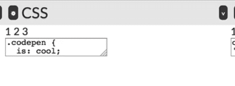
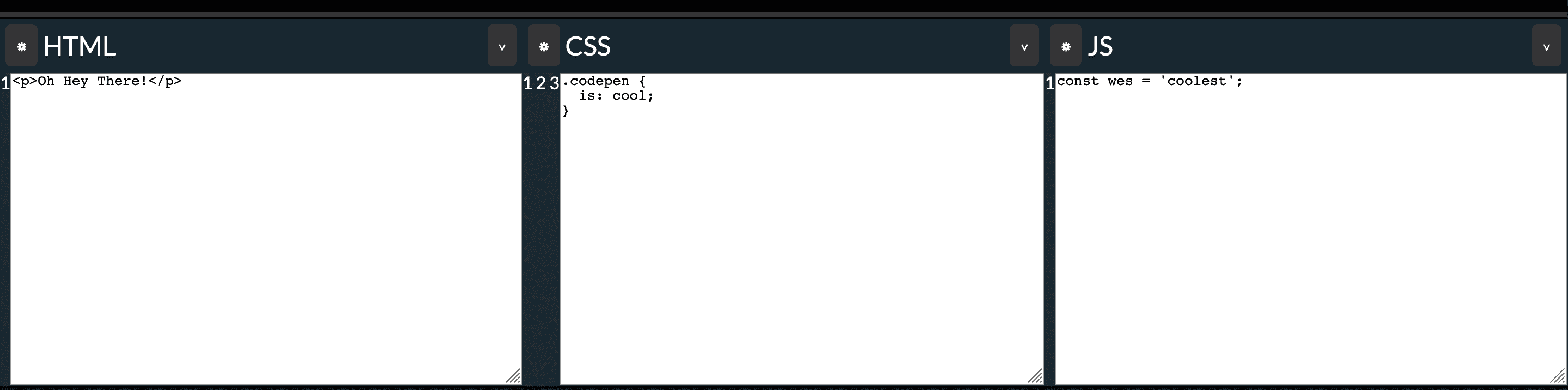
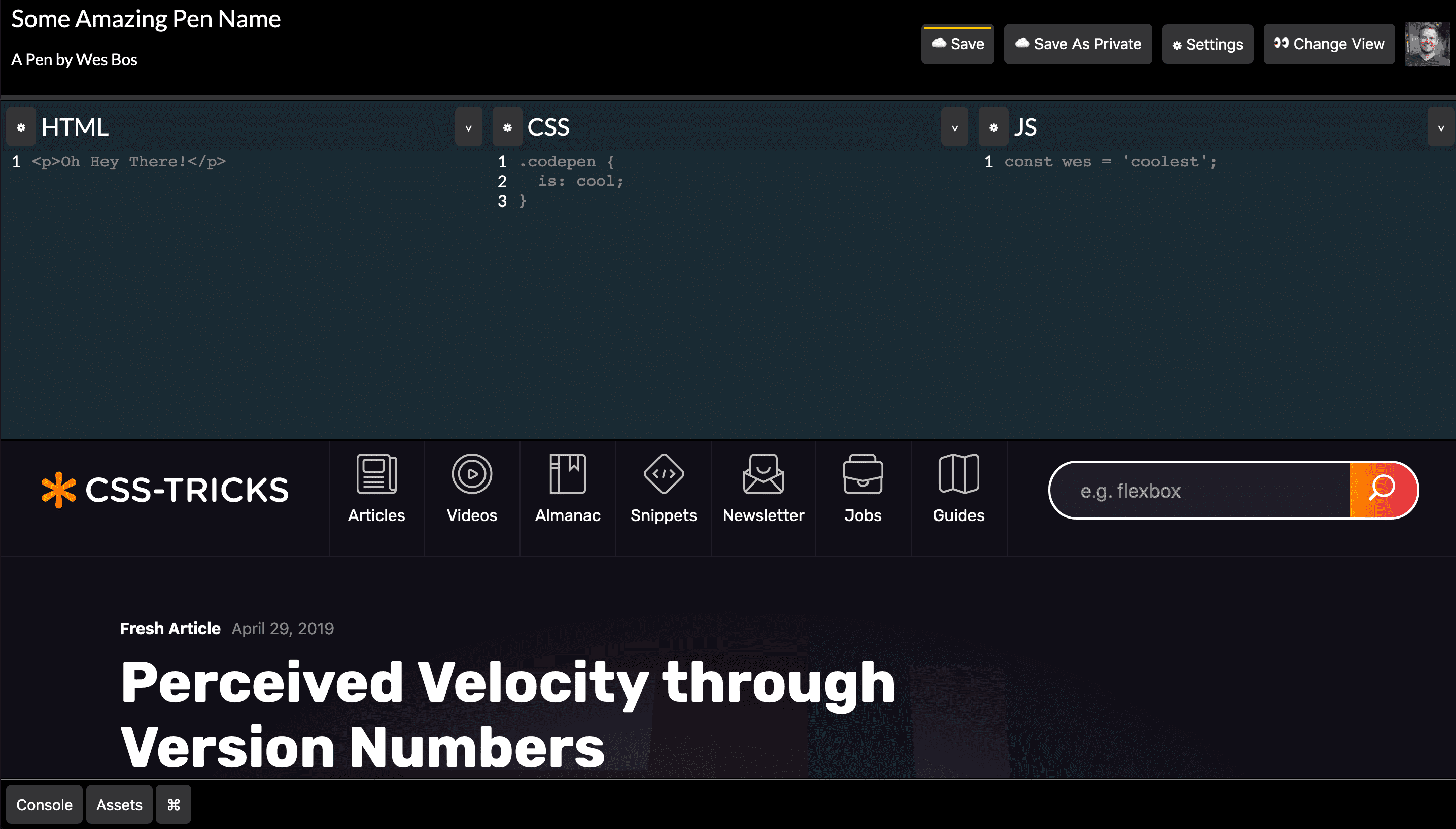
22 - Recreating CodePen
Goal ->
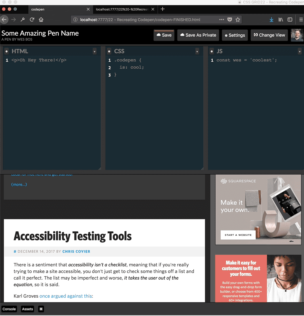
Wes has started us off with some HTML. It contains 4 main parts inside of a “codepen” div ->
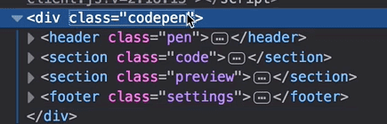
Inside of that we have our pen, code, preview and settings, and inside each of those there are smaller subset grids.
We want the header to take up as much room as it needs, and also for the footer to take up as much room as it needs. The other two we want to divide evenly.
.codepen {
  display: grid;
  grid-template-rows: auto 1fr 1fr auto;
}
However, should the footer (console, assets) be at the bottom? The issue is the codepen doesn’t have a height on it and you need an explicit height in order for it to work.
Add height:100vh
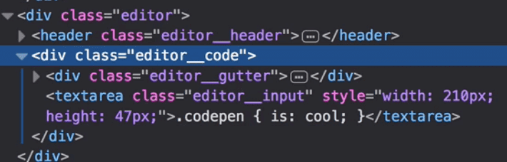
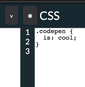
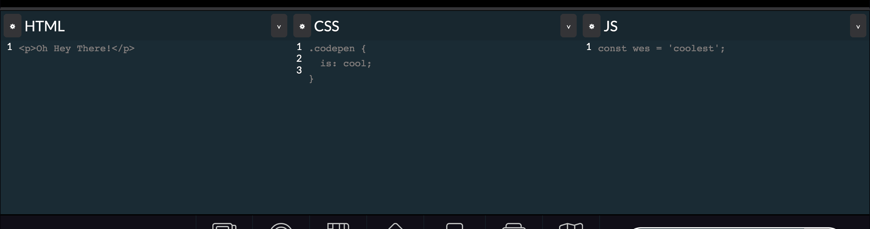
Next we are going to work on the editor. There is one section with class of .code and within it 3 divs with class of .editor
We will make code element display grid and then have 3 columns that repeat equally ->
.code {
  display: grid;
  grid-template-columns: repeat(3, 1fr);
}
Next we will work on the header.
What we want to do here is have the pen details take up as much room as it can, minus the size of the buttons and the avatar.
Add
.pen {
  display: grid;
  grid-template-columns: 1fr;
  grid-auto-flow: column;
}
They are being stretched which we can fix using align-items:center;

For the bottom one div (.preview) we just need to add display:grid; .
Now we will add some styling. First to the header and buttons ->
.pen {
  …background: black;
  border-bottom: 5px solid var(--grey);
  color: white;
  padding: 10px;
}
/* Buttons */
.button {
  background: var(--grey);
  border: 0;
  color: white;
  padding: 10px;
  border-radius: 5px;
  font-size: 15px;
}

.button-small {
  font-size: 12px;
  padding: 4px;
}

We want to add this style to the button ->

In order to do that, we are going to use the ::before element on the button with class .button-dirty
We need to do the typical song-and-dance associated with using ::before
.button—dirty::before {
  background: #ffc600;
  display: block;
  content: “”;
  height: 2px;
That gives us ->

However we are going to position it absolutely. We need to make .button {… position:relative;} and then add the following ->
.button—dirty{
…
 width: calc(100% - 6px);
  position: absolute;
  left:3px;
top:3px;

Next we will work on the editors. Each editor in itself, has a header, which needs to be side by side. All the elements are on the left except the dropdown which is to the right.
We want it to look like this ->
.editor__header {
  display: grid;
  grid-template-columns: auto 1fr auto;
}
Which gives you ->
However they are stretching. We want to add align-items:center; and add padding on the header.
We add some more styling ->
.code {
  ... background: #1b2b34;
}
.editor__header {
  ... padding: 5px;
  grid-gap: 5px;
  background: rgba(0, 0, 0, 0.1);
}

We want the code editor to take up the entire space.
So we need to make the editor itself display:grid.
.editor {
  display: grid;
}
We also need to make the .editor__code display grid because it has two children that need to go below each other. We want the gutter to be small and the code portion to take up the rest the space
.editor__code {
  display: grid;
  grid-template-columns: auto 1fr;
}
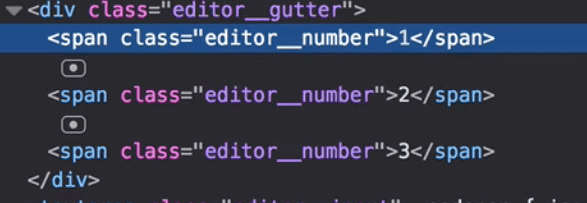
We want the numbers in the gutter to go on each of their own lines.
.editor__number {
  display: block;
  padding: 0 10px;
}
Add some styling to the editor ->
.editor__input {
  resize: none;
  background: none;
  border: 0;
  color: grey;
  font-size: 16px;
  line-height: 19px;
}
Finally we need to style the footer.
.settings {
  padding: 5px;
  background: black;
  border-top: 1px solid grey;
}
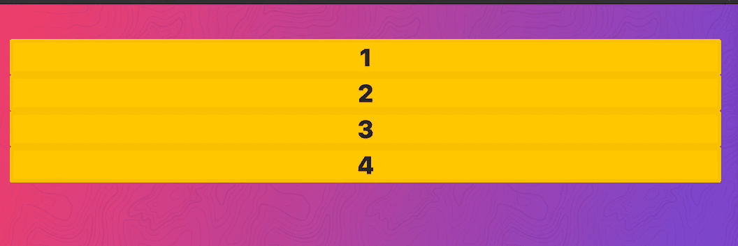
23 - Bootstrappy Grid with CSS Variables
We are going to create a more rigid grid in this exercise similar to bootstrap grid.
Starting point ->
 <div class=“grid”>
    <div class=“item”>1</div>
    <div class=“item”>2</div>
    <div class=“item”>3</div>
    <div class=“item”>4</div>
  </div>

  <style>
    .grid {}
  </style>
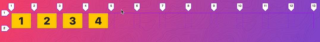
Add
.grid {
  display: grid;
  grid-gap: 20px;
  grid-template-columns: repeat(12, 1fr);
}
One issue here is if one of the items has more content, such as below, they are no longer even sizes.
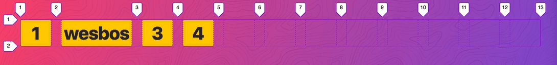
If you try to use % or calc, it still doesn’t work ->
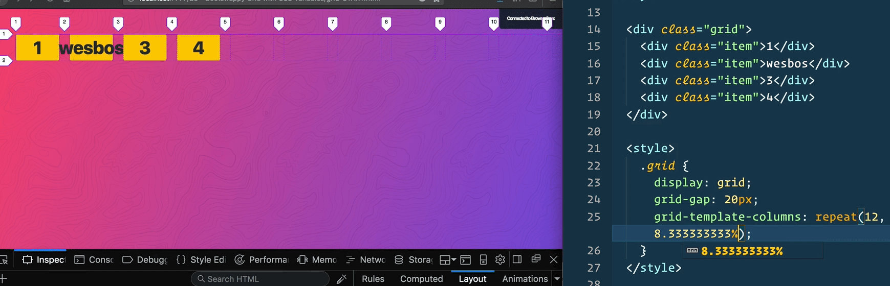
One fix for that is go into the item and give it a min-width of 0 and deal with overflowing text accordingly.
.item{min-width: 0;}

Another way to do this is to modify
.grid {
  ... grid-template-columns: repeat(12, minmax(0, 1fr));
}

.item {
  width: 100%;
}

Next we are going to work on spanning the different items.
We can do this using css variables.
.item {
  min-width: 0;
  width: 100%;
  --span: 1;
  grid-column: span var(--span);
}
And in the html overwrite that variable like so ->
<div class=“item” style=“—span:3;”>2</div>

You could also do something similar with cols. Instead of setting the number of columns in the css explicitly, we could do something like this ->
grid-template-columns: repeat(var(—cols, 12), minmax(0, 1fr));Where 12 is the fallback if no variable is provided and then in the html modify like so ->
<div class=“grid” style=“—cols:10;”>
Next we will make the second item span 7 so all the spaces are taken up and then we will make another nested grid inside of it.
<div class="item" style="--span:7;">
  <div class="grid" style="--cols:2;">
    <div class="items">1</div>
    <div class="items">2</div>
  </div>
</div>
You can use negative margins if you need to deal with the grid gap.
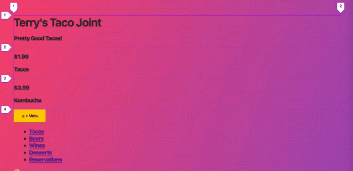
24 - Responsive Website Example
Goal ->
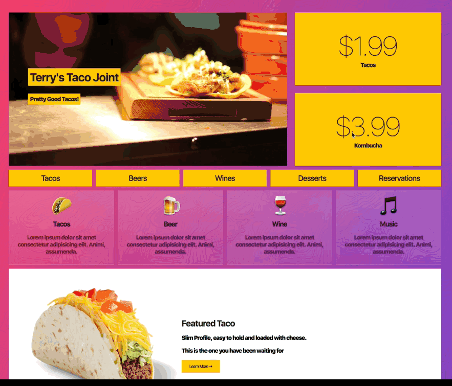
Starting Code ->
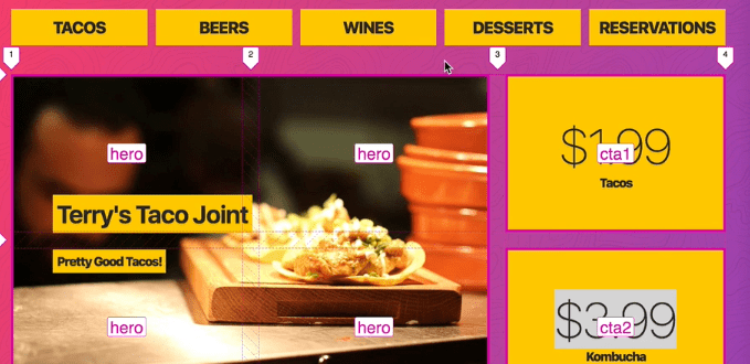
<div class=“wrapper”>
<div class=“top”>
<header class=“hero”>
<h1>Terry’s Taco Joint</h1>
<p>Pretty Good Tacos!</p>
</header>
<div class=“cta cta1”>
<p class=“price”>$1.99</p>
<p>Tacos</p>
</div>
<div class=“cta cta2”>
<p class=“price”>$3.99</p>
<p>Kombucha</p>
</div>
</div>
<nav class=“menu”>
<button aria-expanded=“false” aria-controls=“menu-list”>
<span class=“open”>☰</span>
<span class=“close”>×</span>
Menu
</button>
<ul id=“menu-list”>
<li>
<a href=“”>Tacos</a>
</li>
...
</ul>
</nav>
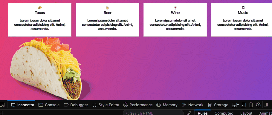
<section class=“features”>
<div class=“feature”>
<span class=“icon”>🌮</span>
<h3>Tacos</h3>
<p>Lorem ipsum dolor sit amet consectetur adipisicing elit. Animi, assumenda.</p>
</div>
...
</section>
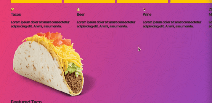
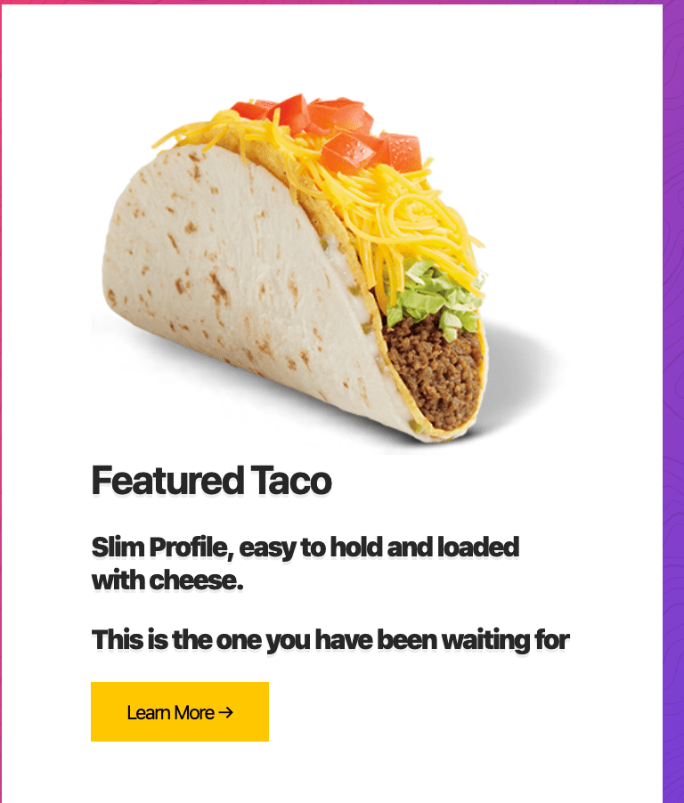
<section class=“about”>
<img src=“images/queso-taco.png” alt=“Yummy Taco” class=“about__mockup”>
<div class=“about__details”>
<h2>Featured Taco</h2>
<p>Slim Profile, easy to hold and loaded with cheese.</p>
<p>This is the one you have been waiting for</p>
<button>Learn More →</button>
</div>
</section>
<section class=“gallery”>
<h2>Instant Grams</h2>
<img src=“https://source.unsplash.com/random/201x201” alt=“”>
...
</section>
</div>body {
font-size: 15px;
}
button {
background: #ffc600;
border: 0;
padding: 10px 20px;
}
img {
max-width: 100%;
}
We will start with the top section and if we display grid on the top.
.top{
display:grid;}
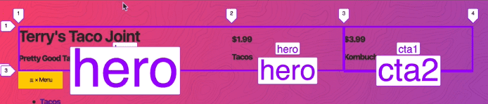
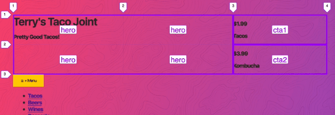
}Instead of defining the columns, we are going to define grid template areas.
Add
grid-template-areas:
  "hero hero cta1"
  "hero hero cta2";
It doesn’t look great here because we need to go ahead and select them.
.hero {
  grid-area: hero;
}
->
Cta1 and Cta2 automatically fall into place but we are going to place them anyway
.cta1 {
  grid-area: cta1;
}
.cta2 {
  grid-area: cta2;
}
Next we are going to style the hero like so ->
.hero {
  grid-area: hero;
  min-height: 400px;
  background: white url(images/taco.jpg);
  background-size: cover;
  background-position: bottom right;
  padding: 50px;
}

For the text, we want it like so ->

With grid, we make the hero a grid container, and the h1 and paragraph are the grid items.
.hero {
…
  display: grid;
  justify-content: start;
  align-content: center;
Which gives you this ->

However the issue is because it’s column based, the columns are going to be as wide as the widest one. That is how grid works. So instead of grid, we are going to use flex box.
  display: flex;
  flex-direction: column;
  align-items: start;
  justify-content: center;
}

When you want variable width is a good example of when you’d turn to flex box over grid.
Next we will do out CTAs. First add grid-gap:20px to .top
Give CTAs background color:
.cta {
  background: var(—yellow);
}

We want to center the text on the CTAs
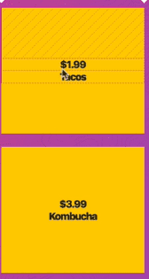
.cta {
  background: var(—yellow);
  display: grid;
  align-items: center;
  justify-items:center;
However now the grid items are stretching

We want the text to be together ->
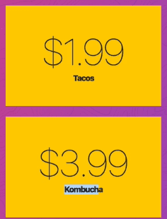
If you add align-content:center it will bring the text together and then if you add .cta p { margin:0;} it will give you this ->
Next we add some styling for the price
.price {
  font-size: 60px;
  font-weight: 300;
}
Moving onto navigation..
We want each of the menu items to take up as much space as they can, which is a good use case for our minmax values.
.menu ul {
  padding: 0;
  margin: 0;
  list-style: none;
  display: grid;
  grid-template-columns: repeat(auto-fit, minmax(100px, 1fr));
}

Instead of styling the li we are going to style the links.
.menu a {
  background: var(--yellow);
}
However that gives us ->
 And that is because link tags are inline by default so we need to add
 display:block ->

Add some more styling
.menu a {
  background: var(--yellow);
  display: block;
  text-decoration: none;
  padding: 10px;
  text-align: center;
  color: var(--black);
  text-transform: uppercase;
  font-size: 20px;
}
Add grid-gap:20px; margin: 20px 0; to .menu ul ->

Right now you can still see the menu, which should only be visible on mobile. We are using aria-controls to hide / expand the menu instead of a bunch of classes ->


We are use an attribute selector to display:none on the menu.
[aria-controls="“menu-list”"] {
  display: none;
}
Now we are going to move into the features section.
.features {
  display: grid;
  grid-template-columns: repeat(auto-fit, minmax(200px, 1fr));
}
Next we are going to style each feature to see if it’s responsive.
.features {
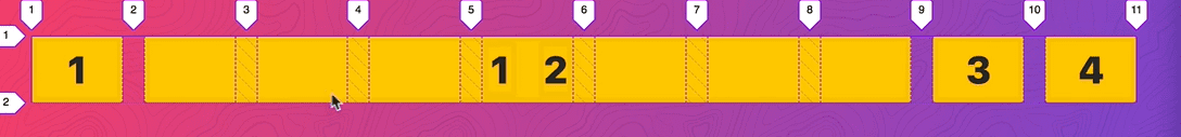
... grid-gap: 20px;
}
.feature {
background: white;
padding: 10px;
border: 1px solid white;
text-align: center;
box-shadow: 0 0 4px rgba(0, 0, 0, 0.1);
}
.feature .icon {
font-size: 50px;
}
.feature p {
color: rgba(0, 0, 0, 0.5);
}
Next we are moving onto the about section where we are displaying the taco.
We want the image to be 400px wide and the text take up the remaining space.
.about {
  background: white;
  padding: 50px;
  display: grid;
  grid-template-columns: 400px 1fr;
}

We want to vertically center everything. Add align-items:center;

Instead of adding margin on everything, we are going to take our wrapper and make it display grid, not put any columns in it and give it a grid gap to all the grid items. This will also allow use the order property to rearrange things on mobile.
Now we are working on gallery.
We are going to make it a grid and we want all the items to display 200px minimum and 1fr maximum.
.gallery {
  display: grid;
  grid-template-columns: repeat(auto-fit, minmax(200px, 1fr));
}
All the images are slightly different sizes so we need to account for that. Add grid-gap:20px and .gallery img { width:100%}

We want the h2 to span all the way across however it’s a grid item.
What we will do is make it span all the way across ->
.gallery h2 {
  grid-column: 1 / -1;
}

However we want this type of effect ->

We are going to make the h2 display:grid and use a before and after attribute which are considered grid items along with the content inside of the h2.
.gallery h2 {
  grid-column: 1 / -1;
  display: grid;
}

.gallery h2::before,
.gallery h2::after {
  display: block;
  content: "";
  height: 10px;
  background: #ffc600;
}

We want the text to be in the middle and have the before and after split whatever is left over. Add to the h2 grid-template-columns: 1fr auto 1fr;

Add to the h2
align-items: center;
grid-gap: 20px;

However we want these to be gradients.

.gallery h2::before,
.gallery h2::after {
  display: block;
  content: “”;
  height: 10px;
  background: linear-gradient(
    to var(—direction, left),
    var(—yellow),
    transparent
  );
}

.gallery h2::after {
  —direction: right;
}
Now we will start on the responsive portion.
As we get smaller, we want to put the CTA underneath the banner image and make the banner image span across.
@media (max-width: 700px) {
  .top {
    grid-template-areas:
      “hero hero”
      “cta1 cta2”;
  }
}
Under 500px we want to make them go one after the other like so ->
@media (max-width: 500px) {
  .top {
    grid-template-areas:
      “hero”
      “cta1”
      “cta2”;
  }
}

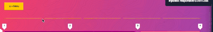
Next is the menu. When we hit 1000pixels, we want to flip the menu to the top.
@media (max-width: 1000px) {
  .menu {
    order: -1;
  }
}
Because menu is a direct descendent of our wrapper, by putting order: -1 it will put it above the actual top.
We want to re-show the menu button
[aria-controls="“menu-list”"] {
  display: block;
  margin-bottom: 10px;
}
Next we add ->
 .menu ul {
    max-height: 0px;
    transform: rotateX(90deg);
    transition: all 0.5s;
  }
Which hides the menu items by rotating them up. When we click the buttons it will hide and show the items.
When the button is clicked, we need the aria-expanded to be set to true or false.
We are going to do that with javascript.
    <script>
      const navButton = document.querySelector(“button[aria-expanded]”);

      function toggleNav() {
        console.log(“TOGGLE!”);
      }

      navButton.addEventListener(“click”, toggleNav);
    </script>
Now we are going to destructure the target.
function toggleNav({ target }) {
  console.log(target)
}
The target is the button itself, the thing that was clicked.
Now we want to get the aria expanded attribute.
function toggleNav({ target }) {
        const expanded = target.getAttribute("aria-expanded");
      }
The attribute returns a string true or false, not a boolean.
const expanded = target.getAttribute(“aria-expanded”) === true || false;Now we want to set the attribute of aria expended to be the opposite of the expanded value.
navButton.setAttribute(“aria - expanded”, !expanded);That is all the js we need
Now we go back to the 1000px media query and say when aria expanded=true, the unordered list that comes after it we are going to display grid on it.
  [aria-expanded=“true”] ~ ul {
    display: grid;
    max-height: 500px;
    transform: rotateX(0);
  }
What you can do is select the parent of the unordered list .menu and give it perspective:800px; and add to .menu ul { overflow:hidden}

The reason we added .menu ul{ max-height:0} and [aria-expanded=“true”] ~ ul { max-height: 500px }
Without it, it won’t slide up the menu, you’ll see something like this ->
Next is the x value on the menu

We want to hide and show them.
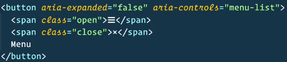
In the max 1000px media query, add the following
[aria-expanded="“false”"] .close {
  display: none;
}
[aria-expanded="“true”"] .close {
  display: inline-block;
}
[aria-expanded="“true”"] .open {
  display: none;
}
This will hide the x when it is closed, and show the x when the menu is open.
Next is our taco. We will add the code for our 700px media query and make the taco one column instead of the two.
@media (max-width: 700px) {
  …
  /*About*/
  .about {
    grid-template-columns: 1fr;
  }
}
25 - Full Bleed Blog Layout
We will be building a blog layout. CSS grid is good for position text as well as creating a full application layout.
Starting Point:
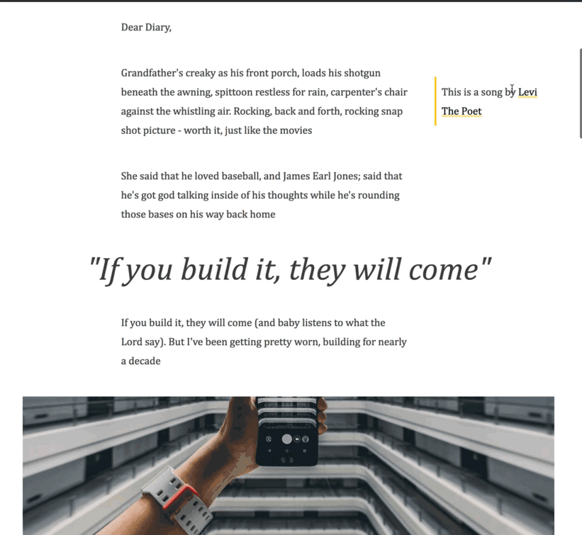
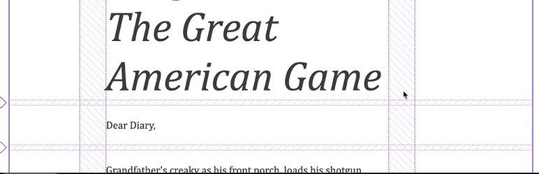
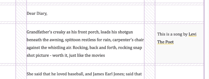
<article class="post">
<h2>Chapter Three: The Great American Game</h2>
<p>Dear Diary,</p>
<p>Grandfather's creaky as his front porch, loads his shotgun beneath the awning, spittoon restless for rain, carpenter's
chair against the whistling air. Rocking, back and forth, rocking snap shot picture - worth it, just like the movies</p>
<div class="tip tip-right">
<p>This is a song by
<a href="http://levithepoet.net/">Levi The Poet</a>
</p>
</div>
<p>She said that he loved baseball, and James Earl Jones; said that he's got god talking inside of his thoughts while he's
rounding those bases on his way back home</p>
<blockquote>
<p>"If you build it, they will come"</p>
</blockquote>
<p>If you build it, they will come (and baby listens to what the Lord say). But I've been getting pretty worn, building
for nearly a decade</p>
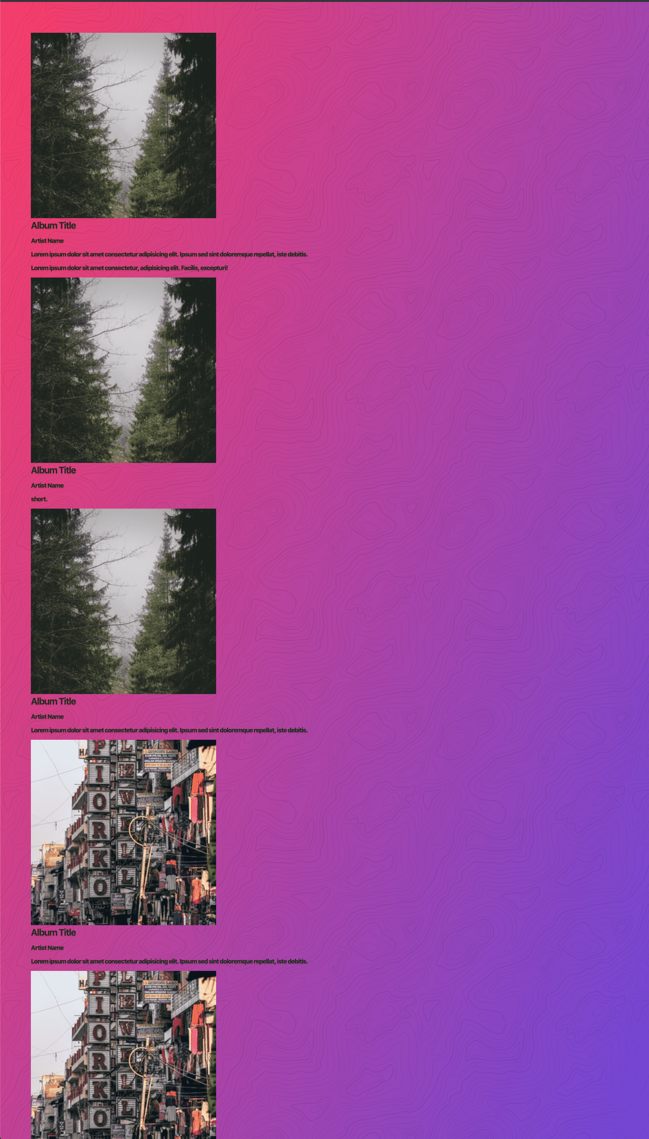
<figure>
<img src="https://source.unsplash.com/1000x300" alt="Big Ass Image">
<figcaption>Super Nice Photo</figcaption>
</figure>
<style>
:root {
--yellow: #ffc600;
}
html {
color: #444;
font-family: Cambria, Cochin, Georgia, 'Times New Roman', Times, serif;
font-size: 20px;
}
p {
line-height: 1.8;
}
img {
max-width: 100%;
}
a {
color: black;
text-decoration: underline wavy var(--yellow);
}
h1,
h2 {
font-size: 80px;
font-style: italic;
font-weight: 100;
margin: 0;
}
</style>

What we are going to do is take the post and make it a three column grid. Most of the content will take up the centre column, images will sometimes span all three across.
We will take the .post and make it display:grid, and put max-width: 1000px and margin:200px auto;.
To make the grid, we are going to make three columns. Initially Wes though to do it with grid-template-columns:15% 60% 25%; grid-gap:20px , however the issue there is grid-gap will give you horizontal scroll because it is added on top of the grid column sizes, not taken away from it.
Since all the percentages are base 5, we can turn them into frs.
grid-template-column: 3fr 12fr 5fr Now everything will add up regardless of how much grid-gap is being added.
Modify the grid-gap to be 10px 50px so the column gaps are 50px but the row gaps are 10px.
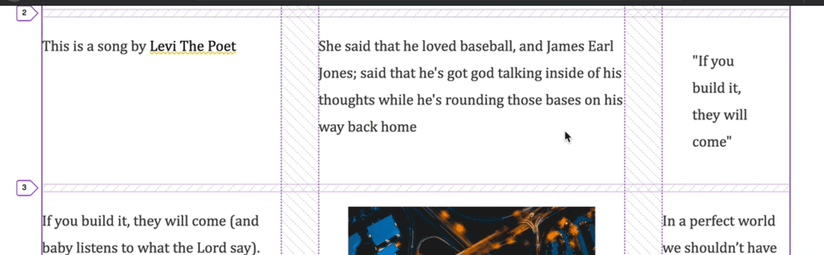
Now we have a problem where every single paragraph/element is taking up a spot. What we need to do is select all of the elements and put them in the centre column.
We want to select every single direct child of the .post element. We are going to start at 2, and span 1.
.post > * {
  grid-column: 2 / span 1;
}
We can also write it like grid-column: 2 / -2 which is more resilient because if more columns are added, it will still span up till two from the end. We want the gutters empty, and all the content in the middle.
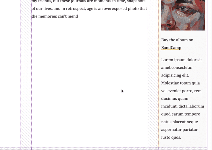
Next we are going to start working with the figures. We want them to span all the way across.
Add ->
.post > figure {
  margin: 0;
  grid-column: 1 / -1;
}
figcaption {
  font-size: 10px;
}

Next we are going to work on the block quotes that we have. We want them to span all the way across.
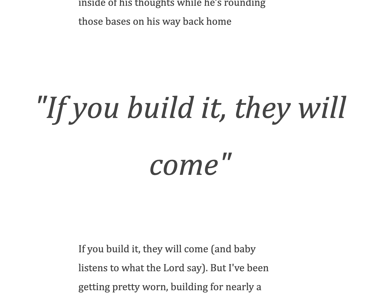
.post > blockquote {
grid-column: 1 / -1;
font-style: italic;
font-size: 60px;
text-align: center;
margin: 0;
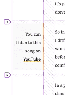
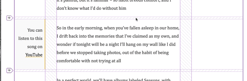
}Next we have the tips which we want to go to the left or the right. What they should do, is go into the actual gutters.
.tip {
  background: #fafafa;
  padding: 10px;
}
.tip-left {
  grid-column: 1 / span 1;
  text-align: right;
  border-right: 2px solid var(--yellow);
}
For the left tips, we want to start at one and only span one space. The rest of the content will fill up that space because we have told all the children to go into the center column.
Next we do the right tip. We want it to span 1, and end at the last one.
.tip-right {
  grid-column: span 1 / -1;
  border-left: 2px solid var(—yellow);
}
One thing is if there is a lot of content in the right/left tip for example, it will force the other columns to have a lot of empty space, which is just how grid works.
One thing you could do is, if you know you don’t have a bunch of tips one after the other, you could also make the tips span a couple of rows each.
.tip {
  background: #fafafa;
  padding: 10px;
  grid-row: span 3;
}
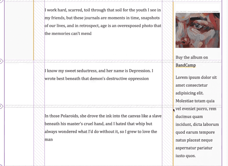
One issue is if a tip doesn’t have a lot of content it will span unnecessarily like so ->

To fix that, you could add align-self:start and it will only go as high as it needs to instead of stretching high ->