- Intro
- Working with Flex-Direction
- Wrapping Elements with Flexbox
- Flexbox Ordering
- Flexbox Alignment + Centering with Justify-Content
- Alignment and Centering with align-items
- Aligning and Entering with align-content
- Aligning and Centering with Align-Self
- Understanding Flexbox Sizing with the flex property
- Understanding flex box flex-grow, flex-shrink and flex-basis
- Flex Basis and Wrapping Work Together
- Cross Browser Flexbox Support - Old Flexbox vs New Flexbox
- Code Along
- Mobile Content Re-ordering with Flex-box
- Nesting Flexbox Vertical and Horizontal Centering with FlexBox
- FlexBox Equal Height Columns and Leftover Elements
- Flexbox Pricing Grid
- Flex Single Line Form
- Make a Mobile App Layout with Flexbox
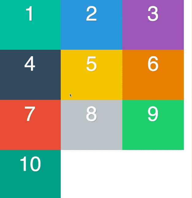
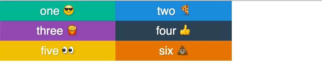
Intro
There is a flex container and flex items.
You give the container the class display:flex
The immediate children become flex-items without having to write any css.
Working with Flex-Direction
The default is flex-direction:row

flex-direction: column

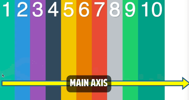
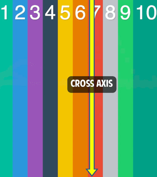
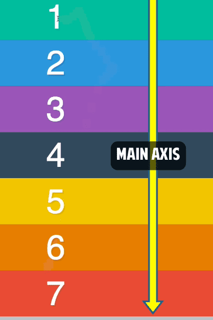
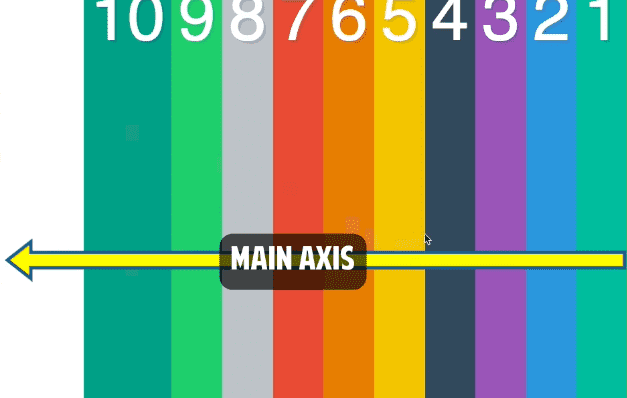
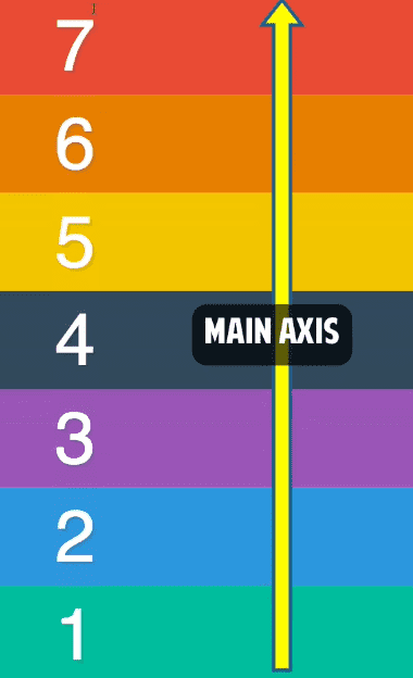
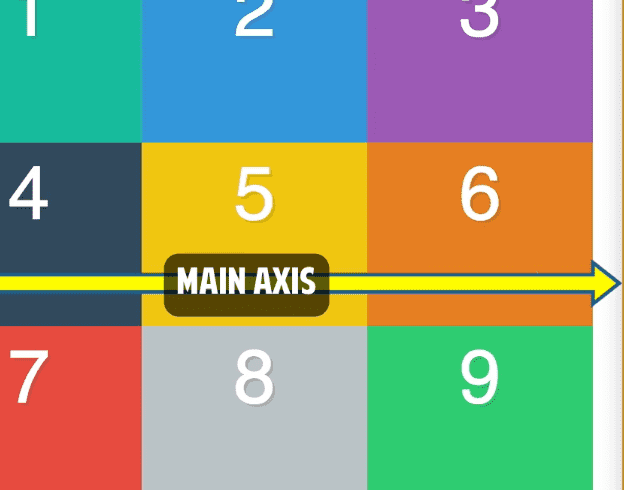
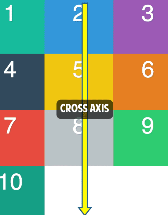
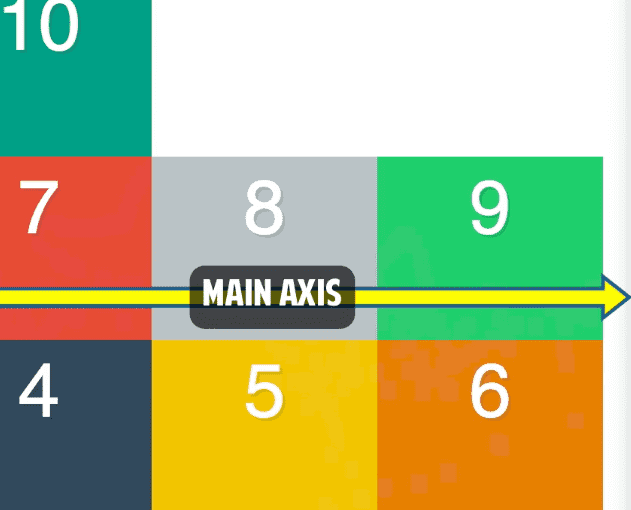
When we are defining things as flex-direction: row and flex-direction:column we have two axises. The main axis and the cross axis.
The main axis on rows is left to right
The cross axis for flex-direction: rows is top to bottom:
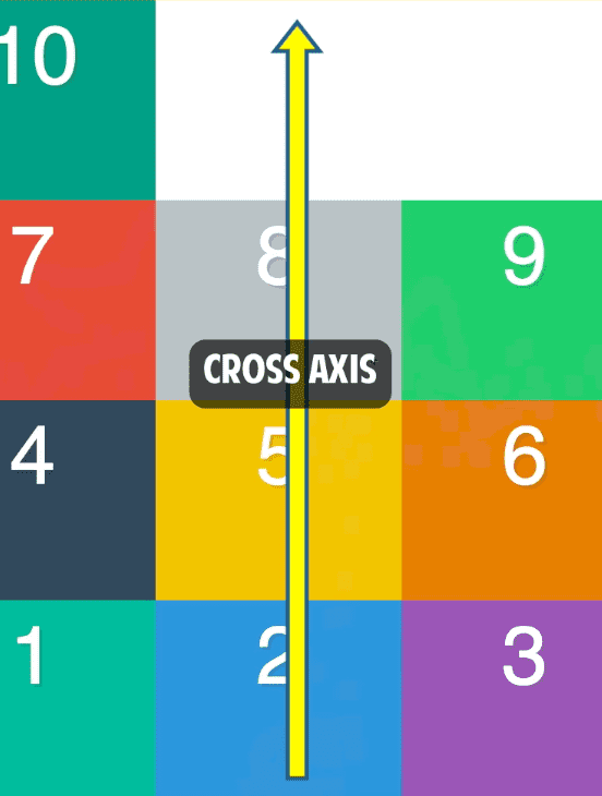
For columns, it’s the opposite.
There is also flex-direction: row-reverse
For flex-direction: column-reverse
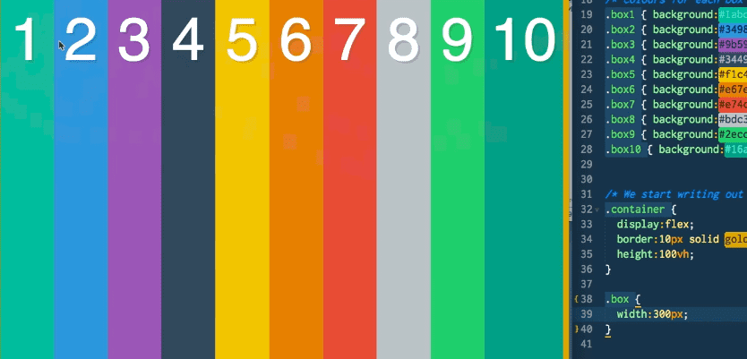
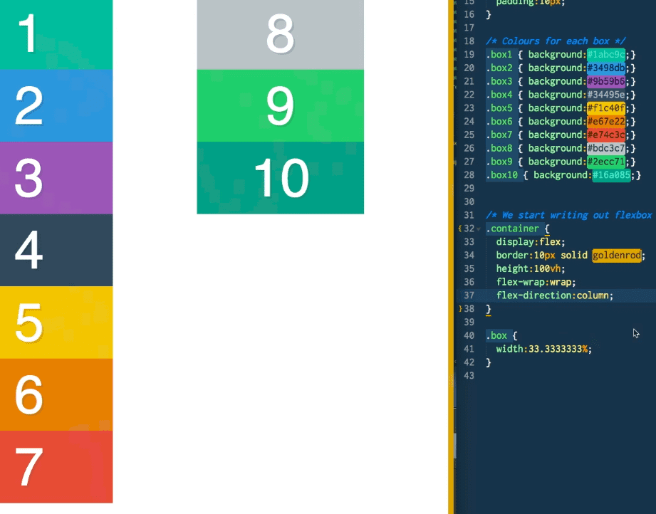
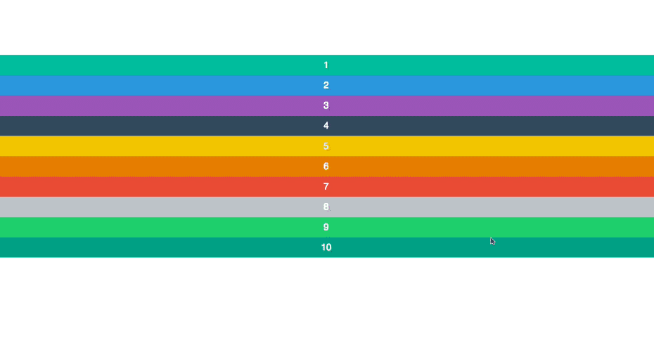
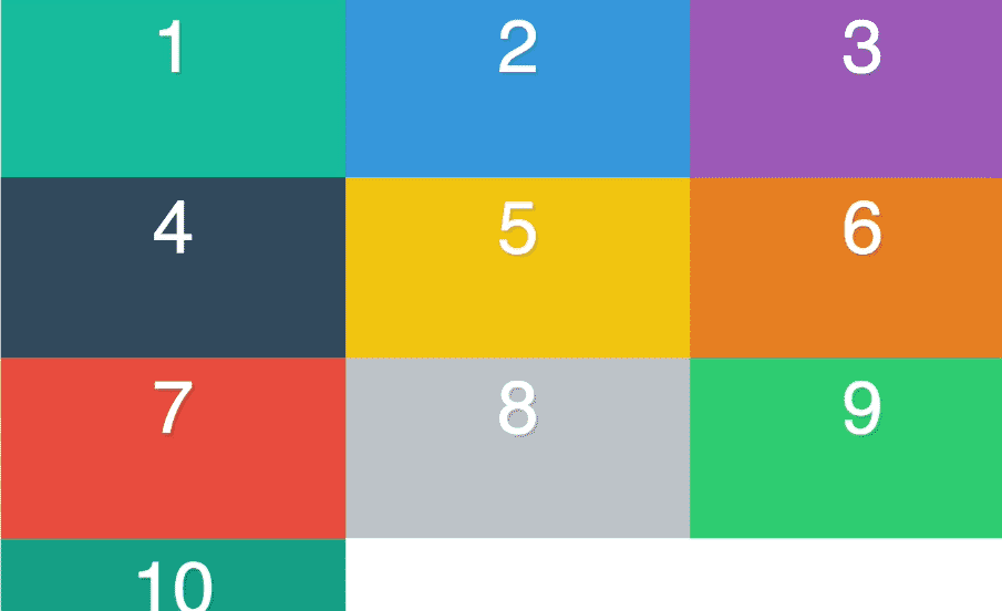
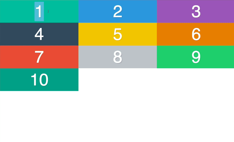
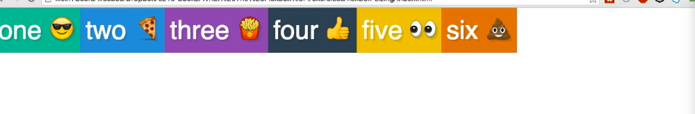
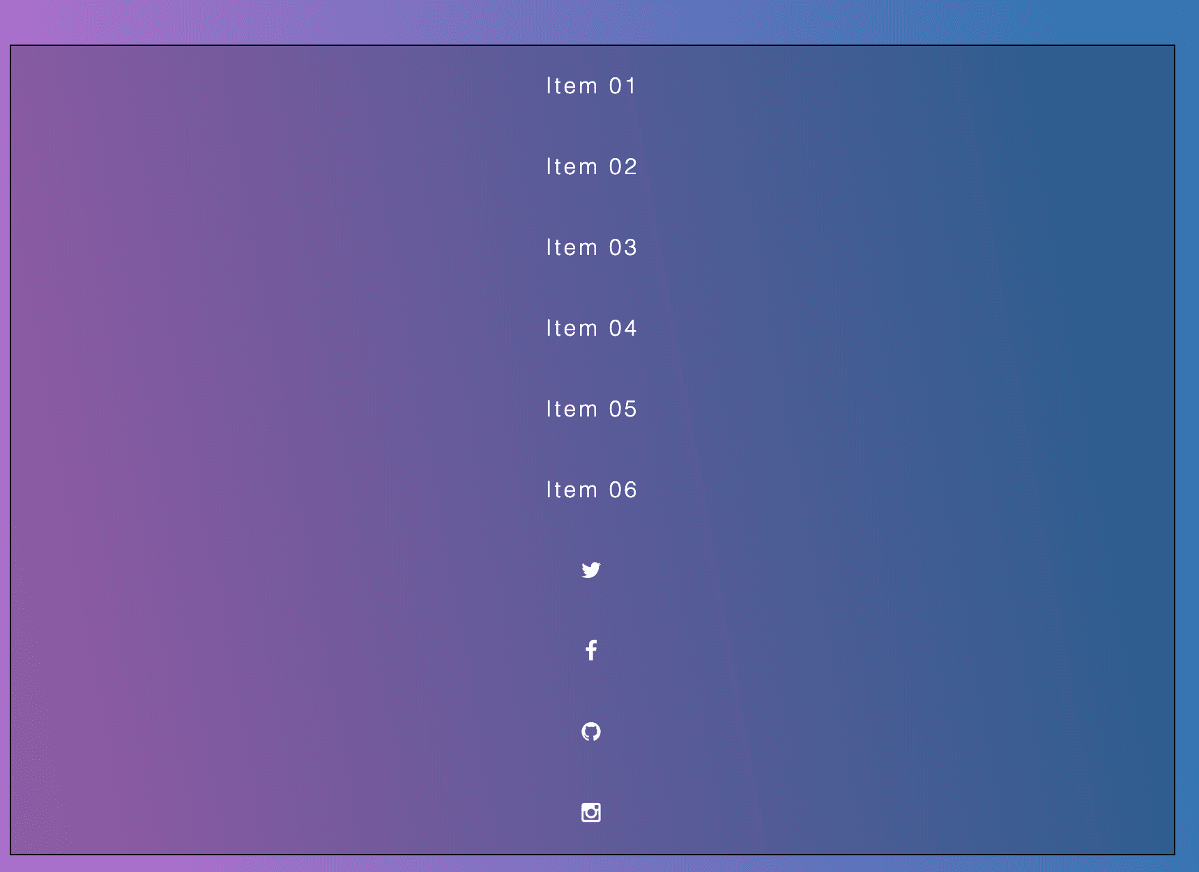
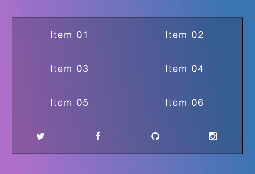
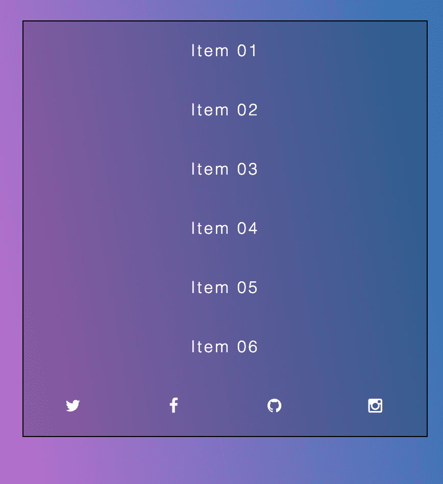
Wrapping Elements with Flexbox
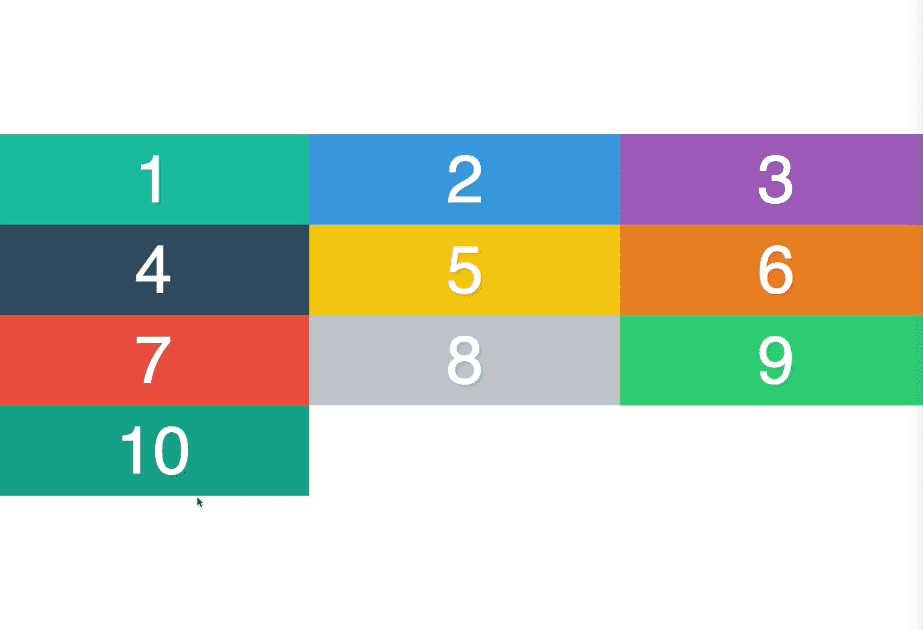
We are going to select each flex item and give them a 300px width. What happens? See image below. Width 300px was clearly not applied.
Flexbox tries to work with the widths you give it, but if it doesn’t work out it will evenly distribute it throughout the children or we will learn about flex property in future video where you can assign more or less to other ones.
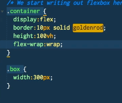
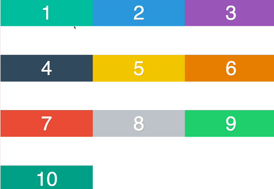
flex-wrap is applied on the flex container (not the items) and the default value is nowrap.
There is also the wrap value.
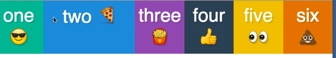
We didn’t set a height, that was done automatically. When we didn’t have the wrap on, each item was the entire length of the viewport. By default, the flex items will try to stretch across their container.
With flex-wrap, it says we need to stretch across our container but we also need to split it up between the 10 of us. The browser figure out we need four rows here, and then it splits it up evenly.
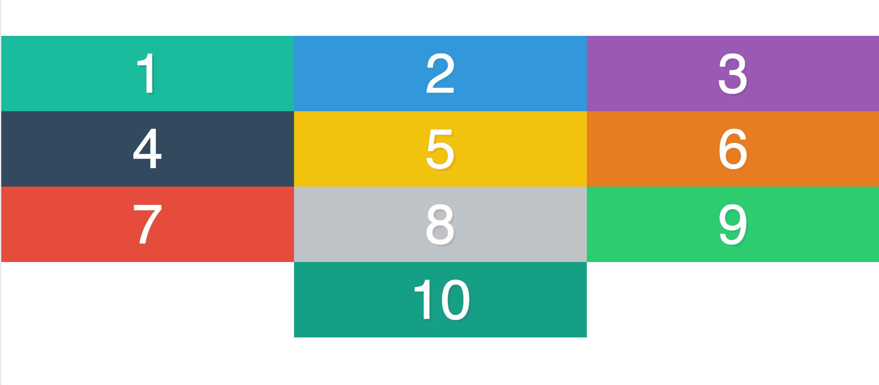
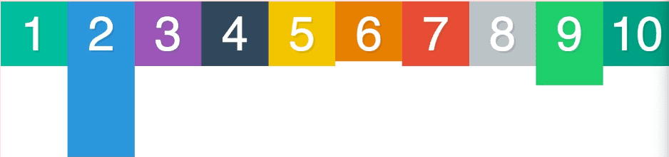
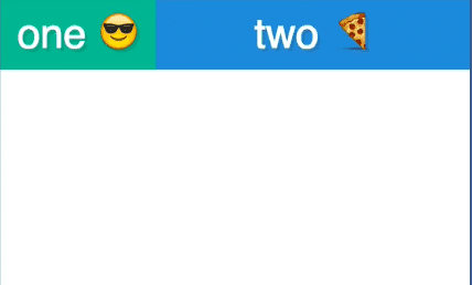
If we do flex-wrap:wrap-reverse the cross axis flips.
Main axis stays the same.
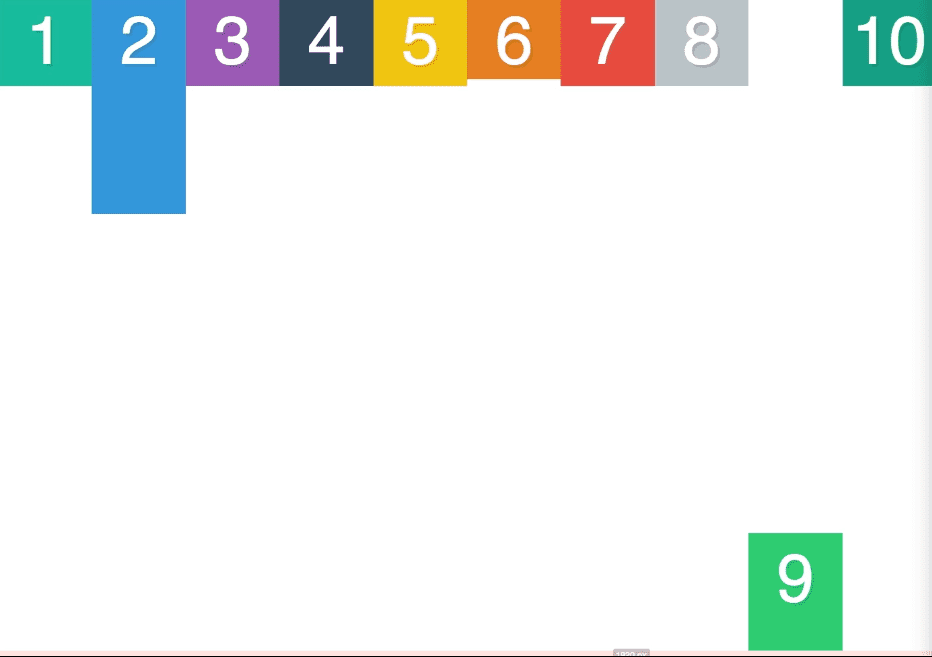
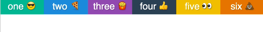
If you add flex-direction:column to the flex-wrap:wrap
It wraps to the new page because in our container we have height:100vh but if we had min-height:100vh the items would go past the screen instead of wrapping to the new .line.
If you add margin on a flex-item, it will break the calculation since margin is not part of the box model like so:

You could do a calculation like
width:calc(33.333333% - 20px); margin:10px; and then it would look like
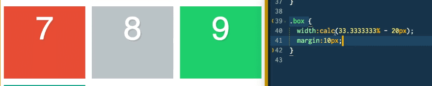
Padding (and border) are part of the box-model, so it would work.
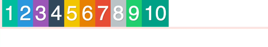
Flexbox Ordering
A way to move the order of DOM elements without actually moving them in the DOM.
You do that using the order css property.
The default is order:0
If you do
.box3{ order:1} the #3 box will go to the very end, because all the other items are order:0 by default.
If you also add .box7 { order:2} the #7 box will be at the end .

Negatives also work.
.box3 { order: -1 } .box7{order:-1} ->

If you put the out of order, when you try to copy the text, it will copy them out of turn so it will still copy 1, 2, 3, 4 even if you have ordered them 1,2,4,3. Not good for copying text.
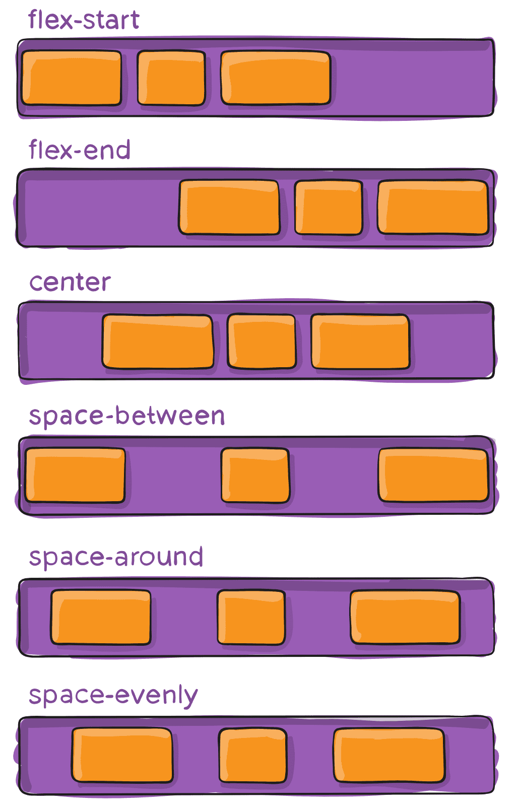
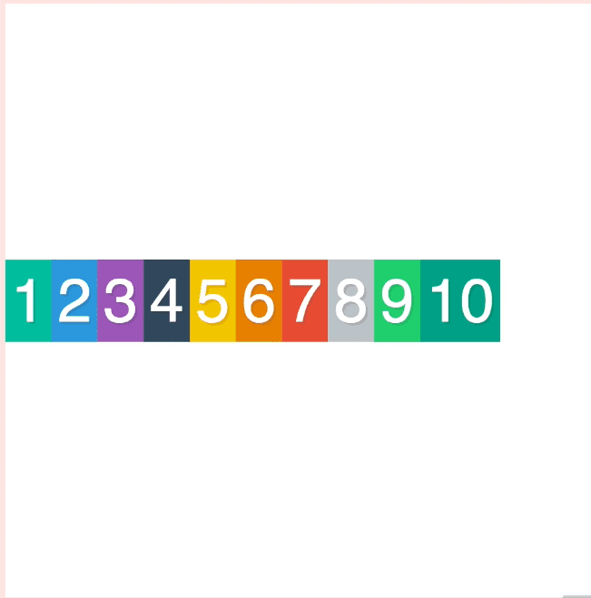
Flexbox Alignment + Centering with Justify-Content
A Complete Guide to Flexbox | CSS-Tricks
justify-content says how the items are aligned on the main axis.
The default is justify-content:flex-start;
Options are
 Html code:
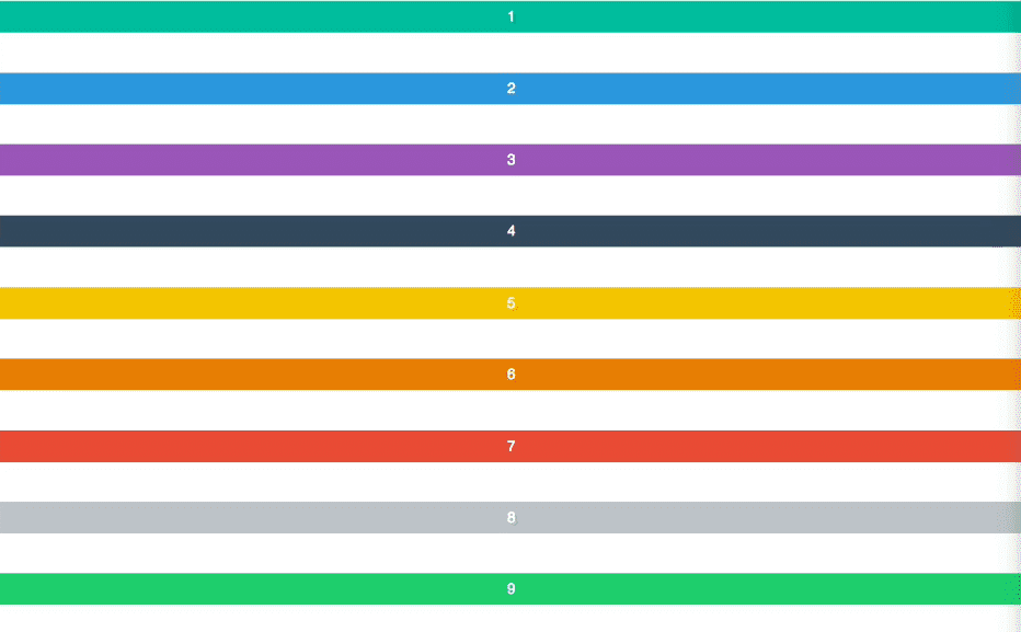
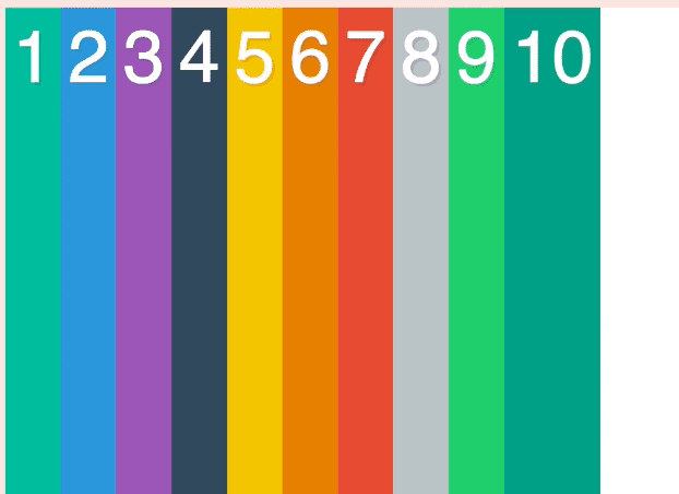
When you change the flex-direction:column it looks completely different.
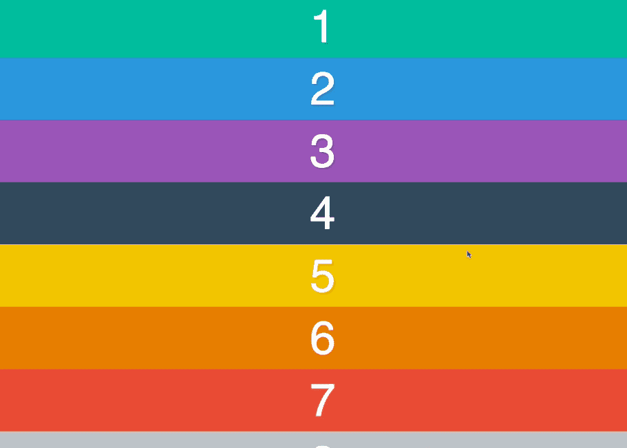
In order to take advantage of justify content when we switch main axis to column, is we need to give the container a height.
When you give the container a min-height on the column, like so:
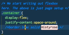
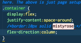
.container {
  display: flex;
  flex-direction: column;
  justify-content: space-around;
  min-height: 100vh;
  border: 10px solid mistyrose;
You get ->
To center you do
justify-content:center;
Alignment and Centering with align-items
Deals with the cross-axis.
People often get frustrated with align-items:center when there is no height in the container.
For example, this code doesn’t change the positioning at all
.container {
  display: flex;
  align-items: center;
  border: 10px solid mistyrose;
If you add height:100vh it looks like this:
The container must have some sort of height .
However, if you take off align-items, it will look like this:
That is because the default is align-items:stretch
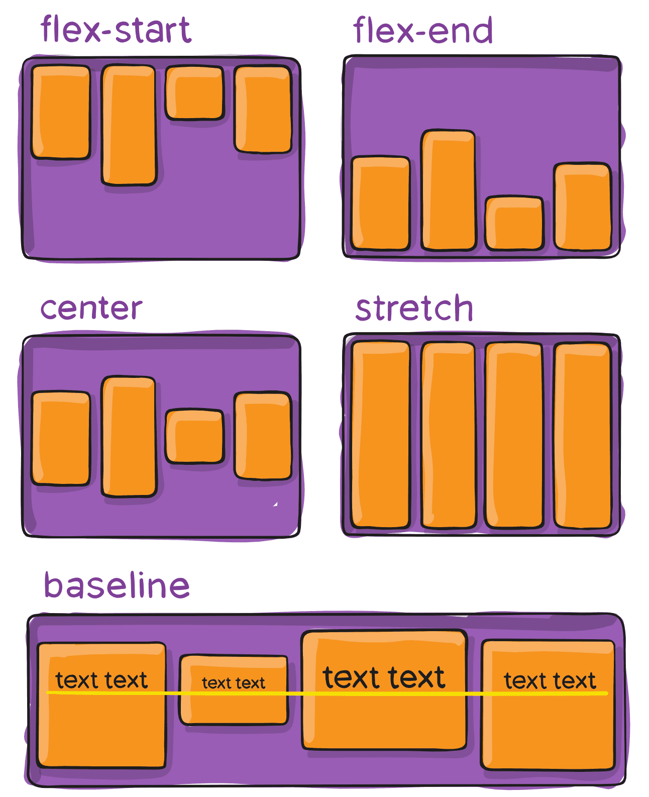
The baseline option aligns the bottom of all the text.
When you change the flex-direction to column
Aligning and Entering with align-content
What justify-content and align-content do is they look at the leftover whitespace and determine how to divvy it up.
With align-content, you can use the same values as justify-content.
justify-content takes up space on the main axis
align-content takes up space on the cross axis.
Align-content only works when we have multiple lines, and if figures out what to do with the extra space on the cross-axis.
To test this, we need to give the flex items a width (width: 33.3333%). However, that just evenly distributes them like so:
To get them on multiple lines we need to add
.container {
  flex-wrap: wrap;
}
Which gives us this:
The default is align-items:stretch
If you do align-content:flex-start you get
 The height of the items is no longer stretched, they instead become the height that they need (for the content and padding) .
If you add extra content in one of the items, the rest of the items in that row will grow to match the height, like so:
align-content: space-between ->
align-content: center ->
.container {
  display: flex;
  border: 10px solid mistyrose;
  height: 100vh;
  flex-wrap: wrap;
  align-content: center;
}
What if we want the 10 in the center? We can use justify-content because it works on the main-axis.
.container {
  display: flex;
  border: 10px solid mistyrose;
  height: 100vh;
  flex-wrap: wrap;
  align-content: center;
  justify-content: center;
}
Align-content needs a wrap in order to work, and it works on the cross axis which is by default top to bottom unless we use flex-direction to change that
Aligning and Centering with Align-Self
.container {
  display: flex;
  border: 10px solid mistyrose;
  height: 100vh;
  align-items: flex-end;
}

.box {
  width: 33.333%;
}

.box2 {
  padding-bottom: 200px;
}

.box6 {
  padding-bottom: 0;
}

.box9 {
  padding-bottom: 50px;
}

.container {
  display: flex;
  border: 10px solid mistyrose;
  height: 100vh;
  align-items: flex-start;
}
What if you wanted one of the flex-items to have sort of different attribute?
You use align-self !
In this example the container is set to flex-start
.box9 {
  padding-bottom: 50px;
  align-self: flex-end;
}
It’s exactly like align-items but you can apply it on a case by case basis on an individual flex item rather than the flex container.
Understanding Flexbox Sizing with the flex property
We are going to apply the property on the flex item this time, instead of the flex container.
What does flex do? It basically answers the question of what do I do with this extra space. Or what do I do when I don’t have enough space? It isn’t supposed to break your layout if you have too much space or not enough space.
by default they are set to width:auto which means they are as big as the content inside of them.
If you apply
.box{
	flex: 1
}
Then all the items will take up the exact amount of space.

If you give
.box2{
	flex: 2
}
You will see that it is twice the size of the other ones.
That is because we said if there is extra space (or there is not enough space) box2 should have double the amount of all the other ones.
If you make it more narrow, they will still try to even the width. If you have .box{flex:1} applied, it will look like this ->

If you also have .box2 { flex:2 } it will display the .box2 element as twice as large as the others in proportion.
This is with .box5 {flex:3}

When there is extra space, or not enough space, how do we divey that up.
Understanding flex box flex-grow, flex-shrink and flex-basis
The flex-property actually has more values packed into it
flex-grow
flex-shrink
flex-basis
When we have extra space ,how should we divide it by everyone on the same line.
Flex-grow : when you have extra space ,how much does it take Flex-basis : in ideal world, before we grow or shrink, how big should it be? How wide should the element be? Or how high if we have switched the axis.

.box1{ flex-basis: 400px }
.box2{flex-basis: 400px }
What happens when we have extra room? How should we divvy it up? That is what flex-grow is responsible for.
If you add flex-grow:1 to .box1, you will see .box2 is still 400px.
That means the default flex-grow property is 0.

If you do
.box2 { flex-grow: 2;
.box2 { flex-grow:1}

One is moved a bit more to the right because it gets twice as much extra space.
If you do
.box2 { flex-grow: 10;
.box2 { flex-grow:1}


.box1 {
  flex-basis: 400px;
  flex-grow: 1;
}

.box2 {
  flex-basis: 400px;
}
flex-shrink is how do we slim ourselves down when there isn’t enough space for everyone.
The default flex-shrink is 1.
When there is not enough room, evenly divide it amongst yourselves until everyone is happy.
Flex-shrink: how much of myself should I give up in proportion to the other one.
.box1 {
Flex-basis: 400px;
Flex-grow: 10;
Flex-shrink: 10
}

.box2 {
flex-basis: 400px;
flex-grow:1;
flex-shrink:1
}
You can do it short form
flex: shrink, grow, basis
flex: 10 5 400px
Flex Basis and Wrapping Work Together
How does it work when you change the direction of the axis or you have items that wrap.
.box {
flex-basis: 500px;
}
Flex-shrink is kicking in, that is why the items above even though set to 500px are only so big.
HOWEVER we can turn on flex-wrap:wrap on parent container.
However we have this extra space, how do you deal with it? Using flex-grow.
If you modify .box css to
.box {
flex-basis: 500px;
flex-grow:1
}
You get the following:

Flex-grow, shrink and basis only work on the row that they are on. They do not have any effect on the item before or after.
If you have the following code:
.container {
  display: flex;
  flex-wrap: wrap;
}

.box {
  flex-basis: 250px;
  flex-grow: 1;
}

.box3 {
  flex-grow: 10;
}
It will look like this:
If you change the flex direction to column, and take out the flex-basis and just add flex-grow to .box and .box3 for example, nothing will happen. That is because the container has no height.
However if you add min-height to the container you get
If you add .box{ flex-basis: 250px}, each items will expand.
.container {
  display: flex;
  flex-wrap: wrap;
  flex-direction: column;
  border: 10px solid goldenrod;
  height: 100vh;
}

.box {
  flex-basis: 250px;
  flex-grow: 1;
}

.box3 {
  flex-grow: 5;
}
Will look like ->
Cross Browser Flexbox Support - Old Flexbox vs New Flexbox
Flexbox has gone through 3 separate iterations and has different support on different browsers. We can just run our code through a compile step.
We write our code with the latest flexbox spec, and we put it into autoprefixer.github.io and it will prefix all the possible vendor prefixes and the older display box.
We are going to use gulp.js to watch our css and every time we save it will recompile it.
We need a package.json file. To create one, run npm init in whatever directory to create a package.json file.
Next, install gulp globally npm install gulp -g will install gulp globally. Sometimes you have to run sudo.
Now create a gulp file in the appropriate package.
In the directory run touch gulpfile.js and install a couple of plugins..
Run npm install gulp —save-dev which should save gulp to your packages.json file.
Next run npm install gulp-autoprefixer —save-dev
In the gulp file you write:
//import plugins
var gulp = require(‘gulp’);
var autoprefixer = require('gulp-autoprefixer');
//create task.. takes two parameters, name and function
gulp.task('styles', function(){
//now we need to source our files
//run it through our plugins and kick it out the other end in another file
gulp.src('css/styles.css')
	.pipe(autoprefixer());
	.pipe(gulp.dest('build))
});
Now when you run gulp styles it will compile the css and add it to the /build directory. In your html, you want to link to the css in the build directory not on the /styles directory.
Now we are going to add a watch task so we don’t need to rerun gulp styles, we want it to run automatically.
Create another task called watch
gulp.task('watch', function(){
//pass it the files that you wish for it to watch, and when those change you can pass it an array of gulp tasks to run
gulp.watch('css/styles.css', ['styles'])
})
Now in the command line you can run gulp watch and whenever you update the css it will recompile it.
Code Along
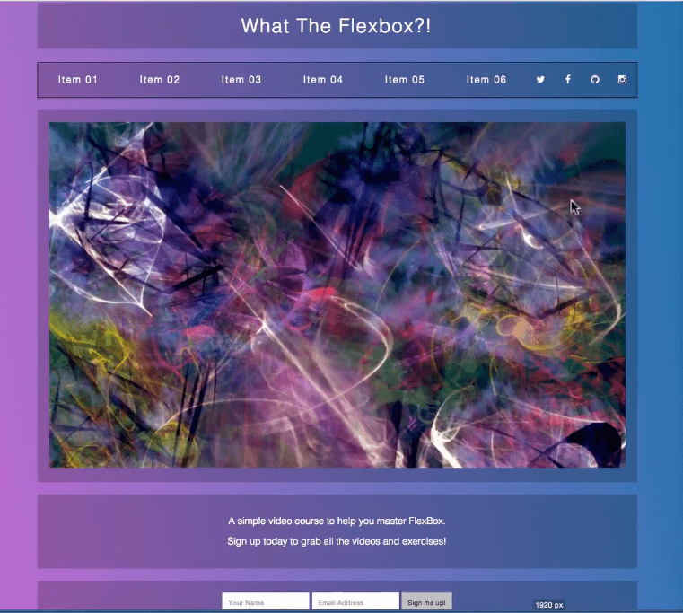
We will be creating a nav using flex box in this tutorial
Box-sizing: CSS box-sizing — Control how width and height are applied - CSS: Cascading Style Sheets | MDN whether border and padding are added in addition to the width and height or are the border and padding included already in the width.
For example, box-sizing: content-box if you set the width of the element to be 100px, any border and padding will be added to the final rendered width. For box-sizing:border-box if the element width is 100px, that 100px will include any padding or border. The content-box will shrink to absorb that extra width.
We have the following structure:
div.wrapper
	nav.flex-nav
		ul
			li
			li
			li
			etc..
			li.social
			li.social
			etc..
Currently looks like:
With this css:
/* Some CSS Setup - nothing to do with flexbox */
html {
box-sizing: border-box;
}
*,
*:before,
*:after {
box-sizing: inherit;
}
body {
font-family: sans-serif;
margin: 0;
background-image: linear-gradient(260deg, #2376ae 0%, #c16ecf 100%);
}
a {
color: white;
font-weight: 100;
letter-spacing: 2px;
text-decoration: none;
background: rgba(0, 0, 0, 0.2);
padding: 20px 5px;
display: inline-block;
width: 100%;
text-align: center;
transition: all 0.5s;
}
a:hover {
background: rgba(0, 0, 0, 0.3);
}
.wrapper {
max-width: 1000px;
margin: 0 auto;
padding: 50px;
}
/* Flex Container */
.flex-nav ul {
border: 1px solid black;
list-style: none;
margin: 0;
padding: 0;
}
@media all and (max-width: 1000px) {
}
@media all and (max-width: 500px) {
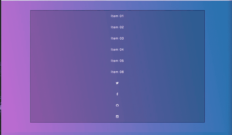
}When you add display:flex to the ul element it looks like:
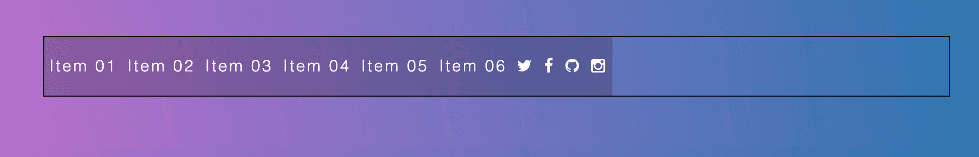
Next we add css style for individual list item:
flex-nav li {
flex: 1
}
And it looks like:
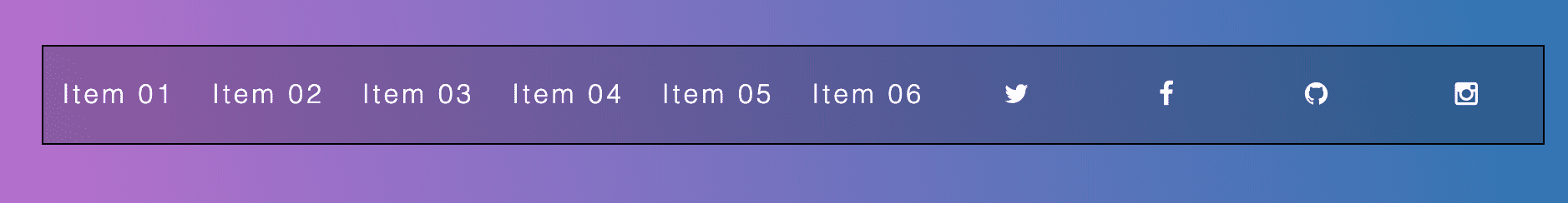
However the social links have too much space.
Modify the css like so:
.flex-nav li {
  flex: 3;
}

.flex-nav .social {
  flex: 1;
}
When we reach 1000pixels, we want them to stack vertically. One way to do that is to use flex-direction:column
If within a media query you do:
@media all and (max-width: 1000px) {
  .flex-nav ul {
    flex-direction: column;
  }
}
It would look like ->
However we want the social icons in a row even when the rest of the list items are stacked.
So we need to keep it as flex-direction: row (which is the default).
Instead, we will apply flex-wrap:wrap. However, we also need to give it some sort of width for wrapping to work. We will do that using the flex-basis property.
We say 1 and 1 for grow and shrink because we want the items to grow and shrink equally.
.flex-nav li {
    flex: 1 1 50%;
  }
  .flex-nav .social {
    flex: 1 1 25%;
  }
Tip: Don’t over qualify your selectors too much or else you will run into issues down the road
For under 500px, we want the list items to stack except for the social icons so add
@media all and (max-width: 500px) {
  .flex-nav li {
    flex-basis: 100%;
  }
}
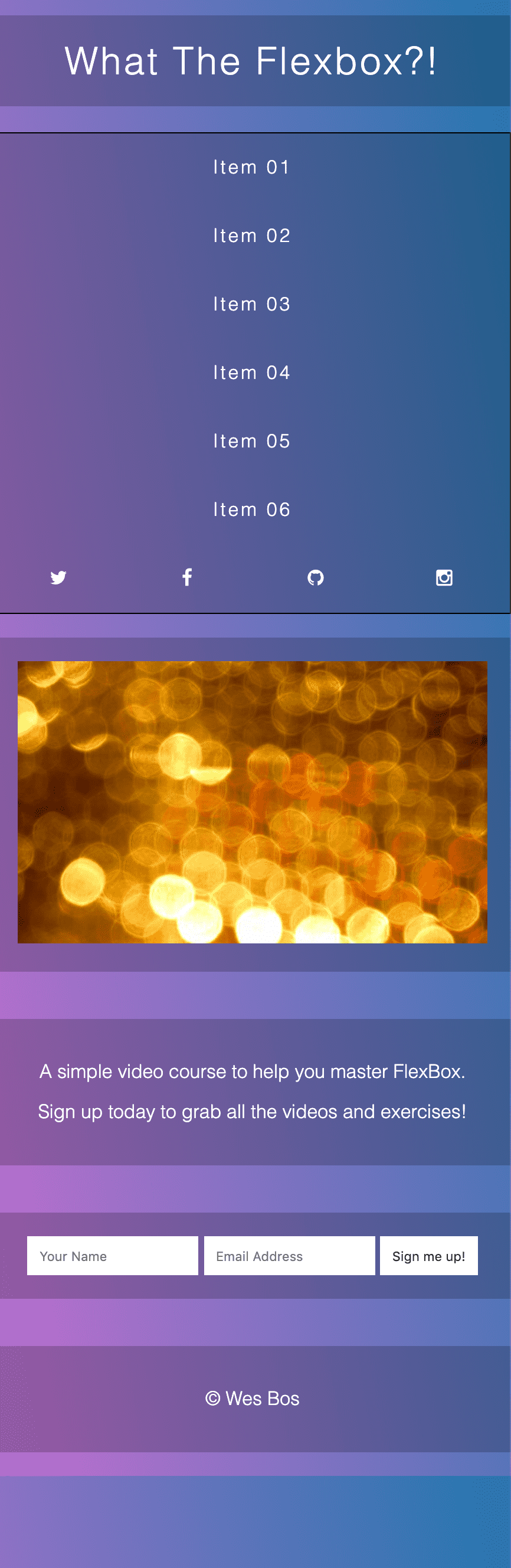
Mobile Content Re-ordering with Flex-box
In this exercise, we are using the same nav bar as in the previous exercise, with one addition
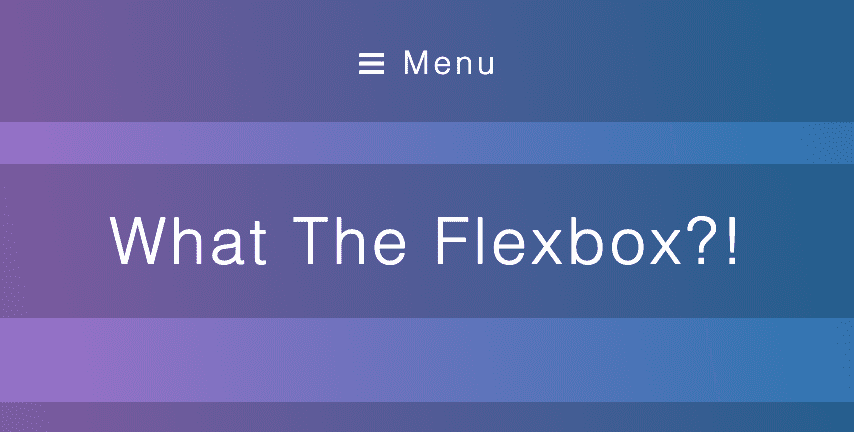
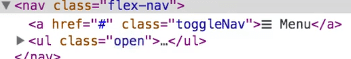
<a href=“#" class="toggleNav">☰ Menu</a>
This is what the layout looks like. There is a hero section, a details section, a signup section and then the footer.
We want it to look like this when it is under 500px
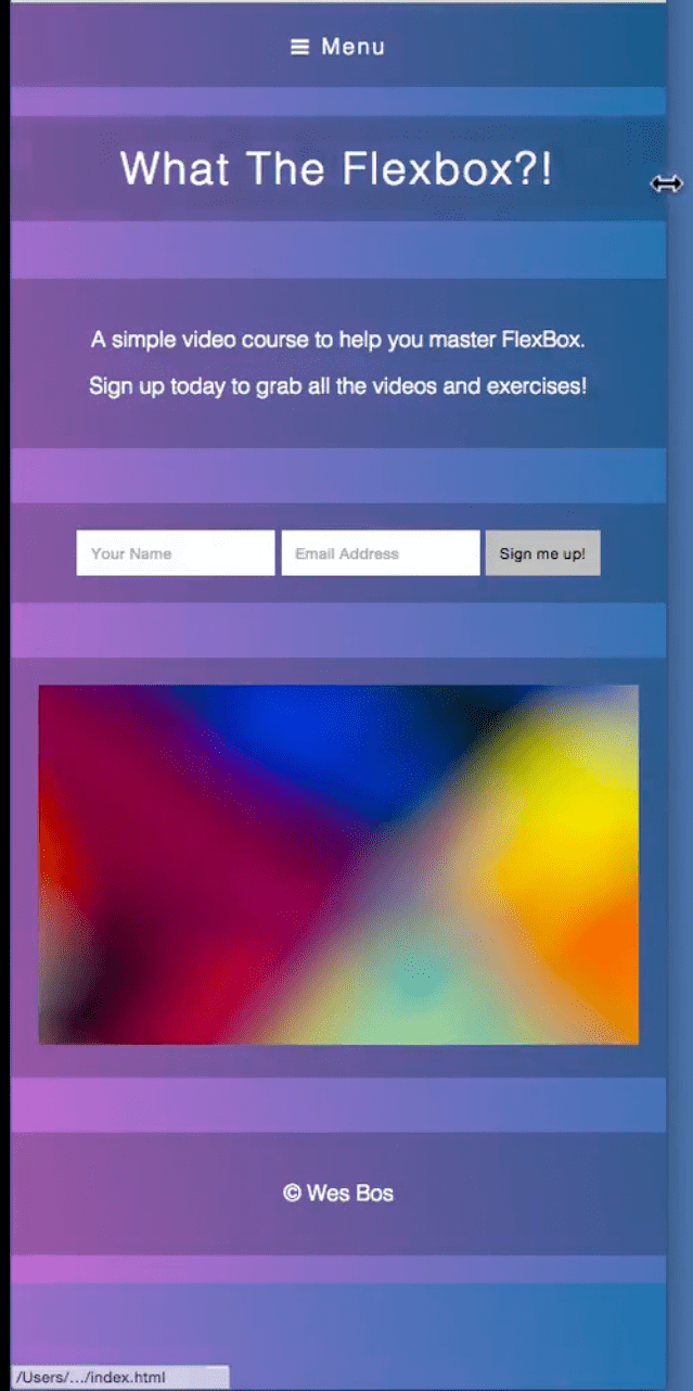
The menu goes to the top, and the details and signup section are re-ordered to be closer to the top.
One gotcha, we are using jQuery toggle.
In order to have flex-items, we need a flex container. We need to make the wrapper a flex-container.
@media all and (max-width: 500px) {
  .flex-nav li {
    flex-basis: 100%;
  }
  .wrapper {
    display: flex;
  }
}
Gives you:

It looks all jumbled, which we do not want. We need to swap the flex-direction.
.wrapper {
  display: flex;
  flex-direction: column;
}
Next we want to start applying ordering to each item.
First we will do it on our flex-nav, however if we just do .flex-nav { order:1} it will actually go to the bottom because by default the order of each element is 0.
What we need to do is put a default order on everything else. We will select every immediate child of the wrapper in order to select each flex item:
/* Flex Item */
.wrapper > * {
  order: 9999;
}
.flex-nav {
  order: 1;
}
We will put a large number for the order value, and what happens when every item has the same order is the order in which they appear in the DOM takes precedence.
Now the nav is at the top, however we want the hamburger menu to appear on mobile.
.toggleNav {
  display: block;
}

.flex-nav ul {
  display: none;
}
When you click the Menu, the class “open” is toggled on and off as a class to the ul element. (We are doing that with jQuery) When you use jQuery to toggle something it changes the display from display none to display block, but we can’t have that because we want display: flex so we have to toggle on a class.
We need to add this line to the media query:
  .flex-nav ul.open {
    display: flex;
  }
Now the menu shows when you hit “Menu”.
To change the order of the details and signup component we need to add the following code to the media query:
.top {
  order: 2;
}

.details {
  order: 3;
}
.signup {
  order: 4;
}
Nesting Flexbox Vertical and Horizontal Centering with FlexBox
Complex Layouts! For the slider, we have items for each slide and back and next button. We used flex box because we weren’t sure how many items would be added, and we want the arrows to take up less space.

Wes ran into an issue when trying to center the text and horizontally and vertically. However, there is a link that we also needed to stretch the entire width. The solution is nested flex box.
Starting with this code
    <div class="wrapper">
      <div class="slider">
        <img src="slide.jpeg" />
      </div>

      <nav class="slider-nav">
        <ul>
          <li class="arrow">
            <a href="#">←</a>
          </li>

          <li>
            <a href="#">Add a CLI to Node Apps with Vantage</a>
          </li>

          <li>
            <a href="#">NewSprint, Spectacle</a>
          </li>

          <li>
            <a href="#">Small Modules: Tales from a Serial Module Author</a>
          </li>

          <li>
            <a href="#">The End</a>
          </li>

          <li class="arrow">
            <a href="#">→</a>
          </li>
        </ul>
      </nav>
    </div>
And very basic css
html {
  box-sizing: border-box;
}

*,
*:before,
*:after {
  box-sizing: inherit;
}

body {
  font-family: sans-serif;
  margin: 0;
  background-image: linear-gradient(260deg, #2376ae 0%, #c16ecf 100%);
}

.wrapper {
  max-width: 1000px;
  margin: 0 auto;
  padding: 50px;
}

img {
  max-width: 100%;
}

a {
  color: white;
  text-decoration: none;
  font-size: 15px;
  background: rgba(0, 0, 0, 0.2);
  padding: 20px 5px;
}
a:hover {
  background: rgba(0, 0, 0, 0.4);
}

.slider-nav ul {
  list-style: none;
  margin: 0;
  padding: 0;
}

We are going to make the ul our flex container.
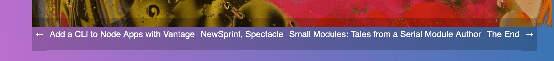
We want to make the flex items evenly spaced so we add:
.slider-nav li {
flex: 1;
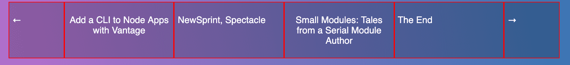
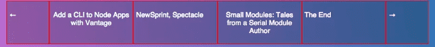
}However it looks strange, so we add a border to the flex items so we know what’s going on.

It looks like the li’s are taking up the appropriate space, however the a tags are not.
If you add
.slider-nav a {
  display: block;
  width: 100%;
}
It looks a bit better however we want the text both vertically and horizontally centered, and the arrows to be smaller.
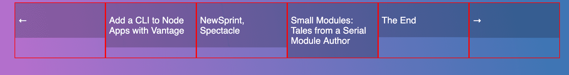
Starting with the arrows, change the other flex items to be flex:2 and add
.slider-nav .arrow {
  flex: 1;
}
Now we want to center the text. For each li, add text-align:center
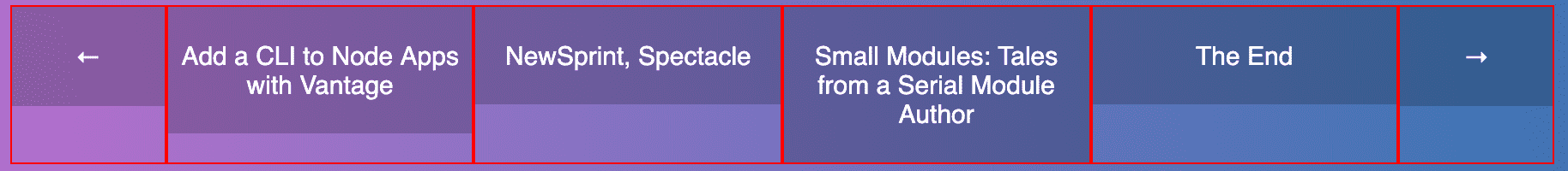
We want to center the items horizontally as well, and we should be able to use align-items:center to horizontally center them (on the cross-axis). Align-items is applied to the parent.
/*Flex Container*/
.slider-nav ul {
  list-style: none;
  margin: 0;
  padding: 0;
  display: flex;
  align-items: center;
}
That is not what we want. It depends on how much content is in there.. now they are just being resized.
By default, align-items is stretch, which means it span the height of the tallest one.
We want center and align-items stretch but you cannot do both.
We want to say is the list items and the links should stretch all the way, but vertically align the content within.
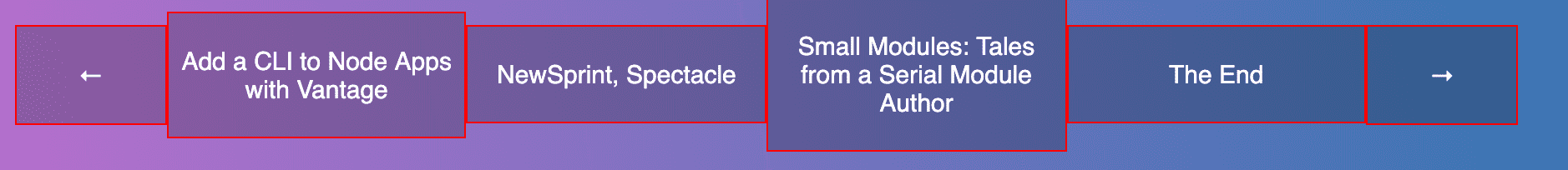
What we need to do is used nested flex box.
You can apply flex properties to a flex item, and also make it a container itself.
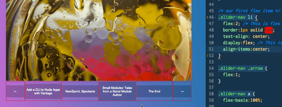
.slider-nav li {
  flex: 2; /* this is flexitem */
  border: 1px solid red;
  text-align: center;
  display: flex; /* this is flex container*/
}

Now the links within the li become flex-items.
We can take off the previous styling for the link and add:
.slider-nav a {
  flex-basis: 100%;
}
If you add align-items:center to the li container, it will center them like so
Using align-self:Center on the a tag also has the same effect.
What we need to do is make the link tags a flex container.
.slider-nav a {
  flex-basis: 100%;
  display: flex;
}
However the text-align:center doesn’t work anymore. And there is no flex-items as the children of the a tag because they just contain text content like so:
 <li>
     <a href=“#">NewSprint, Spectacle</a>
 </li>
What we need to do is add another element by wrapping the contents of each a tag inside of a span
Now we can add align-items:center to the a tag flex container like so:
.slider-nav a {
  flex-basis: 100%;
  display: flex;
  align-items: center;
Before align-items:center:
After align-items:center;

Now we have a few other issues like the weird 4th item and none of the text is centred.
By default, spans are inline-block but we want them to be block. We also have to add width:100%

FlexBox Equal Height Columns and Leftover Elements
Equal height columns and what to do with the extra columns at the end once they have wrapped
The layout is like so:
<div class="elements">
      <div class="item">You can tell the world you never was my girl</div>
      <div class="item">You can burn my clothes when I'm gone</div>
      <div class="item large">
        Or you can tell your friends just what a fool I've been
      </div>
We add flex to the wrapper
.elements {
  display: flex;
  flex-wrap: wrap;
}
And for the flex-items
.item {
  flex: 1 1 33.3%;
}
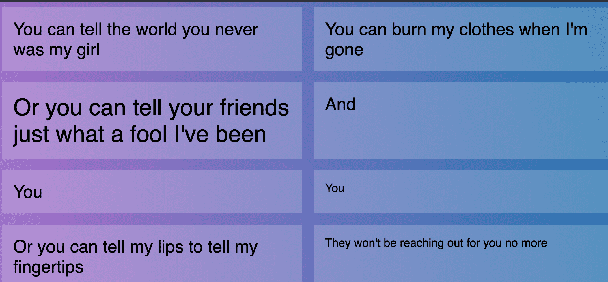
However there should be 3 columns since we split them up by 33.3% however there is padding so we need to use calc like so:
.item {
  flex: 1 1 calc(33.33% - 20px);
}
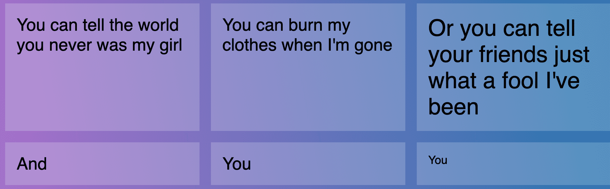
At the bottom, we have a number that is not easily divisible by 3 and the browser just splits up the extra space.

When we try to apply
justify-content:space-between to the flex container, nothing happens because we have told it to flex grow by evenly splitting the extra amounts. If we set flex-grow to zero, it will start working.
.item {
  flex: 0 1 calc(33.33% - 20px);
}

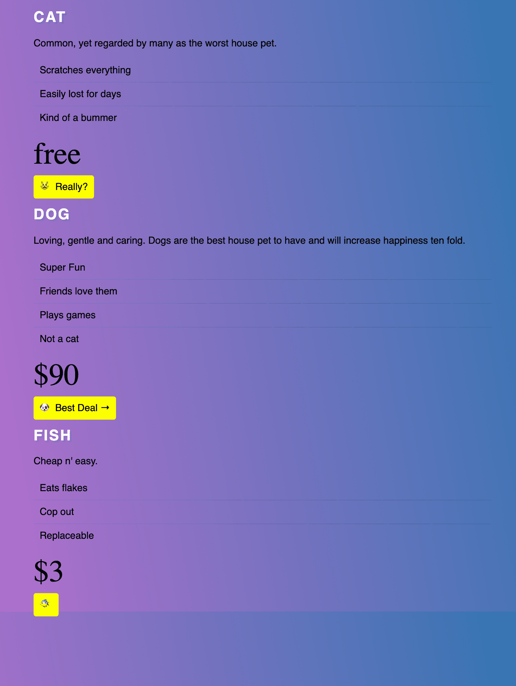
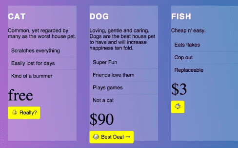
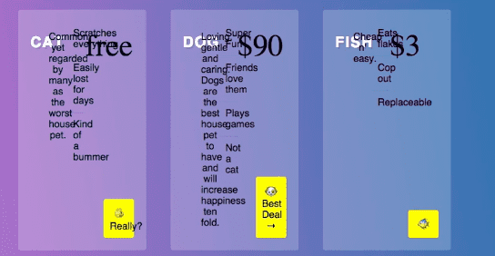
Flexbox Pricing Grid
Starting html
 <div class="pricing-grid">
      <div class="plan plan1">
        <h2>Cat</h2>
        <p>Common, yet regarded by many as the worst house pet.</p>
        <ul class="features">
          <li>Scratches everything</li>
          <li>Easily lost for days</li>
          <li>Kind of a bummer</li>
        </ul>

        <p class="price">free</p>

        <a href="#" class="cta">😾 Really?</a>
      </div>

      <div class="plan plan2">
        <h2>Dog</h2>
        <p>
          Loving, gentle and caring. Dogs are the best house pet to have and
          will increase happiness ten fold.
        </p>
        <ul class="features">
          <li>Super Fun</li>
          <li>Friends love them</li>
          <li>Plays games</li>
          <li>Not a cat</li>
        </ul>

        <p class="price">$90</p>

        <a href="#" class="cta">🐶 Best Deal →</a>
      </div>

      <div class="plan plan3">
        <h2>Fish</h2>
        <p>Cheap n' easy.</p>
        <ul class="features">
          <li>Eats flakes</li>
          <li>Cop out</li>
          <li>Replaceable</li>
        </ul>

        <p class="price">$3</p>

        <a href="#" class="cta">🐠</a>
      </div>
    </div>
And
/* Some CSS Setup - nothing to do with flexbox */
html {
  box-sizing: border-box;
}

*,
*:before,
*:after {
  box-sizing: inherit;
}

body {
  font-family: sans-serif;
  margin: 0;
  background-image: linear-gradient(260deg, #2376ae 0%, #c16ecf 100%);
}

a {
  color: white;
}

.plan ul {
  margin: 0;
  padding: 0;
  list-style: none;
}

.plan ul li {
  border-bottom: 1px solid rgba(0, 0, 0, 0.1);
  padding: 10px;
}

.plan ul li:last-child {
  border-bottom: 0;
}

.plan a {
  text-decoration: none;
  background: #feff00;
  padding: 10px;
  color: black;
  border-radius: 4px;
}

.plan h2 {
  text-transform: uppercase;
  color: white;
  letter-spacing: 2px;
  text-shadow: 3px 3px 0 rgba(0, 0, 0, 0.1);
}

.price {
  font-size: 50px;
  font-family: serif;
  margin: 10px 0;
}

.pricing-grid {
  max-width: 750px;
  margin: 0 auto;
}
add
.pricing-grid {
  display: flex;
}
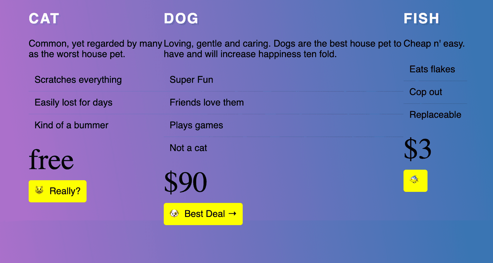
We want each item to be equal space so add the following:
.plan {
  flex: 1;
  background: rgba(255, 255, 255, 0.2);
  margin: 20px;
}
When you set a margin on an item that does not have an explicit width, it will eat into it.
We will add some padding, align the text in the centre and add border-radius.
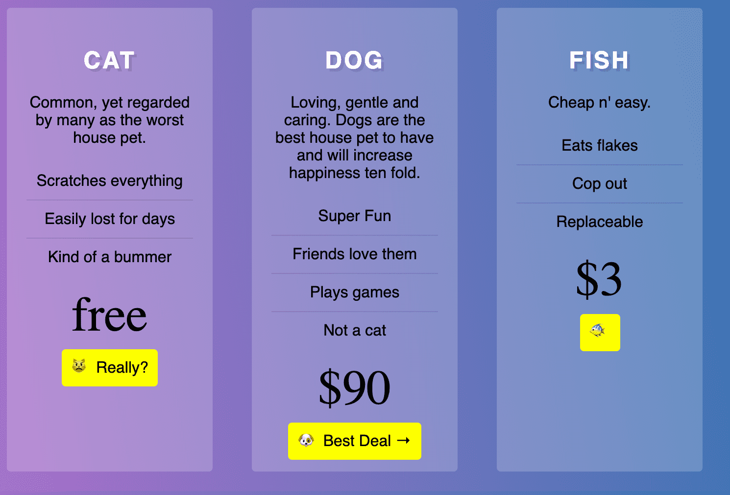
However we now want the call to action buttons on the bottom.
You could do align-items:center on the flex container and get the following:
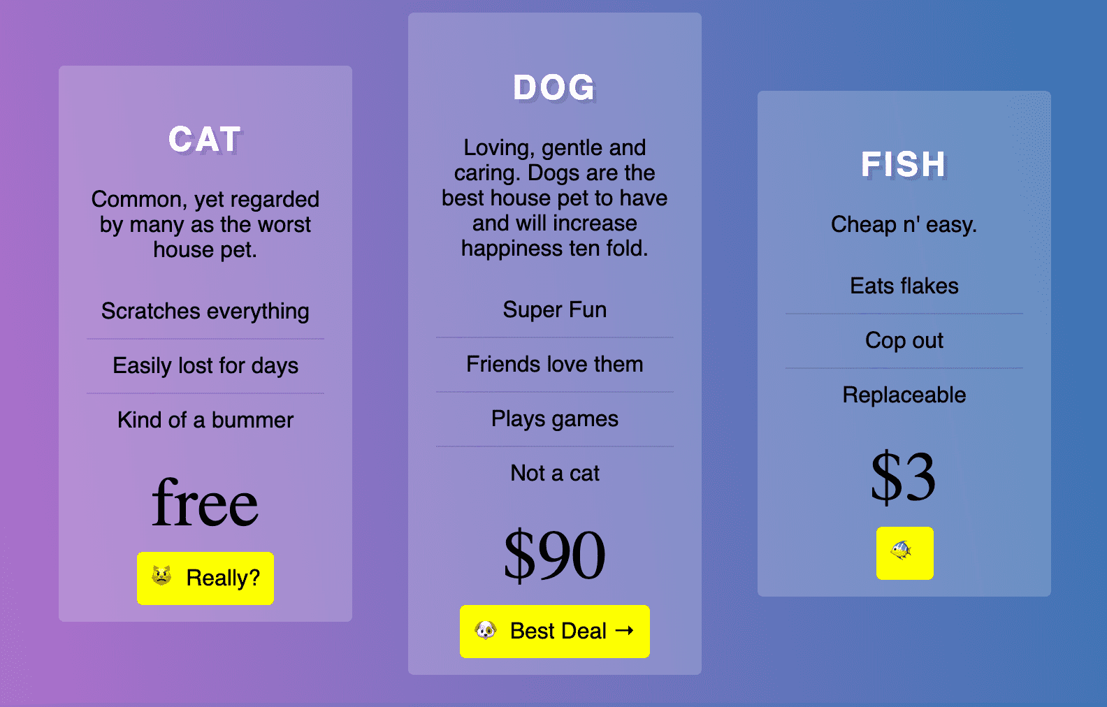
But not exactly what we want.
We have the ability to overwrite a single item and say align-self:flex-end. We try to apply it to the call to action button using
.plan .cta {
  align-self: flex-end;
}
However align-self can only be called on a flex-item and since the call to action is not a direct child of the .pricing-grid flex container, we need to make the .plan a flex container as well.
However, when we do that we get the following:

We need to add flex-wrap:wrap so they go onto additional lines.
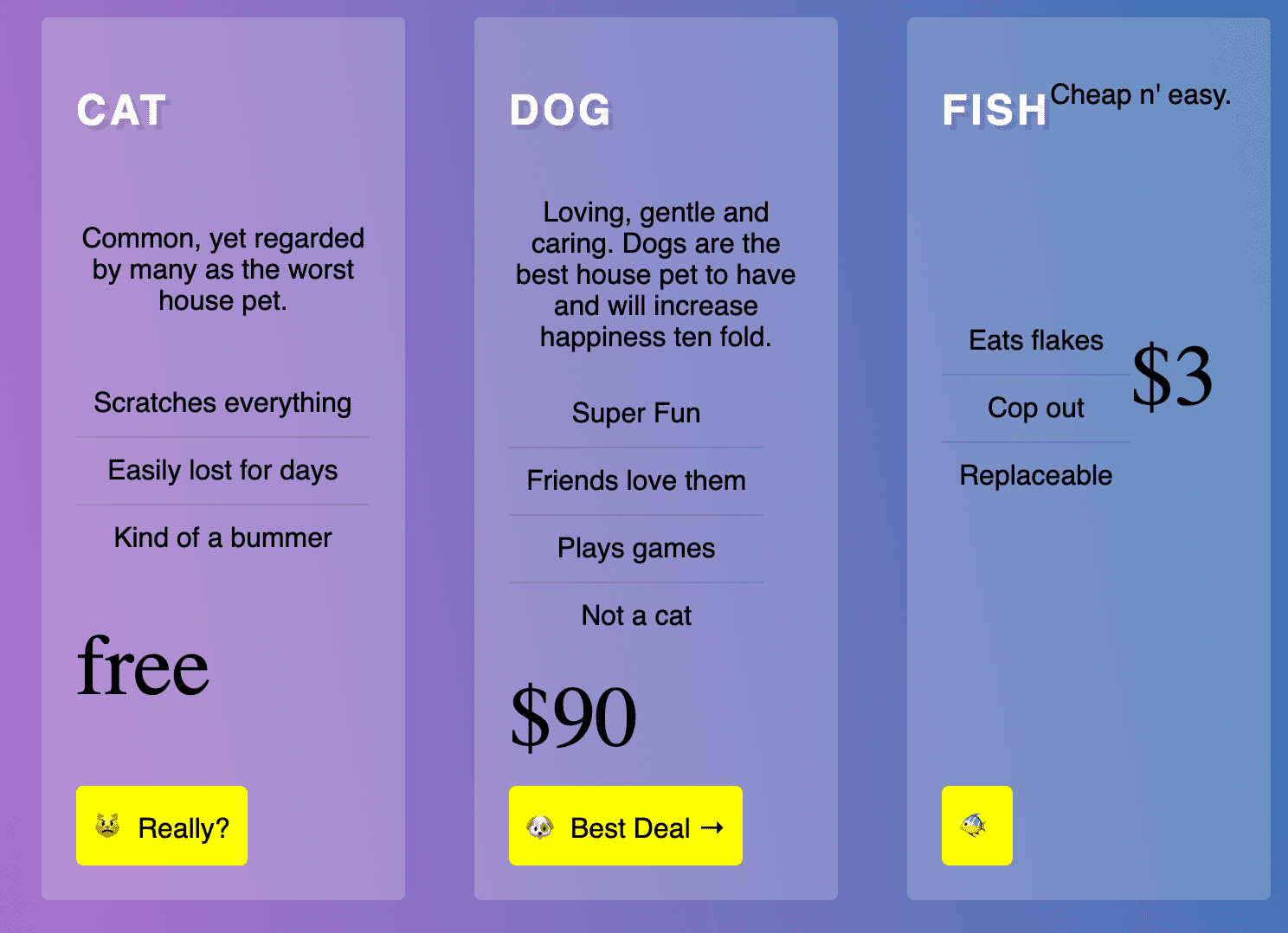
Now we have to select all of the new flex items (direct children of .plan)
If you do
.plan > * {
  flex: 1;
  flex-basis: 100%;
}
Not ideal.. that is because we haven’t set a width on the flex-items. We need to set the flex-basis
.plan > * {
  flex: 1 1 100%;
}
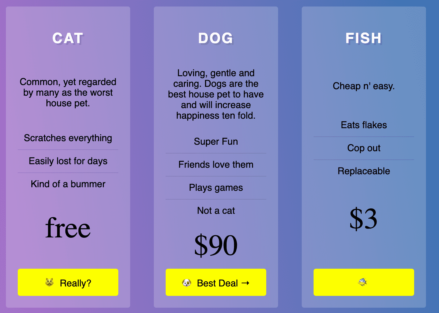
However, if you don’t want them all to be the same height, what we can do is on .pricing-grid we can set align-items:center for this effect:
Flex Single Line Form
We want to create

<div class=“cover”>
      <form class=“flex-form”>
        <input type=“search” placeholder=“Where do you want to go?” />

        <label for=“from”>From</label>
        <input type=“date” name=“from” />

        <label for=“from”>To</label>
        <input type=“date” name=“to” />

        <select name=“” id=“”>
          <option value=“1”>1 Guest</option>
          <option value=“2”>2 Guest</option>
          <option value=“3”>3 Guest</option>
          <option value=“4”>4 Guest</option>
          <option value=“5”>5 Guest</option>
        </select>

        <input type=“submit” value=“Search” />
      </form>
    </div>
We have the following css to start with:
/* Some CSS Setup - nothing to do with flexbox */
html {
  box-sizing: border-box;
}

*,
*:before,
*:after {
  box-sizing: inherit;
}

body {
  font-family: sans-serif;
  margin: 0;
  overflow: hidden;
  background-image: linear-gradient(260deg, #2376ae 0%, #c16ecf 100%);
}

a {
  color: white;
}

.cover {
  height: 100vh;
  width: 100%;
}

/*Video*/

.dog {
  height: 100%;
  -webkit-filter: blur(5px);
  filter: blur(5px);
  position: absolute;
  top: 0;
  z-index: -1;
}

/*Hack to get them to align properly */
.flex-form > *:not([type="date"]) {
  border-top: 1px solid white;
  border-bottom: 1px solid white;
}

.flex-form input[type="submit"] {
  background: #ff5a5f;
  border-top: 1px solid #ff5a5f;
  border-bottom: 1px solid #ff5a5f;
  color: white;
}

.flex-form > * {
  border: 0;
  padding: 10px;
  background: white;
  line-height: 50px;
  font-size: 20px;
  border-radius: 0;
  outline: 0;
  border-right: 1px solid rgba(0, 0, 0, 0.2);
  -webkit-appearance: none;
}

.flex-form > *:last-child {
  border-right: 0;
}

First thing we want is to get our form vertically and horizontally centered.
.cover {
  display: flex;
  align-items: center;
  justify-content: center;
}

Next we need to make the form container also a flex container.
.flex-form {
  display: flex;
}
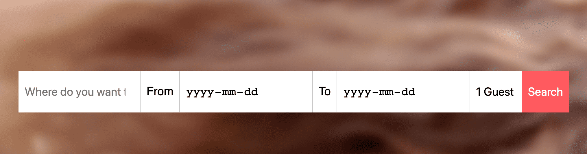
Now all the labels and inputs are flex-items and by default it stretches it across and make them evenly the exact same size for us.
Now we just need to adjust the first field because it is being squished like so:
input[type="search"] {
  flex-basis: 500px;
}

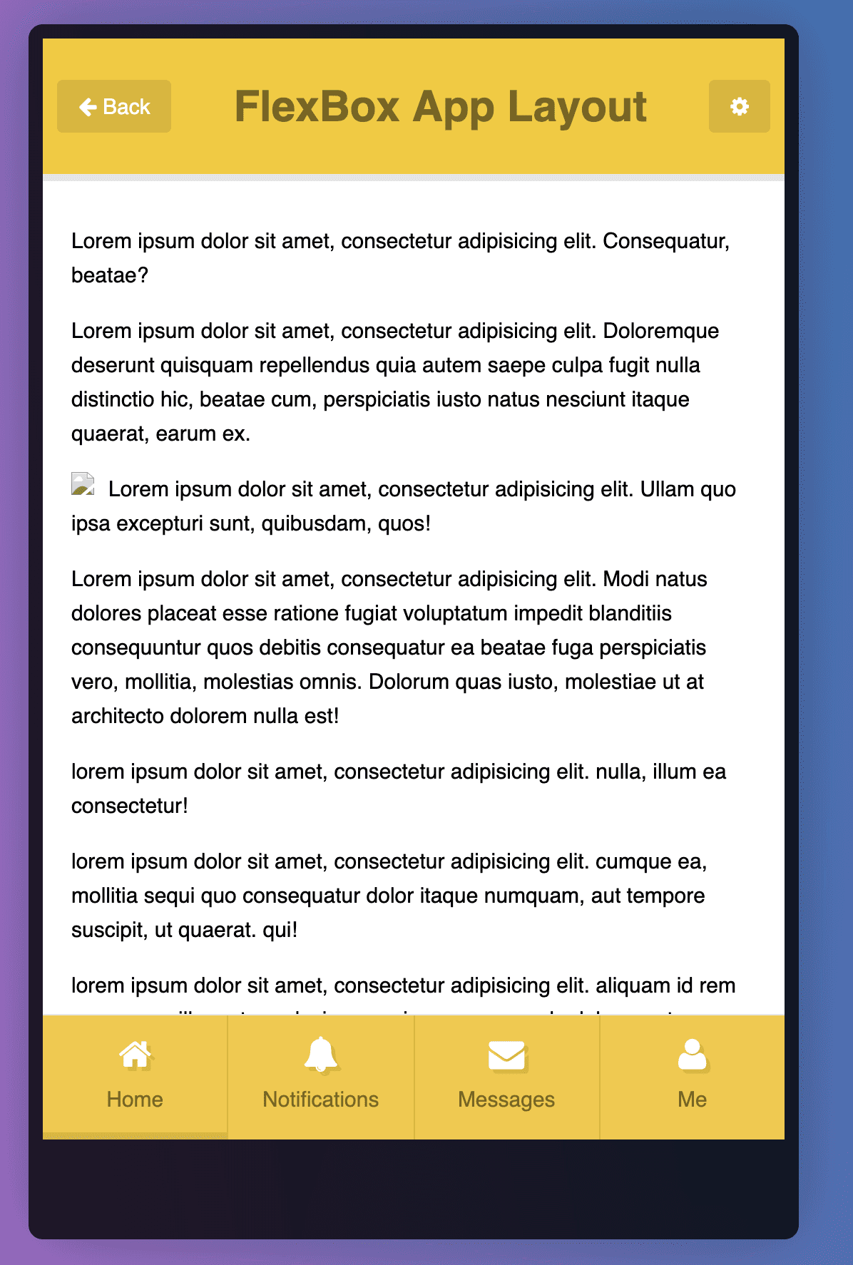
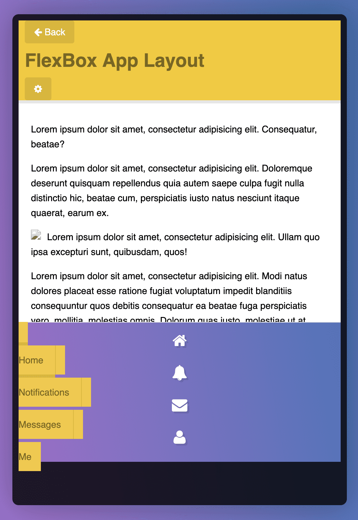
Make a Mobile App Layout with Flexbox
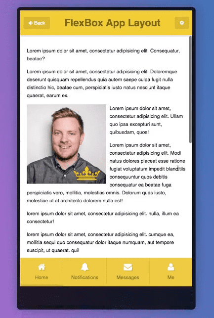
Build this which is responsive in height and width with no media queries or floats etc.
.app-wrap {
  display: flex;
  flex-direction: column;
}
Next we do
.app-wrap > * {
  flex: 1 1 auto;
}
We do auto because we want the header to take up as much space as it needs as well as the buttons. However when we do that there is not much improvement.
Next we add
/* content */
.content {
  overflow-y: scroll;
  -webkit-overflow-scrolling: touch;
}
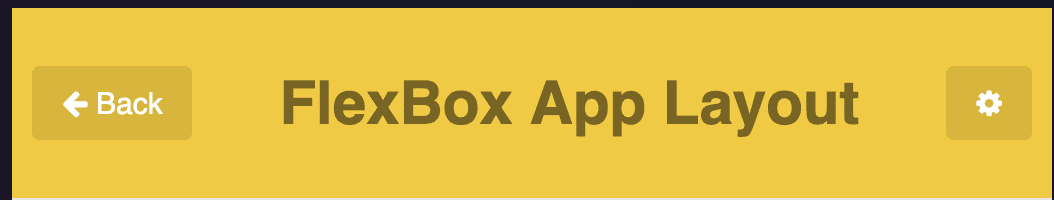
Now we are going to do the header. We want to make the header a flex container so the link (next button and cog wheel) can be flex items for easy positioning.
.app-header {
  display: flex;
}

If we add align-items:center

We want the buttons to have better spacing between them. We don’t want to use padding or margin because we are not sure what the screen size will be. We have access to justify-content however.
.app-header {
  display: flex;
  align-items: center;
  justify-content: space-between;
}
Next we make the icon bar a flex container
.icon-bar {
  display: flex;
}

.icon-bar a {
  flex: 1;
}